
概述
栅格布局是一种通用的辅助定位工具,对移动设备的界面设计有较好的借鉴作用。主要优势包括:
-
提供可循的规律:栅格布局可以为布局提供规律性的结构,解决多尺寸多设备的动态布局问题。通过将页面划分为等宽的列数和行数,可以方便地对页面元素进行定位和排版。
-
统一的定位标注:栅格布局可以为系统提供一种统一的定位标注,保证不同设备上各个模块的布局一致性。这可以减少设计和开发的复杂度,提高工作效率。
-
灵活的间距调整方法:栅格布局可以提供一种灵活的间距调整方法,满足特殊场景布局调整的需求。通过调整列与列之间和行与行之间的间距,可以控制整个页面的排版效果。
-
自动换行和自适应:栅格布局可以完成一对多布局的自动换行和自适应。当页面元素的数量超出了一行或一列的容量时,他们会自动换到下一行或下一列,并且在不同的设备上自适应排版,使得页面布局更加灵活和适应性强。
GridRow 为栅格容器组件,需与栅格子组件 GridCol 在栅格布局场景中联合使用。
栅格容器GridRow
栅格系统断点
栅格系统以设备的水平宽度( 屏幕密度像素值 ,单位vp)作为断点依据,定义设备的宽度类型,形成了一套断点规则。开发者可根据需求在不同的断点区间实现不同的页面布局效果。
栅格系统默认断点将设备宽度分为xs、sm、md、lg四类,尺寸范围如下:
| 断点名称 | 取值范围(vp) | 设备描述 |
|---|---|---|
| xs | [0, 320) | 最小宽度类型设备。 |
| sm | [320, 520) | 小宽度类型设备。 |
| md | [520, 840) | 中等宽度类型设备。 |
| lg | [840, +∞) | 大宽度类型设备。 |
在GridRow栅格组件中,允许开发者使用breakpoints自定义修改断点的取值范围,最多支持6个断点,除了默认的四个断点外,还可以启用xl,xxl两个断点,支持六种不同尺寸(xs, sm, md, lg, xl, xxl)设备的布局设置。
| 断点名称 | 设备描述 |
|---|---|
| xs | 最小宽度类型设备。 |
| sm | 小宽度类型设备。 |
| md | 中等宽度类型设备。 |
| lg | 大宽度类型设备。 |
| xl | 特大宽度类型设备。 |
| xxl | 超大宽度类型设备。 |
- 针对断点位置,开发者根据实际使用场景,通过一个单调递增数组设置。由于breakpoints最多支持六个断点,单调递增数组长度最大为5。
breakpoints: {value: ['100vp', '200vp']}
- 1
表示启用xs、sm、md共3个断点,小于100vp为xs,100vp-200vp为sm,大于200vp为md。
breakpoints: {value: ['320vp', '520vp', '840vp', '1080vp']}
- 1
表示启用xs、sm、md、lg、xl共5个断点,小于320vp为xs,320vp-520vp为sm,520vp-840vp为md,840vp-1080vp为lg,大于1080vp为xl。
- 栅格系统通过监听窗口或容器的尺寸变化进行断点,通过reference设置断点切换参考物。 考虑到应用可能以非全屏窗口的形式显示,以应用窗口宽度为参照物更为通用。
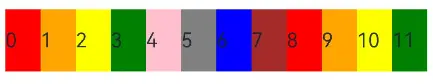
例如,使用栅格的默认列数12列,通过断点设置将应用宽度分成六个区间,在各区间中,每个栅格子元素占用的列数均不同。
@State bgColors: Color[] = [Color.Red, Color.Orange, Color.Yellow, Color.Green, Color.Pink, Color.Grey, Color.Blue, Color.Brown];
...
GridRow({
  breakpoints: {
    value: ['200vp', '300vp', '400vp', '500vp', '600vp'],
    reference: BreakpointsReference.WindowSize
  }
}) {
   ForEach(this.bgColors, (color:Color, index?:number|undefined) => {
     GridCol({
       span: {
         xs: 2, // 在最小宽度类型设备上,栅格子组件占据的栅格容器2列。
         sm: 3, // 在小宽度类型设备上,栅格子组件占据的栅格容器3列。
         md: 4, // 在中等宽度类型设备上,栅格子组件占据的栅格容器4列。
         lg: 6, // 在大宽度类型设备上,栅格子组件占据的栅格容器6列。
         xl: 8, // 在特大宽度类型设备上,栅格子组件占据的栅格容器8列。
         xxl: 12 // 在超大宽度类型设备上,栅格子组件占据的栅格容器12列。
       }
     }) {
       Row() {
         Text(`${index}`)
       }.width("100%").height('50vp')
     }.backgroundColor(color)
   })
}

- 1
- 2
- 3
- 4
- 5
- 6
- 7
- 8
- 9
- 10
- 11
- 12
- 13
- 14
- 15
- 16
- 17
- 18
- 19
- 20
- 21
- 22
- 23
- 24
- 25

布局的总列数
GridRow中通过columns设置栅格布局的总列数。
- columns默认值为12,即在未设置columns时,任何断点下,栅格布局被分成12列。
@State bgColors: Color[] = [Color.Red, Color.Orange, Color.Yellow, Color.Green, Color.Pink, Color.Grey, Color.Blue, Color.Brown,Color.Red, Color.Orange, Color.Yellow, Color.Green];
...
GridRow() {
  ForEach(this.bgColors, (item:Color, index?:number|undefined) => {
    GridCol() {
      Row() {
          Text(`${index}`)
      }.width('100%').height('50')
    }.backgroundColor(item)
  })
}
- 1
- 2
- 3
- 4
- 5
- 6
- 7
- 8
- 9
- 10
- 11
- 当columns为自定义值,栅格布局在任何尺寸设备下都被分为columns列。下面分别设置栅格布局列数为4和8,子元素默认占一列,效果如下:
class CurrTmp{
  currentBp: string = 'unknown';
  set(val:string){
    this.currentBp = val
  }
}
let BorderWH:Record = { 'color': Color.Blue, 'width': 2 }
@State bgColors: Color[] = [Color.Red, Color.Orange, Color.Yellow, Color.Green, Color.Pink, Color.Grey, Color.Blue, Color.Brown];
@State currentBp: string = 'unknown';
...
Row() {
  GridRow({ columns: 4 }) {
    ForEach(this.bgColors, (item:Color, index?:number|undefined) => {
      GridCol() {
        Row() {
          Text(`${index}`)
        }.width('100%').height('50')
      }.backgroundColor(item)
    })
  }
  .width('100%').height('100%')
  .onBreakpointChange((breakpoint:string) => {
    let CurrSet:CurrTmp = new CurrTmp()
    CurrSet.set(breakpoint)
  })
}
.height(160)
.border(BorderWH)
.width('90%')

Row() {
  GridRow({ columns: 8 }) {
    ForEach(this.bgColors, (item:Color, index?:number|undefined) => {
        GridCol() {
          Row() {
            Text(`${index}`)
          }.width('100%').height('50')
        }.backgroundColor(item)
    })
  }
  .width('100%').height('100%')
  .onBreakpointChange((breakpoint:string) => {
    let CurrSet:CurrTmp = new CurrTmp()
    CurrSet.set(breakpoint)
  })
}
.height(160)
.border(BorderWH)
.width('90%')
- 1
- 2
- 3
- 4
- 5
- 6
- 7
- 8
- 9
- 10
- 11
- 12
- 13
- 14
- 15
- 16
- 17
- 18
- 19
- 20
- 21
- 22
- 23
- 24
- 25
- 26
- 27
- 28
- 29
- 30
- 31
- 32
- 33
- 34
- 35
- 36
- 37
- 38
- 39
- 40
- 41
- 42
- 43
- 44
- 45
- 46
- 47
- 48
- 49

- 当columns类型为GridRowColumnOption时,支持下面六种不同尺寸(xs, sm, md, lg, xl, xxl)设备的总列数设置,各个尺寸下数值可不同。
@State bgColors: Color[] = [Color.Red, Color.Orange, Color.Yellow, Color.Green, Color.Pink, Color.Grey, Color.Blue, Color.Brown]
GridRow({ columns: { sm: 4, md: 8 }, breakpoints: { value: ['200vp', '300vp', '400vp', '500vp', '600vp'] } }) {
  ForEach(this.bgColors, (item:Color, index?:number|undefined) => {
    GridCol() {
      Row() {
        Text(`${index}`)
      }.width('100%').height('50')
    }.backgroundColor(item)
  })
}
- 1
- 2
- 3
- 4
- 5
- 6
- 7
- 8
- 9
- 10

若只设置sm, md的栅格总列数,则较小的尺寸使用默认columns值12,较大的尺寸使用前一个尺寸的columns。这里只设置sm:4, md:8,则较小尺寸的xs:12,较大尺寸的参照md的设置,lg:8, xl:8, xxl:8
排列方向
栅格布局中,可以通过设置GridRow的direction属性来指定栅格子组件在栅格容器中的排列方向。该属性可以设置为GridRowDirection.Row(从左往右排列)或GridRowDirection.RowReverse(从右往左排列),以满足不同的布局需求。通过合理的direction属性设置,可以使得页面布局更加灵活和符合设计要求。
- 子组件默认从左往右排列。
GridRow({ direction: GridRowDirection.Row }){}
- 1

- 子组件从右往左排列。
GridRow({ direction: GridRowDirection.RowReverse }){}
- 1

子组件间距
GridRow中通过gutter属性设置子元素在水平和垂直方向的间距。
- 当gutter类型为number时,同时设置栅格子组件间水平和垂直方向边距且相等。下例中,设置子组件水平与垂直方向距离相邻元素的间距为10。
GridRow({ gutter: 10 }){}
- 1

- 当gutter类型为GutterOption时,单独设置栅格子组件水平垂直边距,x属性为水平方向间距,y为垂直方向间距。
GridRow({ gutter: { x: 20, y: 50 } }){}
- 1

子组件GridCol
GridCol组件作为GridRow组件的子组件,通过给GridCol传参或者设置属性两种方式,设置span(占用列数),offset(偏移列数),order(元素序号)的值。
- 设置span。
let Gspan:Record = { 'xs': 1, 'sm': 2, 'md': 3, 'lg': 4 }
GridCol({ span: 2 }){}
GridCol({ span: { xs: 1, sm: 2, md: 3, lg: 4 } }){}
GridCol(){}.span(2)
GridCol(){}.span(Gspan)
- 1
- 2
- 3
- 4
- 5
- 设置offset。
let Goffset:Record = { 'xs': 1, 'sm': 2, 'md': 3, 'lg': 4 }
GridCol({ offset: 2 }){}
GridCol({ offset: { xs: 2, sm: 2, md: 2, lg: 2 } }){}
GridCol(){}.offset(Goffset)
- 1
- 2
- 3
- 4
- 设置order。
let Gorder:Record = { 'xs': 1, 'sm': 2, 'md': 3, 'lg': 4 }
GridCol({ order: 2 }){}
GridCol({ order: { xs: 1, sm: 2, md: 3, lg: 4 } }){}
GridCol(){}.order(2)
GridCol(){}.order(Gorder)
- 1
- 2
- 3
- 4
- 5
span
子组件占栅格布局的列数,决定了子组件的宽度,默认为1。
- 当类型为number时,子组件在所有尺寸设备下占用的列数相同。
@State bgColors: Color[] = [Color.Red, Color.Orange, Color.Yellow, Color.Green, Color.Pink, Color.Grey, Color.Blue, Color.Brown];
...
GridRow({ columns: 8 }) {
  ForEach(this.bgColors, (color:Color, index?:number|undefined) => {
    GridCol({ span: 2 }) {
      Row() {
        Text(`${index}`)
      }.width('100%').height('50vp')
    }
    .backgroundColor(color)
  })
}
- 1
- 2
- 3
- 4
- 5
- 6
- 7
- 8
- 9
- 10
- 11
- 12

- 当类型为GridColColumnOption时,支持六种不同尺寸(xs, sm, md, lg, xl, xxl)设备中子组件所占列数设置,各个尺寸下数值可不同。
@State bgColors: Color[] = [Color.Red, Color.Orange, Color.Yellow, Color.Green, Color.Pink, Color.Grey, Color.Blue, Color.Brown];
...
GridRow({ columns: 8 }) {
  ForEach(this.bgColors, (color:Color, index?:number|undefined) => {
    GridCol({ span: { xs: 1, sm: 2, md: 3, lg: 4 } }) {
      Row() {
        Text(`${index}`)
      }.width('100%').height('50vp')
    }
    .backgroundColor(color)
  })
}
- 1
- 2
- 3
- 4
- 5
- 6
- 7
- 8
- 9
- 10
- 11
- 12

offset
栅格子组件相对于前一个子组件的偏移列数,默认为0。
- 当类型为number时,子组件偏移相同列数。
@State bgColors: Color[] = [Color.Red, Color.Orange, Color.Yellow, Color.Green, Color.Pink, Color.Grey, Color.Blue, Color.Brown];
...
GridRow() {
  ForEach(this.bgColors, (color:Color, index?:number|undefined) => {
    GridCol({ offset: 2 }) {
      Row() {
        Text('' + index)
      }.width('100%').height('50vp')
    }
    .backgroundColor(color)
  })
}
- 1
- 2
- 3
- 4
- 5
- 6
- 7
- 8
- 9
- 10
- 11
- 12

栅格默认分成12列,每一个子组件默认占1列,偏移2列,每个子组件及间距共占3列,一行放四个子组件。
- 当类型为GridColColumnOption时,支持六种不同尺寸(xs, sm, md, lg, xl, xxl)设备中子组件所占列数设置,各个尺寸下数值可不同。
@State bgColors: Color[] = [Color.Red, Color.Orange, Color.Yellow, Color.Green, Color.Pink, Color.Grey, Color.Blue, Color.Brown];
...

GridRow() {
  ForEach(this.bgColors, (color:Color, index?:number|undefined) => {
    GridCol({ offset: { xs: 1, sm: 2, md: 3, lg: 4 } }) {
      Row() {
        Text('' + index)
      }.width('100%').height('50vp')
    }
    .backgroundColor(color)
  })
}
- 1
- 2
- 3
- 4
- 5
- 6
- 7
- 8
- 9
- 10
- 11
- 12
- 13

order
栅格子组件的序号,决定子组件排列次序。当子组件不设置order或者设置相同的order, 子组件按照代码顺序展示。当子组件设置不同的order时,order较小的组件在前,较大的在后。
当子组件部分设置order,部分不设置order时,未设置order的子组件依次排序靠前,设置了order的子组件按照数值从小到大排列。
- 当类型为number时,子组件在任何尺寸下排序次序一致。
GridRow() {
  GridCol({ order: 4 }) {
    Row() {
      Text('1')
    }.width('100%').height('50vp')
  }.backgroundColor(Color.Red)
  GridCol({ order: 3 }) {
    Row() {
      Text('2')
    }.width('100%').height('50vp')
  }.backgroundColor(Color.Orange)
  GridCol({ order: 2 }) {
    Row() {
      Text('3')
    }.width('100%').height('50vp')
  }.backgroundColor(Color.Yellow)
  GridCol({ order: 1 }) {
    Row() {
      Text('4')
    }.width('100%').height('50vp')
  }.backgroundColor(Color.Green)
}
- 1
- 2
- 3
- 4
- 5
- 6
- 7
- 8
- 9
- 10
- 11
- 12
- 13
- 14
- 15
- 16
- 17
- 18
- 19
- 20
- 21
- 22

- 当类型为GridColColumnOption时,支持六种不同尺寸(xs, sm, md, lg, xl, xxl)设备中子组件排序次序设置。在xs设备中,子组件排列顺序为1234;sm为2341,md为3412,lg为2431。
GridRow() {
  GridCol({ order: { xs:1, sm:5, md:3, lg:7}}) {
    Row() {
      Text('1')
    }.width('100%').height('50vp')
  }.backgroundColor(Color.Red)
  GridCol({ order: { xs:2, sm:2, md:6, lg:1} }) {
    Row() {
      Text('2')
    }.width('100%').height('50vp')
  }.backgroundColor(Color.Orange)
  GridCol({ order: { xs:3, sm:3, md:1, lg:6} }) {
    Row() {
      Text('3')
    }.width('100%').height('50vp')
  }.backgroundColor(Color.Yellow)
  GridCol({ order: { xs:4, sm:4, md:2, lg:5} }) {
    Row() {
      Text('4')
    }.width('100%').height('50vp')
  }.backgroundColor(Color.Green)
}
- 1
- 2
- 3
- 4
- 5
- 6
- 7
- 8
- 9
- 10
- 11
- 12
- 13
- 14
- 15
- 16
- 17
- 18
- 19
- 20
- 21
- 22

栅格组件的嵌套使用
栅格组件也可以嵌套使用,完成一些复杂的布局。
以下示例中,栅格把整个空间分为12份。第一层GridRow嵌套GridCol,分为中间大区域以及“footer”区域。第二层GridRow嵌套GridCol,分为“left”和“right”区域。子组件空间按照上一层父组件的空间划分,粉色的区域是屏幕空间的12列,绿色和蓝色的区域是父组件GridCol的12列,依次进行空间的划分。
@Entry
@Component
struct GridRowExample {
  build() {
    GridRow() {
      GridCol({ span: { sm: 12 } }) {
        GridRow() {
          GridCol({ span: { sm: 2 } }) {
            Row() {
              Text('left').fontSize(24)
            }
            .justifyContent(FlexAlign.Center)
            .height('90%')
          }.backgroundColor('#ff41dbaa')

          GridCol({ span: { sm: 10 } }) {
            Row() {
              Text('right').fontSize(24)
            }
            .justifyContent(FlexAlign.Center)
            .height('90%')
          }.backgroundColor('#ff4168db')
        }
        .backgroundColor('#19000000')
        .height('100%')
      }

      GridCol({ span: { sm: 12 } }) {
        Row() {
          Text('footer').width('100%').textAlign(TextAlign.Center)
        }.width('100%').height('10%').backgroundColor(Color.Pink)
      }
    }.width('100%').height(300)
  }
}
- 1
- 2
- 3
- 4
- 5
- 6
- 7
- 8
- 9
- 10
- 11
- 12
- 13
- 14
- 15
- 16
- 17
- 18
- 19
- 20
- 21
- 22
- 23
- 24
- 25
- 26
- 27
- 28
- 29
- 30
- 31
- 32
- 33
- 34
- 35

综上所述,栅格组件提供了丰富的自定义能力,功能异常灵活和强大。只需要明确栅格在不同断点下的Columns、Margin、Gutter及span等参数,即可确定最终布局,无需关心具体的设备类型及设备状态(如横竖屏)等。
鸿蒙全栈开发全新学习指南
为了积极培养鸿蒙生态人才,让大家都能学习到鸿蒙开发最新的技术,针对一些在职人员、0基础小白、应届生/计算机专业、鸿蒙爱好者等人群,整理了一套纯血版鸿蒙(HarmonyOS Next)全栈开发技术的学习路线【包含了大厂APP实战项目开发】。
本路线共分为四个阶段:
第一阶段:鸿蒙初中级开发必备技能
第二阶段:鸿蒙南北双向高工技能基础:gitee.com/MNxiaona/733GH
第三阶段:应用开发中高级就业技术
第四阶段:全网首发-工业级南向设备开发就业技术:gitee.com/MNxiaona/733GH
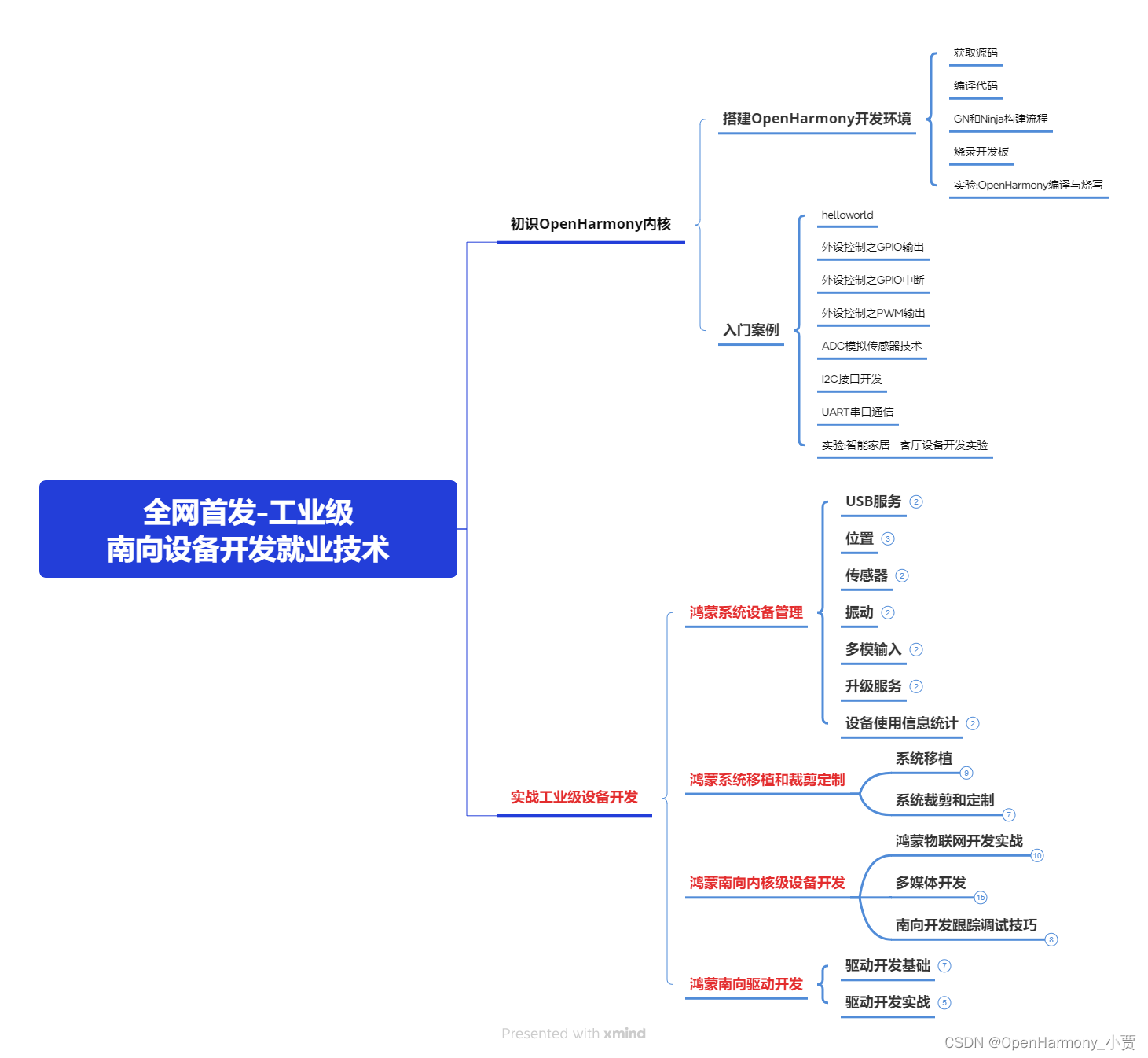
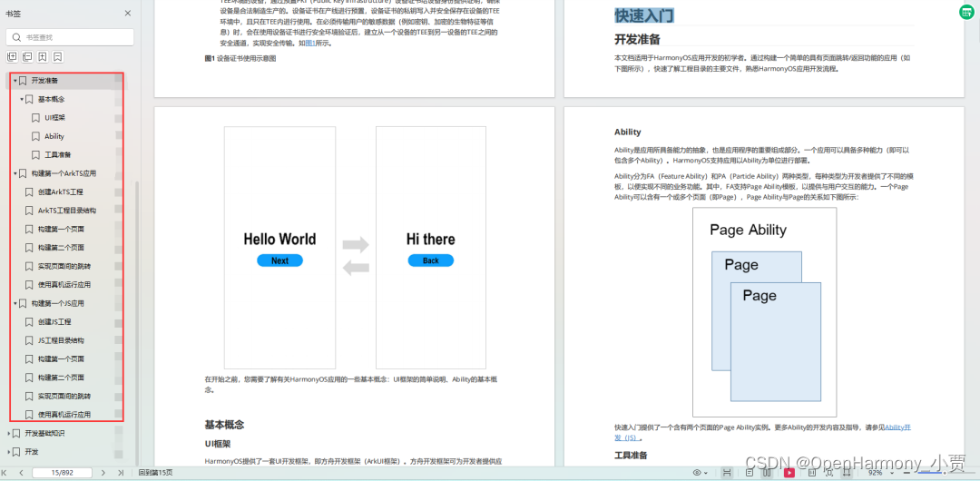
《鸿蒙 (Harmony OS)开发学习手册》(共计892页)
如何快速入门?
1.基本概念
2.构建第一个ArkTS应用
3.……
开发基础知识:gitee.com/MNxiaona/733GH
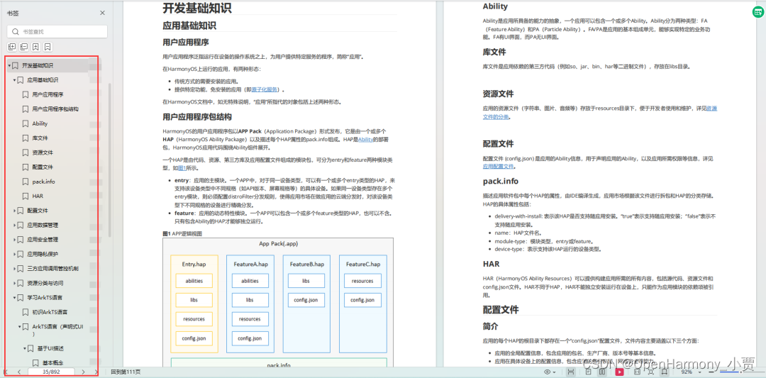
1.应用基础知识
2.配置文件
3.应用数据管理
4.应用安全管理
5.应用隐私保护
6.三方应用调用管控机制
7.资源分类与访问
8.学习ArkTS语言
9.……
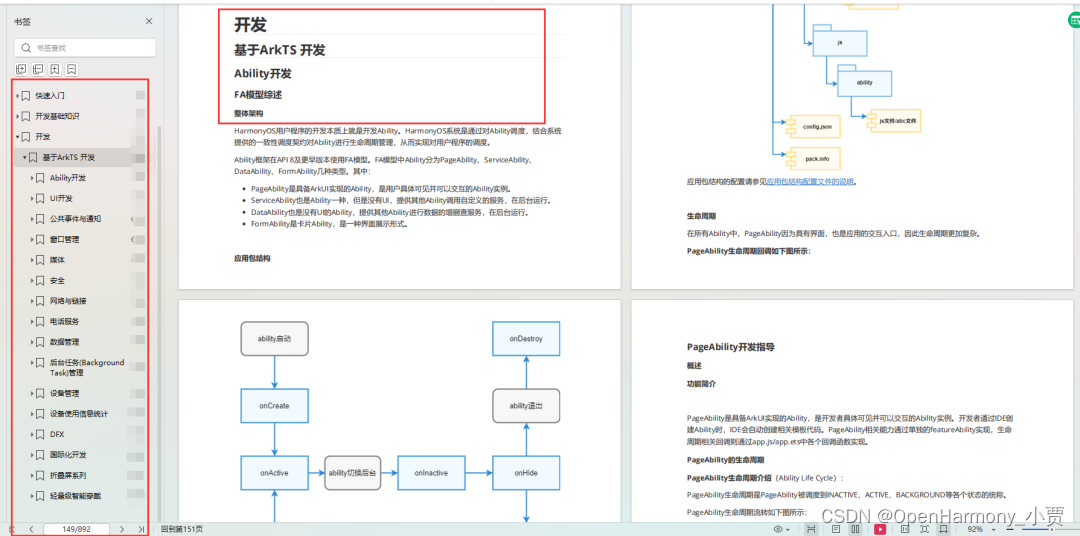
基于ArkTS 开发
1.Ability开发
2.UI开发
3.公共事件与通知
4.窗口管理
5.媒体
6.安全
7.网络与链接
8.电话服务
9.数据管理
10.后台任务(Background Task)管理
11.设备管理
12.设备使用信息统计
13.DFX
14.国际化开发
15.折叠屏系列
16.……
鸿蒙开发面试真题(含参考答案):gitee.com/MNxiaona/733GH
鸿蒙入门教学视频:
美团APP实战开发教学:gitee.com/MNxiaona/733GH

写在最后
- 如果你觉得这篇内容对你还蛮有帮助,我想邀请你帮我三个小忙:
- 点赞,转发,有你们的 『点赞和评论』,才是我创造的动力。
- 关注小编,同时可以期待后续文章ing?,不定期分享原创知识。
- 想要获取更多完整鸿蒙最新学习资源,请移步前往小编:
gitee.com/MNxiaona/733GH


 微信名片
微信名片

评论记录:
回复评论: