
1. 引言
在 Flutter 中,PopupMenuButton 是一个用于创建弹出菜单的组件,适用于提供上下文操作、设置选项等功能。用户点击按钮后,会弹出一个菜单列表,供用户选择。本文将介绍 PopupMenuButton 的基本用法、主要属性及自定义样式。
2. PopupMenuButton 的基本用法
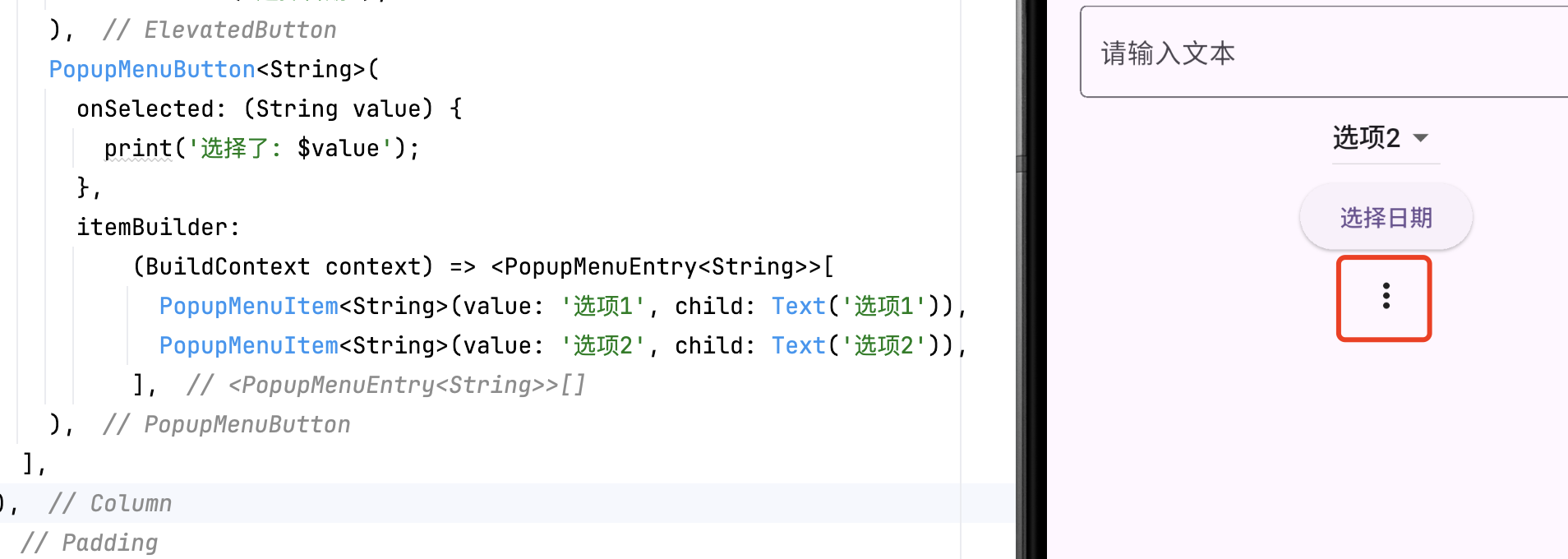
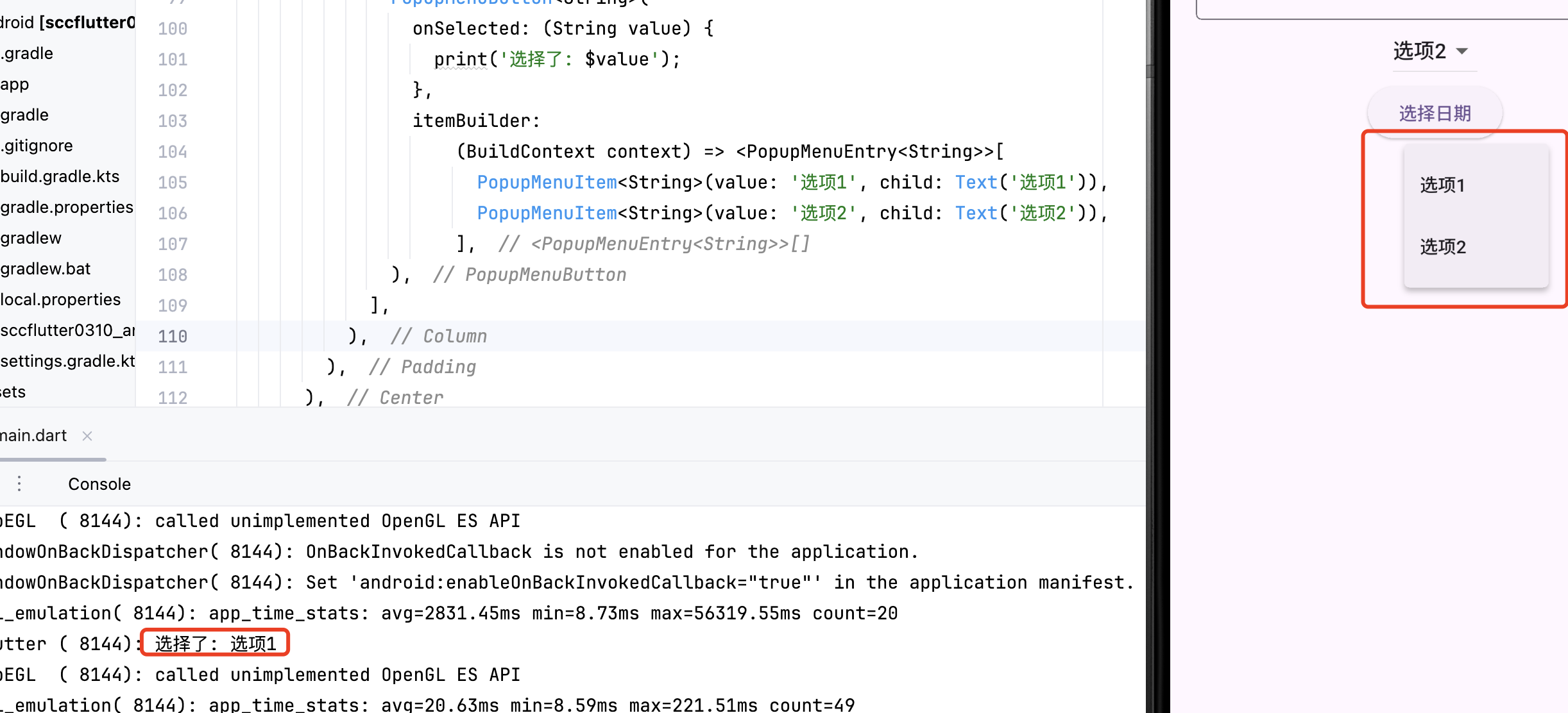
PopupMenuButton 通过 itemBuilder 创建菜单项,并通过 onSelected 处理选中事件。
- //方法一
- PopupMenuButton<String>(
- onSelected: (String value) {
- print('选择了: $value');
- },
- itemBuilder: (BuildContext context) =>
String>>[ - PopupMenuItem<String>(
- value: '选项1',
- child: Text('选项1'),
- ),
- PopupMenuItem<String>(
- value: '选项2',
- child: Text('选项2'),
- ),
- ],
- )
-
- //方法二
- PopupMenuButton<String>(
- onSelected: (value) => print('选中: $value'),
- itemBuilder: (context) => [
- const PopupMenuItem(value: 'edit', child: Text('编辑')),
- const PopupMenuItem(value: 'delete', child: Text('删除')),
- const PopupMenuItem(value: 'share', child: Text('分享')),
- ],
- )

3. 主要属性
| 属性 | 说明 |
|---|---|
onSelected | 选中某一项时的回调 |
itemBuilder | 构建菜单项的方法 |
icon | 自定义按钮图标 |
tooltip | 长按提示文本 |
offset | 菜单相对于按钮的偏移量 |
enabled | 是否启用菜单按钮 |
示例:
- PopupMenuButton<int>(
- icon: Icon(Icons.more_vert),
- onSelected: (int value) {
- print('选中了选项: $value');
- },
- itemBuilder: (BuildContext context) =>
int>>[ - PopupMenuItem<int>(value: 1, child: Text('编辑')),
- PopupMenuItem<int>(value: 2, child: Text('删除')),
- ],
- )
4. 样式定制:打造品牌化菜单
1. 修改全局主题
- PopupMenuButton(
- color: Colors.blue[50], // 菜单背景色
- surfaceTintColor: Colors.blue, // 材质效果色调
- elevation: 8, // 阴影高度
- shape: RoundedRectangleBorder( // 菜单形状
- borderRadius: BorderRadius.circular(16),
- side: BorderSide(color: Colors.blue),
- ),
- // ...其他参数
- )
2. 自定义菜单项样式
- PopupMenuItem(
- value: 'premium',
- height: 48, // 调整项高度
- child: Row(
- children: [
- Icon(Icons.star, color: Colors.amber),
- const SizedBox(width: 12),
- Text('升级会员', style: TextStyle(
- color: Colors.blue[800],
- fontWeight: FontWeight.w500,
- )),
- ],
- ),
- )
3. 添加菜单图标与分隔线
- itemBuilder: (context) => [
- const PopupMenuItem(
- value: 'edit',
- child: ListTile(
- leading: Icon(Icons.edit),
- title: Text('编辑'),
- ),
- ),
- const PopupMenuDivider(), // 分隔线
- const PopupMenuItem(
- value: 'delete',
- child: ListTile(
- leading: Icon(Icons.delete, color: Colors.red),
- title: Text('删除', style: TextStyle(color: Colors.red)),
- ),
- ),
- ],
5. 高级功能扩展
5.1. 动态生成菜单项
- final List
_options = [ - MenuOption(id: 1, title: '置顶', icon: Icons.arrow_upward),
- MenuOption(id: 2, title: '举报', icon: Icons.report),
- MenuOption(id: 3, title: '收藏', icon: Icons.favorite),
- ];
-
- PopupMenuButton
( - itemBuilder: (context) => _options.map((option) {
- return PopupMenuItem(
- value: option,
- child: ListTile(
- leading: Icon(option.icon),
- title: Text(option.title),
- ),
- );
- }).toList(),
- onSelected: (option) => _handleMenuAction(option.id),
- )
5.2. 异步操作支持
- PopupMenuButton(
- itemBuilder: (context) => [
- PopupMenuItem(
- value: 'load',
- child: const Text('加载数据'),
- onTap: () async {
- await Future.delayed(Duration.zero); // 确保菜单关闭
- _fetchData(); // 执行异步操作
- },
- ),
- ],
- )
5.3. 与状态管理结合(Provider)
- // 在构建器中访问状态
- itemBuilder: (context) {
- final user = context.watch
().user; - return [
- PopupMenuItem(
- value: 'profile',
- child: Text(user.isVip ? 'VIP' : 'SVIP'),
- ),
- ];
- },
6. 性能优化技巧
6.1. 避免不必要的重建
- // 将菜单项定义为常量
- class _MenuItems {
- static const List
items = [ - PopupMenuItem(value: 'edit', child: Text('编辑')),
- PopupMenuItem(value: 'delete', child: Text('删除')),
- ];
- }
-
- PopupMenuButton(
- itemBuilder: (context) => _MenuItems.items,
- )
6.2. 分块渲染大型菜单
- itemBuilder: (context) => [
- ..._renderFirstSection(),
- const PopupMenuDivider(),
- ..._renderSecondSection(),
- ],
7. 常见问题解决方案
7.1. 菜单弹出位置异常
- PopupMenuButton(
- offset: const Offset(0, 40), // 向下偏移40像素
- )
7.2. 菜单项点击无响应
确保 onSelected 或 onTap 中处理状态更新:
- onSelected: (value) {
- if (!mounted) return; // 防止 disposed 状态
- setState(() => _selectedValue = value);
- }
3. 自定义内容无法选中
7.为自定义组件添加点击区域:
- PopupMenuItem(
- child: InkWell(
- onTap: () => Navigator.pop(context, 'custom'),
- child: const Text('自定义项'),
- ),
- )
8. 扩展功能:进阶交互设计
8.1. 嵌套子菜单
- PopupMenuItem(
- child: PopupMenuButton(
- itemBuilder: (context) => [
- PopupMenuItem(child: Text('子菜单项1')),
- PopupMenuItem(child: Text('子菜单项2')),
- ],
- child: const ListTile(
- title: Text('更多操作'),
- trailing: Icon(Icons.arrow_right),
- ),
- ),
- )
8.2. 菜单展开动画定制
- PopupMenuButton(
- icon: const Icon(Icons.more_vert),
- position: PopupMenuPosition.under,
- splashRadius: 24, // 点击涟漪效果半径
- )
9. 结论
PopupMenuButton 是 Flutter 提供的弹出菜单组件,适用于创建简洁、交互友好的上下文菜单。它支持自定义图标、菜单项样式及弹出位置等功能。掌握 PopupMenuButton 的使用,有助于提升应用的交互体验。
相关推荐
Flutter DatePicker 详解-CSDN博客文章浏览阅读778次,点赞15次,收藏17次。DatePicker 是 Flutter 提供的日期选择组件,适用于各种需要用户选择日期的场景,如日程安排、生日选择等。Flutter 通过 showDatePicker 方法弹出日期选择器,并返回用户选择的日期。本文将介绍 DatePicker 的基本用法、主要属性及自定义方法。 http://iyenn.com/rec/1820859.htmlFlutter DropdownButton 详解-CSDN博客文章浏览阅读1.1k次,点赞21次,收藏29次。DropdownButton 是 Flutter 中用于创建下拉菜单的组件,适用于表单选择、筛选项等场景。它允许用户从多个选项中选择一个,并支持自定义样式和交互逻辑。本文将介绍 DropdownButton 的基本用法、主要属性及其自定义方法。http://iyenn.com/rec/1820860.html
评论记录:
回复评论: