
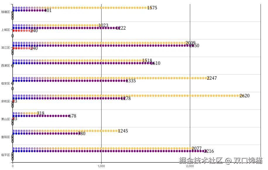
项目接到一个需求,需要实现柱是像电池一样一节一节断开拼接上去的渐变柱,如图实现效果图
1.技术选型分析
搜索全网,基本都是2种,一种是echarts渐变实柱叠一层pictorial栅格柱达到渐变效果;另一种就是纯d3仿直角轴图表。优劣势非常明显,第一种用现成api实现比较快,但是不灵活,无法满足高动态配置项场景下理想渲染;第二种工期长,完全自定义轴边柱,起码多3倍时间,但是实现后可灵活调整,可定制,可满足更多配置项需求;我在项目中2种都实现过。最后选择d3的原因是,项目需要往外抛的配置项非常多,要满足几乎每一个样式都是可以配置且用户改变任何配置项,渲染保证正常。这么一听,肯定是d3更符合一点。下面就是开始开发。
2.数据准备
这是多系列数据data,画图表需要的类echarts数据集的数据,如果是常规接口数据,还需要转化后使用。
js 代码解读复制代码[
  { "regionName": "钱塘区", "基教": 1575, "幼教": 401, "高教": 0, "中职": 0, "高职": 0},
  { "regionName": "上城区", "基教": 1023, "幼教": 1222, "高教": 240, "高职": 0},
  { "regionName": "滨江区", "基教": 2009, "幼教": 2050, "高教": 240, "中职": 0, "高职": 0},
  { "regionName": "西湖区", "基教": 1518, "幼教": 1610, "高教": 0 },
  { "regionName": "临安区", "基教": 2247, "幼教": 1335, "高教": 0, "高职": 0  },
  { "regionName": "余杭区", "基教": 2620, "幼教": 1278, "高教": 23, "中职": 0, "高职": 0  },
  { "regionName": "萧山区", "基教": 318, "幼教": 678, "高教": 23, "中职": 0, "高职": 0 },
  { "regionName": "富阳区", "基教": 1245, "幼教": 780, "高教": 0, "中职": 0, "高职": 0},
  { "regionName": "临平区", "基教": 2077, "幼教": 2216, "高教": 0, "中职": 0, "高职": 0 },

]
3.绘制图表
3.1 绘制x轴和y轴
系列提取数组保存const seriesNames = ["基教", "幼教", "高教", "中职", "高职"];
js 代码解读复制代码 const width = 928;
const height = 600;
const marginTop = 30;
const marginRight = 40;
const marginBottom = 30;
const marginLeft = 40;

// Create the SVG container
const svg = d3
.create('svg')
.attr('width', width)
.attr('height', height)
.attr('viewBox', [0, 0, width, height])
.attr('style', 'max-width: 100%; height: auto;');
const yTick = 0.2;
const y0 = d3
.scaleBand()
.rangeRound([marginTop, height - marginBottom])
.paddingInner(yTick);
const y1 = d3.scaleBand().padding(0.16);
const x = d3.scaleLinear().rangeRound([marginLeft, width - marginRight]);
const seriesNames = ['基教', '幼教', '高教', '中职', '高职'];
const xValueMap = {};
data.forEach((item) => {
const newItem = { ...item };
delete newItem['regionName'];
xValueMap[item['regionName']] = newItem;
});
const layers = data.map((d) =>
seriesNames.map((key) => ({ key, value: d[key], ['regionName']: d['regionName'] })),
);
y0.domain(data.map((d) => d['regionName']));
y1.domain(seriesNames).rangeRound([0, y0.bandwidth()]);
const maxDataValue = d3.max(data, (d) => d3.max(seriesNames, (key) => d[key]));
x.domain([0, maxDataValue]).nice();
const xAxis = (g) => {
g.attr('transform', `translate(0,${height - marginBottom})`).call(
d3.axisBottom(x).tickSize(0),
);
};
// Draw X axes
svg.append('g').call(xAxis);
const yAxis = (g) => {
g.attr('transform', `translate(${marginLeft},0)`).call(
d3.axisLeft(y0).tickValues(y0.domain()),
);
};
svg.append('g').call(yAxis);
绘制如图:
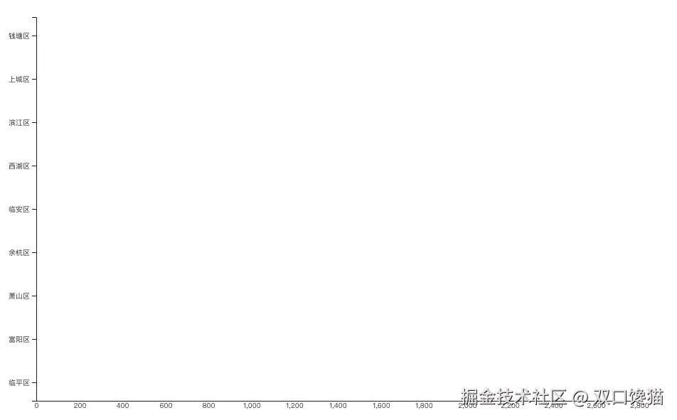 如图是简单的绘制出了x轴数值刻度,这个刻度会因为每次数值的变化而变化数值,最糟糕的是,有的时候出现非整10的倍数或者整100的倍数的刻度显示,这是与预期刻度尺应该展示的不相符合的,所以要着重修改一下这个渲染:
js 代码解读复制代码      const xAxis = (g) => {
        g.attr('transform', `translate(0,${height - marginBottom})`).call(
          d3.axisBottom(x).tickSize(0), // tickSize(0)改成tickValues(axisTicks),其中axisTicks需要着重计算
        );
      };
封装函数去计算刻度步数
js 代码解读复制代码  function calcTStepAndDMax(maxValue, tickCount) {
    let tickStep, domainMax;

    const magnitude = Math.pow(10, Math.floor(Math.log10(maxValue)));
    tickStep = magnitude;
    domainMax = Math.ceil(maxValue / tickStep) * tickStep;

    // Adjust tickStep based on the number of ticks needed
    if (domainMax / tickStep < tickCount) {
      tickStep = tickStep / 2; // Use half steps if fewer ticks than desired
    }

    domainMax = Math.ceil(maxValue / tickStep) * tickStep;

    return { tickStep, domainMax };
  }
然后得到axisTicks变量
js 代码解读复制代码    const { tickStep, domainMax } = calcTStepAndDMax(maxDataValue, numGridLines);
    const axisTicks = d3.range(0, domainMax + tickStep, tickStep);
    //顺便绘制每个刻度线上的网格

  const grid = svg.append("g")
    .attr("class", "grid")
    .attr("transform", `translate(0,0)`);

    const xGrid = d3
      .axisBottom(x)
      .tickValues(axisTicks) // 设置x轴的刻度值
      .tickSize(-height + marginTop + marginBottom)
      .tickFormat('')
      .tickSizeOuter(0); // 无外部刻度

    // 应用xGrid网格线
    svg
      .append('g')
      .attr('class', 'x grid')
      .attr('transform', `translate(0,${height - marginBottom})`)
      .call(xGrid);
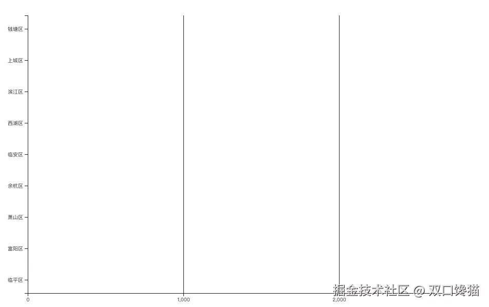
此时绘制图如下:
 剩下部分就是绘制系列柱形图,不过在这之前,要准备一个生成渐变色的函数
js 代码解读复制代码  function createGradient(id, color1, color2) {
    const gradient = defs.append("linearGradient")
      .attr("id", id)
      .attr("x1", "0%")
      .attr("y1", "0%")
      .attr("x2", "100%")
      .attr("y2", "0%");

    gradient.append("stop")
      .attr("offset", "0%")
      .attr("stop-color", color1);

    gradient.append("stop")
      .attr("offset", "100%")
      .attr("stop-color", color2);
  }
3.2 绘制分段渐变电池柱
上述已有代码不赘述了,再加bar生成的代码:
js 代码解读复制代码  const segmentHeight = 7;
    const segmentGap = 2;
    const yStep = (height - marginTop - marginBottom) / data.length;
    const barsGroup = svg.append('g');

    // Background bar on hover
    const backgroundBar = barsGroup
      .append('rect')
      .attr('class', 'background-bar')
      .attr('y', marginTop)
      .attr('height', y0.bandwidth())
      .attr('x', marginLeft)
      .attr('width', width - marginLeft - marginRight)
      .attr('fill', 'lightgrey')
      .style('opacity', 0);
    let lastXField = null;
    let lastKey = null;
    let previousWidth = 0;
    const bars = barsGroup
      .selectAll('g')
      .data(layers)
      .enter()
      .append('g')
      .attr('class', 'bar-wrapper')
      .attr(
        'transform',
        (d, i) => `translate(0, ${marginTop + yStep * i + yStep / 2 - y0.bandwidth() / 2})`,
      )
      .selectAll('rect')
      .data((d) =>
        d.flatMap((dataPoint) => {
          const gradients = [];
          const [startColor, endColor] = baseColors[dataPoint.key];
          let color1 = startColor;
          const totalWidth = x(dataPoint.value) - x(0);
          let numSegments = Math.ceil(totalWidth / (segmentHeight + segmentGap));
          let currentSegHeight = segmentHeight;

          if (totalWidth % (segmentHeight + segmentGap) > 0) {
            numSegments = Math.floor(totalWidth / (segmentHeight + segmentGap));
          }

          if (dataPoint.value > 0 && numSegments <= 0) {
            numSegments = 1;
          }

          for (let i = 0; i < numSegments; i++) {
            const gradientId = `gradient${gradientCounter++}${new Date().getTime()}`;
            let color2;
            if (i === numSegments - 1) {
              color2 = endColor;
            } else {
              const colorInterpolator = d3.interpolateRgb(color1, endColor);
              color2 = colorInterpolator((i + 1) / numSegments);
            }
            createGradient(gradientId, color1, color2);
            gradients.push({ ...dataPoint, segmentIndex: i, gradientId, currentSegHeight });
            color1 = color2;
          }
          return gradients;
        }),
      )
      .enter()
      .append('rect')
      .attr('y', (d) => y1(d.key))
      .attr('x', (d, i, nodes) => {
        if (lastXField !== d['regionName'] || lastKey !== d.key) {
          previousWidth = 0; // Reset the width when switching to a new xField or key
        }

        lastXField = d['regionName'];
        lastKey = d.key;

        const currentWidth = previousWidth;
        previousWidth += d.currentSegHeight + segmentGap;

        return marginLeft + currentWidth;
      })
      .attr('height', y1.bandwidth())
      .attr('width', (d) => d.currentSegHeight)
      .attr('rx', 4)
      .attr('ry', 4)
      .attr('fill', (d) => `url(#${d.gradientId})`);
这样最主要的图表绘制就差不多完成了。
3.3 完整代码展示
下面是完整代码,完整代码里还有一些增值功能,是项目中用到了的需要的展示,可作为参考,完整代码d3官网是调试通过了的。完整代码如下:
js 代码解读复制代码chart = {
  const width = 928;
  const height = 600;
  const marginTop = 30;
  const marginRight = 40;
  const marginBottom = 30;
  const marginLeft = 40;

  // Create the SVG container
  const svg = d3
    .create('svg')
    .attr('width', width)
    .attr('height', height)
    .attr('viewBox', [0, 0, width, height])
    .attr('style', 'max-width: 100%; height: auto;');

  const yTick = 0.2;
  const y0 = d3
    .scaleBand()
    .rangeRound([marginTop, height - marginBottom])
    .paddingInner(yTick);

  const y1 = d3.scaleBand().padding(0.16);

  const x = d3.scaleLinear().rangeRound([marginLeft, width - marginRight]);

  const seriesNames = ['基教', '幼教', '高教', '中职', '高职'];

  const xValueMap = {};
  data.forEach((item) => {
    const newItem = { ...item };
    delete newItem['regionName'];
    xValueMap[item['regionName']] = newItem;
  });
  const layers = data.map((d) =>
    seriesNames.map((key) => ({ key, value: d[key], ['regionName']: d['regionName'] })),
  );

  y0.domain(data.map((d) => d['regionName']));
  y1.domain(seriesNames).rangeRound([0, y0.bandwidth()]);
  const maxDataValue = d3.max(data, (d) => d3.max(seriesNames, (key) => d[key]));
  x.domain([0, maxDataValue]).nice();
  const numGridLines = 2;
  function calcTStepAndDMax(maxValue, tickCount) {
    let tickStep, domainMax;

    const magnitude = Math.pow(10, Math.floor(Math.log10(maxValue)));
    tickStep = magnitude;
    domainMax = Math.ceil(maxValue / tickStep) * tickStep;

    // Adjust tickStep based on the number of ticks needed
    if (domainMax / tickStep < tickCount) {
      tickStep = tickStep / 2; // Use half steps if fewer ticks than desired
    }

    domainMax = Math.ceil(maxValue / tickStep) * tickStep;

    return { tickStep, domainMax };
  }
  const { tickStep, domainMax } = calcTStepAndDMax(maxDataValue, numGridLines);
  const axisTicks = d3.range(0, domainMax + tickStep, tickStep);
  const segmentHeight = 7;
  const segmentGap = 2;

  function createGradient(id, color1, color2) {
    const gradient = defs
      .append('linearGradient')
      .attr('id', id)
      .attr('x1', '0%')
      .attr('y1', '0%')
      .attr('x2', '100%')
      .attr('y2', '0%');

    gradient.append('stop').attr('offset', '0%').attr('stop-color', color1);

    gradient.append('stop').attr('offset', '100%').attr('stop-color', color2);
  }

  const baseColors = {
    基教: ['#7b5afe', '#fac858'],
    幼教: ['blue', 'purple'],
    高教: ['red', '#fa6a6a'],
    中职: ['#f5c324', '#f5c324'],
    高职: ['#ff8a65', '#c23000'],
  };

  const defs = svg.append('defs');
  let gradientCounter = 1;

  const tooltip = d3
    .select('body')
    .append('div')
    .attr('class', 'tooltip')
    .style('position', 'absolute')
    .style('visibility', 'hidden')
    .style('background', '#fff')
    .style('border', '1px solid #ccc')
    .style('padding', '10px')
    .style('border-radius', '5px')
    .style('box-shadow', '0 0 10px rgba(0, 0, 0, 0.1)');

  const grid = svg.append('g').attr('class', 'grid').attr('transform', `translate(0,0)`);

  const xGrid = d3
    .axisBottom(x)
    .tickValues(axisTicks) // 设置x轴的刻度值
    .tickSize(-height + marginTop + marginBottom)
    .tickFormat('')
    .tickSizeOuter(0); // 无外部刻度

  // 应用xGrid网格线
  svg
    .append('g')
    .attr('class', 'x grid')
    .attr('transform', `translate(0,${height - marginBottom})`)
    .call(xGrid);

  const yStep = (height - marginTop - marginBottom) / data.length;
  grid
    .selectAll('line.vertical')
    .data(data.slice(1))
    .enter()
    .append('line')
    .attr('class', 'vertical')
    .attr('x1', marginLeft)
    .attr('x2', width - marginRight)
    .attr('y1', (d, i) => marginTop + yStep * (i + 1))
    .attr('y2', (d, i) => marginTop + yStep * (i + 1))
    .attr('stroke', '#ccc')
    .attr('stroke-width', 1);

  svg
    .append('line')
    .attr('x1', marginLeft)
    .attr('x2', marginLeft)
    .attr('y1', marginTop)
    .attr('y2', height - marginBottom)
    .attr('stroke', '#000')
    .attr('stroke-width', 1);

  svg
    .append('line')
    .attr('x1', width - marginRight)
    .attr('x2', width - marginRight)
    .attr('y1', marginTop)
    .attr('y2', height - marginBottom)
    .attr('stroke', '#000')
    .attr('stroke-width', 1);

  svg
    .append('line')
    .attr('x1', marginLeft)
    .attr('x2', width - marginRight)
    .attr('y1', height - marginBottom)
    .attr('y2', height - marginBottom)
    .attr('stroke', '#000')
    .attr('stroke-width', 1);
  const xAxis = (g) => {
    g.attr('transform', `translate(0,${height - marginBottom})`).call(
      d3.axisBottom(x).tickValues(axisTicks),
    );
  };
  // Draw X axes
  svg.append('g').call(xAxis);
  const yAxis = (g) => {
    g.attr('transform', `translate(${marginLeft},0)`).call(d3.axisLeft(y0).tickValues(y0.domain()));
  };
  svg.append('g').call(yAxis);

  const barsGroup = svg.append('g');

  // Background bar on hover
  const backgroundBar = barsGroup
    .append('rect')
    .attr('class', 'background-bar')
    .attr('y', marginTop)
    .attr('height', y0.bandwidth())
    .attr('x', marginLeft)
    .attr('width', width - marginLeft - marginRight)
    .attr('fill', 'lightgrey')
    .style('opacity', 0);
  let lastXField = null;
  let lastKey = null;
  let previousWidth = 0;
  const bars = barsGroup
    .selectAll('g')
    .data(layers)
    .enter()
    .append('g')
    .attr('class', 'bar-wrapper')
    .attr(
      'transform',
      (d, i) => `translate(0, ${marginTop + yStep * i + yStep / 2 - y0.bandwidth() / 2})`,
    )
    .selectAll('rect')
    .data((d) =>
      d.flatMap((dataPoint) => {
        const gradients = [];
        const [startColor, endColor] = baseColors[dataPoint.key];
        let color1 = startColor;
        const totalWidth = x(dataPoint.value) - x(0);
        let numSegments = Math.ceil(totalWidth / (segmentHeight + segmentGap));
        let currentSegHeight = segmentHeight;

        if (totalWidth % (segmentHeight + segmentGap) > 0) {
          numSegments = Math.floor(totalWidth / (segmentHeight + segmentGap));
        }

        if (dataPoint.value > 0 && numSegments <= 0) {
          numSegments = 1;
        }

        for (let i = 0; i < numSegments; i++) {
          const gradientId = `gradient${gradientCounter++}${new Date().getTime()}`;
          let color2;
          if (i === numSegments - 1) {
            color2 = endColor;
          } else {
            const colorInterpolator = d3.interpolateRgb(color1, endColor);
            color2 = colorInterpolator((i + 1) / numSegments);
          }
          createGradient(gradientId, color1, color2);
          gradients.push({ ...dataPoint, segmentIndex: i, gradientId, currentSegHeight });
          color1 = color2;
        }
        return gradients;
      }),
    )
    .enter()
    .append('rect')
    .attr('y', (d) => y1(d.key))
    .attr('x', (d, i, nodes) => {
      if (lastXField !== d['regionName'] || lastKey !== d.key) {
        previousWidth = 0; // Reset the width when switching to a new xField or key
      }

      lastXField = d['regionName'];
      lastKey = d.key;

      const currentWidth = previousWidth;
      previousWidth += d.currentSegHeight + segmentGap;

      return marginLeft + currentWidth;
    })
    .attr('height', y1.bandwidth())
    .attr('width', (d) => d.currentSegHeight)
    .attr('rx', 4)
    .attr('ry', 4)
    .attr('fill', (d) => `url(#${d.gradientId})`)
    .on('mouseover', function (event, d) {
      const currentAllSeries = xValueMap[d['xField']];
      const xValue = d['xField'];

      backgroundBar.attr('y', y0(xValue)).style('opacity', 0.2);
    })
    .on('mousemove', function (event) {
      tooltip.style('top', `${event.pageY - 10}px`).style('left', `${event.pageX + 10}px`);
    })
    .on('mouseout', function () {
      backgroundBar.style('opacity', 0);
      tooltip.style('visibility', 'hidden');
    });
  const labelPosition = 'right'; // Options: 'left', 'middle', 'right', 'boundary'
  const labelOffset = 0; // Offset from the bar
  barsGroup
    .selectAll('g.bar-group')
    .data(layers)
    .enter()
    .append('g')
    .attr('class', 'bar-group')
    .attr(
      'transform',
      (d, i) => `translate(0, ${marginTop + yStep * i + yStep / 2 - y0.bandwidth() / 2})`,
    )
    .selectAll('.label')
    .data((d) => d)
    .enter()
    .append('text')
    .attr('class', 'label')
    .attr('x', (d) => {
      if (labelPosition === 'left') {
        return marginLeft - labelOffset;
      } else if (labelPosition === 'middle') {
        return marginLeft + (x(d.value) - x(0)) / 2;
      } else if (labelPosition === 'right') {
        return x(d.value) + labelOffset;
      } else if (labelPosition === 'boundary') {
        return width - marginRight + labelOffset;
      }
    })
    .attr('y', (d) => y1(d.key) + y1.bandwidth() / 2)
    .attr('dy', '0.35em') // Center the text vertically
    .attr('text-anchor', 'middle')
    // .attr('text-anchor', d => (labelPosition === 'left' || labelPosition === 'boundary') ? 'end' : 'middle')
    .attr('fill', 'black')
    .text((d) => d.value);


  // Return the SVG element.
  return svg.node();
}
4. 小技巧
- 找个在线网站可以调试d3代码,比如d3官网的Examples板块就可以在线调试。
- 有个比较完整的有效代码,再结合chartGPT,修正代码,能快速实现想要的某个定制化功能,大致能得到普类基础型,然后再小修小改,得到最终想要的结果。
5. 总结
本次实现也是踩坑了蛮多点的,比如整数刻度问题,网格必须在系列中间,往往是单一功能修改正确后,会干扰别的有点想关联的其他功能,一旦改动,就需要重新修正别的部分,否则就会出现展示bug。还蛮挑战耐心的!而且搜索d3的比较完整的案例很多没有完整的代码,忧桑之~
评论记录:
回复评论: