
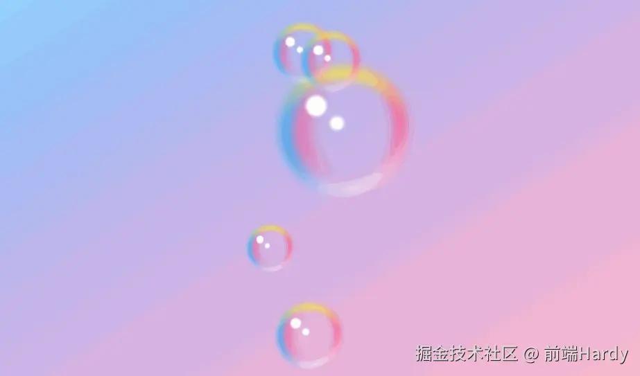
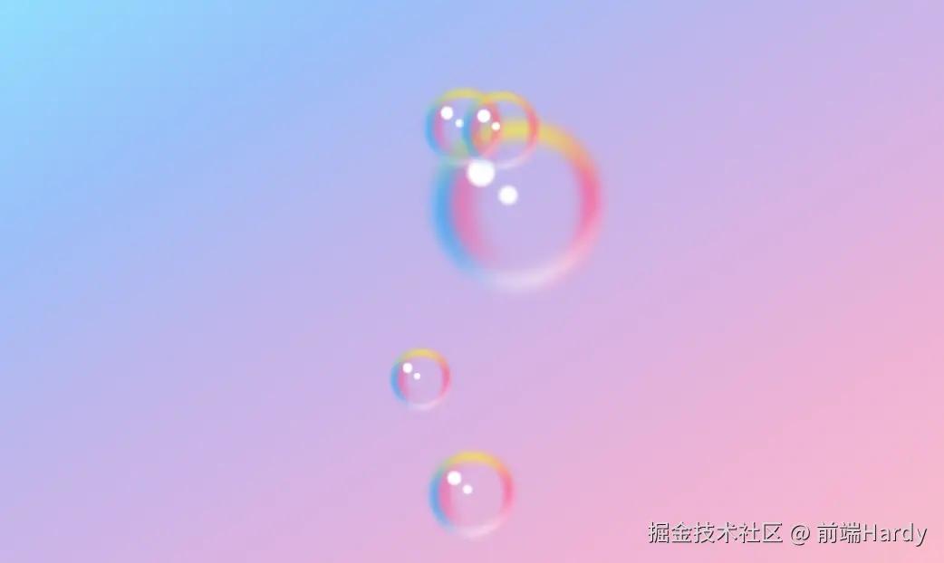
效果演示
这段代码是一个HTML文档,包含了内联的CSS样式,用于创建一个具有动画效果的网页背景,其中包含多个彩色浮动的气泡元素。
HTML
html 代码解读复制代码<div class="container">
    <div class="bubble">
        <span>span>
        <span>span>
        <span>span>
        <span>span>
        <span>span>
    div>
    <div class="bubble">
        <span>span>
        <span>span>
        <span>span>
        <span>span>
        <span>span>
    div>
    <div class="bubble">
        <span>span>
        <span>span>
        <span>span>
        <span>span>
        <span>span>
    div>
    <div class="bubble">
        <span>span>
        <span>span>
        <span>span>
        <span>span>
        <span>span>
    div>
    <div class="bubble">
        <span>span>
        <span>span>
        <span>span>
        <span>span>
        <span>span>
    div>
 div>
- container: 是一个容器元素,用于包裹所有的气泡元素。
- bubble: 是一个气泡元素,包含了五个span元素,这些 span元素用于创建气泡的光晕效果。
CSS
css 代码解读复制代码.bubble {
  position: absolute;
  width: 200px;
  height: 200px;
  border-radius: 50%;
  box-shadow: inset 0 0 25px rgba (255, 255, 255, 0.25);
  animation: animate_4010 8s ease-in-out infinite;
}

.bubble:nth-child(2) {
  position: relative;
  zoom: 0.45;
  left: -10px;
  top: -100px;
  animation-delay: -4s;
}

.bubble:nth-child(3) {
  position: relative;
  zoom: 0.45;
  right: -80px;
  top: -300px;
  animation-delay: -6s;
}

.bubble:nth-child(4) {
  position: relative;
  zoom: 0.35;
  left: -120px;
  bottom: -200px;
  animation-delay: -3s;
}

.bubble:nth-child(5) {
  position: relative;
  zoom: 0.5;
  left: 0px;
  top: 200px;
  animation-delay: -5s;
}

@keyframes animate_4010 {
  0%,100% {
    transform: translateY(-20px);
  }

  50% {
    transform: translateY(20px);
  }
}

.bubble::before {
  content: '';
  position: absolute;
  top: 50px;
  left: 45px;
  width: 30px;
  height: 30px;
  border-radius: 50%;
  background: #fff;
  z-index: 10;
  filter: blur(2px);
}

.bubble::after {
  content: '';
  position: absolute;
  top: 80px;
  left: 80px;
  width: 20px;
  height: 20px;
  border-radius: 50%;
  background: #fff;
  z-index: 10;
  filter: blur(2px);
}

.bubble span {
  position: absolute;
  border-radius: 50%;
}

.bubble span:nth-child(1) {
  inset: 10px;
  border-left: 15px solid #0fb4ff;
  filter: blur(8px);
}

.bubble span:nth-child(2) {
  inset: 10px;
  border-right: 15px solid #ff4484;
  filter: blur(8px);
}

.bubble span:nth-child(3) {
  inset: 10px;
  border-top: 15px solid #ffeb3b;
  filter: blur(8px);
}

.bubble span:nth-child(4) {
  inset: 30px;
  border-left: 15px solid #ff4484;
  filter: blur(12px);
}

.bubble span:nth-child(5) {
  inset: 10px;
  border-bottom: 10px solid #fff;
  filter: blur(8px);
  transform: rotate(330deg);
}
- .bubble 选择器定义了气泡的基本样式,包括位置、大小、形状和阴影效果。animation 属性用于定义动画效果。
- .bubble:nth-child() 选择器用于为特定顺序的气泡元素设置不同的样式和动画延迟。
- @keyframes animate_4010 定义了一个名为 animate_4010 的动画,该动画使气泡上下浮动。
- .bubble::before 和 .bubble::after 伪元素用于在气泡内部创建光点效果。
- .bubble span 选择器用于创建气泡的光晕效果,每个 span 元素都有不同的边框颜色和模糊效果。
评论记录:
回复评论: