
目录
1. 引言
Text 组件是 Flutter 中最常用的 UI 组件之一,用于显示文本内容。它支持样式自定义、多行显示、溢出控制等功能,适用于各种文本场景。本文将详细介绍 Text 组件的使用方式及其重要参数。
2. 基本使用
- import 'package:flutter/material.dart';
-
- class ScTextPage extends StatefulWidget {
- const ScTextPage({super.key});
-
- @override
- State
createState() => _ScTextPageState(); - }
-
- class _ScTextPageState extends State<ScTextPage> {
- @override
- Widget build(BuildContext context) {
- return Text('Hello, Flutter!');
- }
- }
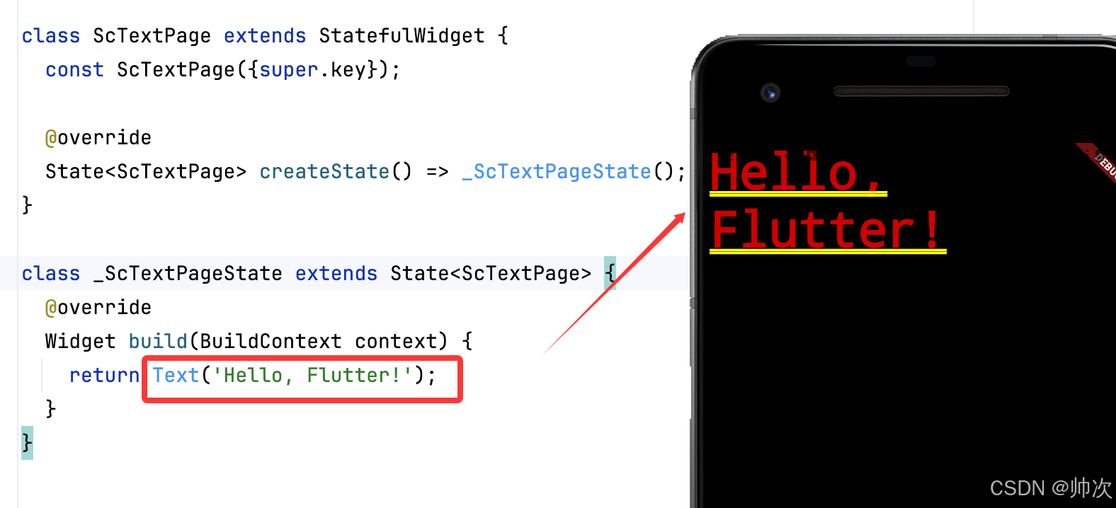
解析:
Text('Hello, Flutter!')创建了一个最简单的文本组件。- 默认使用
defaultTextStyle,字体大小、颜色取决于应用主题。
虽然设置了主题,但是没有设置 Scaffold,依然丑,我们加一下Scaffold :
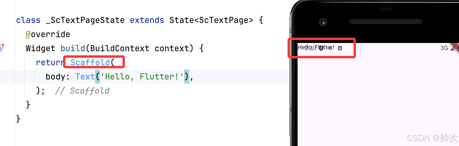
加了 Scaffold 样式好看了很多,但是位置有点问题,咱们可以在下面调整一下
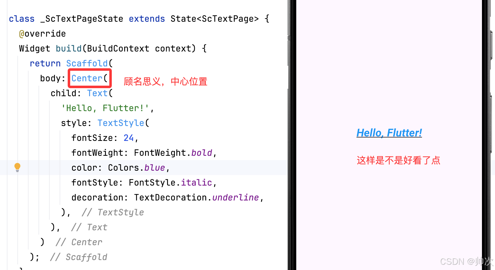
3. 自定义样式
Text 组件可以通过 style 参数自定义字体样式。
- class _ScTextPageState extends State<ScTextPage> {
- @override
- Widget build(BuildContext context) {
- return Scaffold(
- body: Center(
- child: Text(
- 'Hello, Flutter!',
- style: TextStyle(
- fontSize: 24,
- fontWeight: FontWeight.bold,
- color: Colors.blue,
- fontStyle: FontStyle.italic,
- decoration: TextDecoration.underline,
- ),
- ),
- )
- );
- }
- }

常用样式参数:
fontSize:字体大小fontWeight:字体粗细(FontWeight.bold、FontWeight.w300等)color:文本颜色fontStyle:字体风格(FontStyle.normal、FontStyle.italic)decoration:文本装饰(如下划线、删除线)
4. 文本对齐与溢出控制
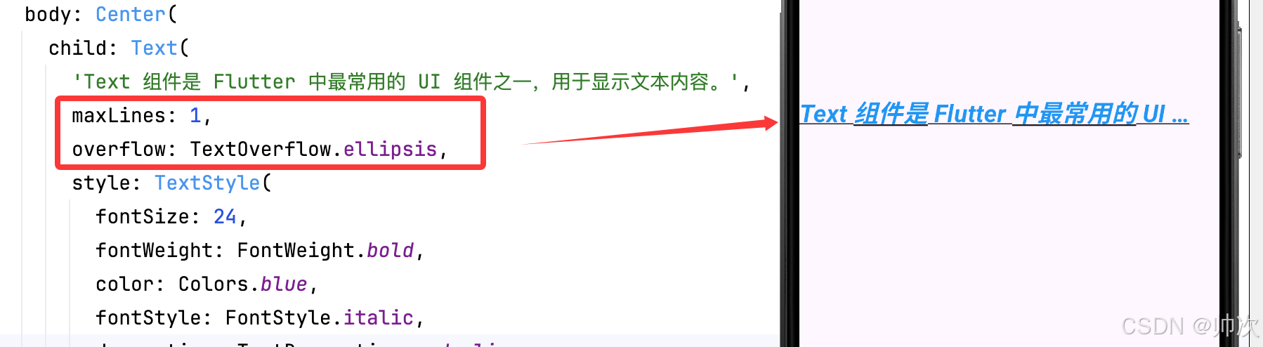
当文本过长时,可以使用 overflow 参数控制显示方式。
- Text(
- 'Text 组件是 Flutter 中最常用的 UI 组件之一,用于显示文本内容。',
- maxLines: 1,
- overflow: TextOverflow.ellipsis,
- )
重要参数:
maxLines:限制最大行数overflow:文本溢出处理方式(TextOverflow.ellipsis显示省略号)
5. 外边距
在 Flutter 中,Text 组件本身没有直接的 margin 属性,但可以通过以下 4 种方式设置外边距。
5.1 使用 Container 包裹
这是最常用的解决方案,通过 Container 的 margin 属性控制外边距:
- class _ScTextPageState extends State<ScTextPage> {
- @override
- Widget build(BuildContext context) {
- return Scaffold(
- body: Center(
- child:Container(
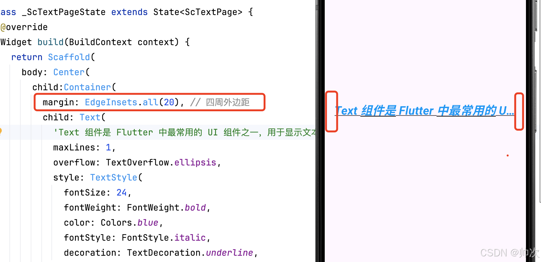
- margin: EdgeInsets.all(20), // 四周外边距
- child: Text('带外边距的文本'),
- ),
- )
- )
- );
- }
- }
5.2 使用 Padding 组件
如果只需要单边外边距,推荐使用 Padding 组件:
- Padding(
- // padding: EdgeInsets.all(40),//可以all
- padding: EdgeInsets.only(left: 20,right: 40,),//可以上下左右随意设置
- child: Text('左侧缩进20,右侧缩进40'),
- )
5.3 在 Row/Column 中使用
当文本位于行列布局中时,可用 SizedBox 间隔:
- Row(
- children: [
- Text('左边文本'),
- SizedBox(width: 20), // 横向间距
- Text('右边文本')
- ],
- )
5.4 动态边距调整
使用 MediaQuery 响应式布局:
- Container(
- margin: EdgeInsets.symmetric(
- horizontal: MediaQuery.of(context).size.width * 0.1
- ),
- child: Text('自适应边距文本'),
- )
5.5 关键区别说明
| 属性/组件 | 作用范围 | 典型使用场景 |
|---|---|---|
margin | 组件外部空间 | 控制与其他组件的间距 |
padding | 组件内部空间 | 控制文本内容与容器的间距 |
SizedBox | 布局间隔 | 在行列布局中精确控制元素间距 |
5.6 设置 margin 无效
-
检查父容器是否允许子组件扩展(如
ListView需要设置shrinkWrap: true) -
确保外层没有被
Center或Align等布局组件限制
6. 结论
Text 组件是 Flutter 开发中不可或缺的一部分,它提供了丰富的自定义选项,适用于不同文本场景。掌握 Text 组件的各种参数和特性,可以帮助开发者构建更加美观和灵活的 UI 界面。
相关推荐
Flutter Widget 体系结构解析-CSDN博客文章浏览阅读710次,点赞23次,收藏15次。Flutter 是 Google 开发的一款跨平台 UI 框架,它基于 Dart 语言,能够在 iOS、Android、Web、桌面等多个平台运行。Flutter 采用 声明式 UI,并依赖其强大的 Widget 体系来构建界面。本文将深入解析 Flutter 的 Widget 体系结构,帮助开发者理解其运行原理,并掌握构建高效 UI 的方法。 http://iyenn.com/rec/1821637.htmlFlutter:StatelessWidget vs StatefulWidget 深度解析-CSDN博客文章浏览阅读631次,点赞44次,收藏29次。在 Flutter 中,所有的 UI 组件都是由 Widget 组成,而 Widget 又分为两大类:StatelessWidget(无状态组件) 和 StatefulWidget(有状态组件)。StatelessWidget 适用于不会随时间变化的 UI,如文本、图标等静态内容;StatefulWidget 则适用于需要动态更新的 UI,如用户交互、动画、网络请求等。本文将深入解析这两种 Widget 的本质区别、适用场景以及生命周期,帮助开发者更好地理解 Flutter 组件的运行机制。http://iyenn.com/rec/1821638.html
评论记录:
回复评论: