
属性样式动画
在关键帧(Keyframes)中动态设置父组件的width和height,实现组件变大缩小。子组件设置scale属性使父子组件同时缩放,再设置opacity实现父子组件的显示与隐藏。
    fading away


    getting bigger
- 1
- 2
- 3
- 4
- 5
- 6
- 7
- 8
- 9
/* xxx.css */
.container {
  background-color:#F1F3F5;
  display: flex;
  justify-content: center;
  align-items: center;
  flex-direction: column;
  width: 100%;
  height: 100%;
}
.fade {
  width: 30%;
  height: 200px;
  left: 35%;
  top: 25%;
  position: absolute;
  animation: 2s change infinite friction;
}
.bigger {
  width: 20%;
  height: 100px;
  background-color: blue;
  animation: 2s change1 infinite linear-out-slow-in;
}
text {
  width: 100%;
  height: 100%;
  text-align: center;
  color: white;
  font-size: 35px;
  animation: 2s change2 infinite linear-out-slow-in;
}
/* 颜色变化 */
@keyframes change{
  from {
    background-color: #f76160;
    opacity: 1;
  }
  to {
    background-color: #09ba07;
    opacity: 0;
  }
}
/* 父组件大小变化 */
@keyframes change1 {
  0% {
    width: 20%;
    height: 100px;
  }
  100% {
    width: 80%;
    height: 200px;
  }
}
/* 子组件文字缩放 */
@keyframes change2 {
  0% {
    transform: scale(0);
  }
  100% {
    transform: scale(1.5);
  }
}

- 1
- 2
- 3
- 4
- 5
- 6
- 7
- 8
- 9
- 10
- 11
- 12
- 13
- 14
- 15
- 16
- 17
- 18
- 19
- 20
- 21
- 22
- 23
- 24
- 25
- 26
- 27
- 28
- 29
- 30
- 31
- 32
- 33
- 34
- 35
- 36
- 37
- 38
- 39
- 40
- 41
- 42
- 43
- 44
- 45
- 46
- 47
- 48
- 49
- 50
- 51
- 52
- 53
- 54
- 55
- 56
- 57
- 58
- 59
- 60
- 61
- 62
- 63

说明
- animation取值不区分先后,duration (动画执行时间)/ delay (动画延迟执行时间)按照出现的先后顺序解析。
- 必须设置animation-duration样式,否则时长为0则不会有动画效果。当设置animation-fill-mode属性为forwards时,组件直接展示最后一帧的样式。
transform样式动画
设置transform属性对组件进行旋转、缩放、移动和倾斜。
设置静态动画
创建一个正方形并旋转90°变成菱形,并用下方的长方形把菱形下半部分遮盖形成屋顶,设置长方形translate属性值为(150px,-150px)确定坐标位置形成门,再使用position属性使横纵线跟随父组件(正方形)移动到指定坐标位置,接着设置scale属性使父子组件一起变大形成窗户大小,最后使用skewX属性使组件倾斜后设置坐标translate(200px,-710px)得到烟囱。
- 1
- 2
- 3
- 4
- 5
- 6
- 7
- 8
- 9
- 10
- 11
- 12
/* xxx.css */
.container {
  width:100%;
  height:100%;
  background-color:#F1F3F5;
  align-items: center;
  flex-direction: column;
}
.top{
  z-index: -1;
  position: absolute;
  width: 428px;
  height: 428px;
  background-color: #860303;
  transform: rotate(45deg);
  margin-top: 284px;
  margin-left: 148px;
}
.content{
  margin-top: 500px;
  width: 600px;
  height: 400px;
  background-color: white;
  border:  1px solid black;
}
.door{
  width: 100px;
  height: 135px;
  background-color: #1033d9;
  transform: translate(150px,-137px);
}
.window{
  z-index: 1;
  position: relative;
  width: 100px;
  height: 100px;
  background-color: white;
  border: 1px solid black;
  transform: translate(-150px,-400px) scale(1.5);
}
/* 窗户的横轴 */
.horizontal{
  position: absolute;
  top: 50%;
  width: 100px;
  height: 5px;
  background-color: black;
}
/* 窗户的纵轴 */
.vertical{
  position: absolute;
  left: 50%;
  width: 5px;
  height: 100px;
  background-color: black;
}
.chimney{
  z-index: -2;
  width: 40px;
  height: 100px;
  border-radius: 15px;
  background-color: #9a7404;
  transform: translate(200px,-710px) skewX(-5deg);
}
- 1
- 2
- 3
- 4
- 5
- 6
- 7
- 8
- 9
- 10
- 11
- 12
- 13
- 14
- 15
- 16
- 17
- 18
- 19
- 20
- 21
- 22
- 23
- 24
- 25
- 26
- 27
- 28
- 29
- 30
- 31
- 32
- 33
- 34
- 35
- 36
- 37
- 38
- 39
- 40
- 41
- 42
- 43
- 44
- 45
- 46
- 47
- 48
- 49
- 50
- 51
- 52
- 53
- 54
- 55
- 56
- 57
- 58
- 59
- 60
- 61
- 62
- 63
- 64

设置平移动画
小球下降动画,改变小球的Y轴坐标实现小球下落,在下一段是时间内减小Y轴坐标实现小球回弹,让每次回弹的高度逐次减小直至回弹高度为0,就模拟出了小球下降的动画。
- 1
- 2
- 3
- 4
- 5
/* xxx.css */
.container {
  width:100%;
  height:100%;
  background-color:#F1F3F5;
  display: flex;
  justify-content: center;
}
.circle{
  width: 100px;
  height: 100px;
  border-radius: 50px;
  background-color: red;
  /* forwards停在动画的最后一帧 */
  animation: down 3s fast-out-linear-in forwards;
}
.flower{
  position: fixed;
  width: 80%;
  margin-left: 10%;
  height: 5px;
  background-color: black;
  top: 1000px;
}
@keyframes down {
  0%{
    transform: translate(0px,0px);
  }
  /* 下落 */
  15%{
    transform: translate(10px,900px);
  }
  /* 开始回弹 */
  25%{
    transform: translate(20px,500px);
  }
  /* 下落 */
  35%{
    transform: translate(30px,900px);
  }
  /* 回弹 */
  45%{
    transform: translate(40px,700px);
  }
  55%{
    transform: translate(50px,900px);
  }
  65%{
    transform: translate(60px,800px);
  }
  80%{
    transform: translate(70px,900px);
  }
  90%{
    transform: translate(80px,850px);
  }
  /* 停止 */
  100%{
    transform: translate(90px,900px);
  }
}
- 1
- 2
- 3
- 4
- 5
- 6
- 7
- 8
- 9
- 10
- 11
- 12
- 13
- 14
- 15
- 16
- 17
- 18
- 19
- 20
- 21
- 22
- 23
- 24
- 25
- 26
- 27
- 28
- 29
- 30
- 31
- 32
- 33
- 34
- 35
- 36
- 37
- 38
- 39
- 40
- 41
- 42
- 43
- 44
- 45
- 46
- 47
- 48
- 49
- 50
- 51
- 52
- 53
- 54
- 55
- 56
- 57
- 58
- 59
- 60
- 61

设置旋转动画
设置不同的原点位置(transform-origin)改变元素所围绕的旋转中心。rotate3d属性前三个参数值分别为X轴、Y轴、Z轴的旋转向量,第四个值为旋转角度,旋转向角度可为负值,负值则代表旋转方向为逆时针方向。
- 1
- 2
- 3
- 4
- 5
- 6
- 7
- 8
- 9
- 10
- 11
- 12
- 13
- 14
- 15
- 16
/* xxx.css */
.container {
    flex-direction: column;
    background-color:#F1F3F5;
    display: flex;
    align-items: center;
    justify-content: center;
    width: 100%;
    height: 100%;
}
.rect {
    width: 100px;
    height: 100px;
    animation: rotate 3s infinite;
    margin-left: 30px;
}
.rect1 {
    background-color: #f76160;
}
.rect2 {
    background-color: #60f76f;
/* 改变原点位置*/
    transform-origin: 10% 10px;
}
.rect3 {
    background-color: #6081f7;
/*  改变原点位置*/
    transform-origin: right bottom;
}
@keyframes rotate {
    from {
        transform: rotate(0deg)
    }
    to {
        transform: rotate(360deg);
    }
}
/* 3d示例样式 */
.rotate3d {
    margin-top: 150px;
    flex-direction: column;
    background-color:#F1F3F5;
    display: flex;
    align-items: center;
    width: 80%;
    height: 600px;
    border-radius: 300px;
    border: 1px solid #ec0808;
}
.content {
    padding-top: 150px;
    display: flex;
    align-items: center;
    justify-content: center;
}
/* react4 react5 翻转形成眼睛 */
.rect4 {
    width: 100px;
    height: 100px;
    animation: rotate3d1 1000ms infinite;
    background-color: darkmagenta;
}
.rect5 {
    width: 100px;
    height: 100px;
    animation: rotate3d1 1000ms infinite;
    margin-left: 100px;
    background-color: darkmagenta;
}
.mouse {
    margin-top: 150px;
    width: 200px;
    height: 100px;
    border-radius: 50px;
    border: 1px solid #e70303;
    animation: rotate3d2 1000ms infinite;
}
/* 眼睛的动效 */
@keyframes rotate3d1 {
    0% {
        transform:rotate3d(0,0,0,0deg)
    }
    50% {
        transform:rotate3d(20,20,20,360deg);
    }
    100% {
        transform:rotate3d(0,0,0,0deg);
    }
}
/* 嘴的动效 */
@keyframes rotate3d2 {
    0% {
        transform:rotate3d(0,0,0,0deg)
    }
    33% {
        transform:rotate3d(0,0,10,30deg);
    }
    66% {
        transform:rotate3d(0,0,10,-30deg);
    }
    100% {
        transform:rotate3d(0,0,0,0deg);
    }
}
- 1
- 2
- 3
- 4
- 5
- 6
- 7
- 8
- 9
- 10
- 11
- 12
- 13
- 14
- 15
- 16
- 17
- 18
- 19
- 20
- 21
- 22
- 23
- 24
- 25
- 26
- 27
- 28
- 29
- 30
- 31
- 32
- 33
- 34
- 35
- 36
- 37
- 38
- 39
- 40
- 41
- 42
- 43
- 44
- 45
- 46
- 47
- 48
- 49
- 50
- 51
- 52
- 53
- 54
- 55
- 56
- 57
- 58
- 59
- 60
- 61
- 62
- 63
- 64
- 65
- 66
- 67
- 68
- 69
- 70
- 71
- 72
- 73
- 74
- 75
- 76
- 77
- 78
- 79
- 80
- 81
- 82
- 83
- 84
- 85
- 86
- 87
- 88
- 89
- 90
- 91
- 92
- 93
- 94
- 95
- 96
- 97
- 98
- 99
- 100
- 101
- 102
- 103
- 104

说明
transform-origin变换对象的原点位置,如果仅设置一个值,另一个值为50%,若设置两个值第一个值表示X轴的位置,第二个值表示Y轴的位置。
设置缩放动画
设置scale样式属性实现涟漪动画,先使用定位确定元素的位置,确定坐标后创建多个组件实现重合效果,再设置opacity属性改变组件不透明度实现组件隐藏与显示,同时设置scale值使组件可以一边放大一边隐藏,最后设置两个组件不同的动画执行时间,实现扩散的效果。
设置sacle3d中X轴、Y轴、Z轴的缩放参数实现动画。
    ripple


    spring
- 1
- 2
- 3
- 4
- 5
- 6
- 7
- 8
- 9
- 10
- 11
- 12
/* xxx.css */
.container {
    flex-direction: column;
    background-color:#F1F3F5;
    width: 100%;
    position: relative;
}
.circle{
    margin-top: 400px;
    margin-left: 40%;
    width: 100px;
    height: 100px;
    border-radius: 50px;
    background-color: mediumpurple;
    z-index: 1;  position: absolute;
}
.ripple{
    margin-top: 400px;
    margin-left: 40%;
    position: absolute;  z-index: 0;
    width: 100px;
    height: 100px;
    border-radius: 50px;
    background-color: blueviolet;
    animation: ripple 5s infinite;
}
/* 设置不同的动画时间 */
.ripple2{
    animation-duration: 2.5s;
}
@keyframes ripple{
    0%{
        transform: scale(1);
        opacity: 0.5;
    }
    50%{
        transform: scale(3);
        opacity: 0;
    }
    100%{
        transform: scale(1);
        opacity: 0.5;
    }
}
text{
    color: white;
    text-align: center;
    height: 100%;
    width: 100%;
}
.content {
    margin-top: 700px;
    margin-left: 33%;
    width: 200px;
    height: 100px;
    animation:rubberBand 1s infinite;
    background-color: darkmagenta;
    position: absolute;
}
@keyframes rubberBand {
    0% {
        transform: scale3d(1, 1, 1);
    }
    30% {
        transform: scale3d(1.25, 0.75, 1.1);
    }
    40% {
        transform: scale3d(0.75, 1.25, 1.2);
    }
    50% {
        transform: scale3d(1.15, 0.85, 1.3);
    }
    65% {
        transform: scale3d(.95, 1.05, 1.2);
    }
    75% {
        transform: scale3d(1.05, .95, 1.1);
    }
    100%{
        transform: scale3d(1, 1, 1);
    }
}
- 1
- 2
- 3
- 4
- 5
- 6
- 7
- 8
- 9
- 10
- 11
- 12
- 13
- 14
- 15
- 16
- 17
- 18
- 19
- 20
- 21
- 22
- 23
- 24
- 25
- 26
- 27
- 28
- 29
- 30
- 31
- 32
- 33
- 34
- 35
- 36
- 37
- 38
- 39
- 40
- 41
- 42
- 43
- 44
- 45
- 46
- 47
- 48
- 49
- 50
- 51
- 52
- 53
- 54
- 55
- 56
- 57
- 58
- 59
- 60
- 61
- 62
- 63
- 64
- 65
- 66
- 67
- 68
- 69
- 70
- 71
- 72
- 73
- 74
- 75
- 76
- 77
- 78
- 79
- 80
- 81
- 82

说明
设置transform属性值后,子元素会跟着父元素一起改变,若只改变父元素其他属性值时(如:height,width),子元素不会改变。
设置matrix属性
matrix是一个入参为六个值的矩阵,6个值分别代表:scaleX, skewY, skewX, scaleY, translateX, translateY。下面示例中设置 了matrix属性为matrix(1,0,0,1,0,200)使组件移动和倾斜。
- 1
- 2
- 3
- 4
/* xxx.css */
.container{
  background-color:#F1F3F5;
  display: flex;
  justify-content: center;
  width: 100%;
  height: 100%;
}
.rect{
  width: 100px;
  height: 100px;
  background-color: red;
  animation: down 3s infinite forwards;
}
@keyframes down{
  0%{
    transform: matrix(1,0,0,1,0,0);
  }
  10%{
    transform: matrix(1,0,0,1,0,200);
  }
  60%{
    transform: matrix(2,1.5,1.5,2,0,700);
  }
  100%{
    transform: matrix(1,0,0,1,0,0);
  }
}
- 1
- 2
- 3
- 4
- 5
- 6
- 7
- 8
- 9
- 10
- 11
- 12
- 13
- 14
- 15
- 16
- 17
- 18
- 19
- 20
- 21
- 22
- 23
- 24
- 25
- 26
- 27
- 28

整合transform属性
transform可以设置多个值并且多个值可同时设置,下面案例中展示同时设置缩放(scale),平移(translate),旋转(rotate)属性时的动画效果。
- 1
- 2
- 3
- 4
- 5
- 6
- 7
- 8
/* xxx.css */
.container{
    width: 100%;
    height: 100%;
    flex-direction:column;
    background-color:#F1F3F5;
    padding:50px;
}
.rect1{
    width: 100px;
    height: 100px;
    background-color: red;
    animation: change1 3s infinite forwards;
}
.rect2{
    margin-top: 50px;
    width: 100px;
    height: 100px;
    background-color: darkblue;
    animation: change2 3s infinite forwards;
}
.rect3{
    margin-top: 50px;
    width: 100px;
    height: 100px;
    background-color: darkblue;
    animation: change3 3s infinite;
}
.rect4{
    align-self: center;
    margin-left: 50px;
    margin-top: 200px;
    width: 100px;
    height: 100px;
    background-color: darkmagenta;
    animation: change4 3s infinite;
}
.rect5{
    margin-top: 300px;
    width: 100px;
    height: 100px;
   background-color: cadetblue;
    animation: change5 3s infinite;
}
/* change1 change2 对比 */
@keyframes change1{
    0%{
        transform: translate(0,0);    transform: rotate(0deg)
    }
    100%{
        transform: translate(0,500px);
        transform: rotate(360deg)
    }
}
/* change2 change3 对比属性顺序不同的动画效果 */
@keyframes change2{
    0%{
        transform:translate(0,0) rotate(0deg) ;
    }
    100%{
        transform: translate(300px,0) rotate(360deg);
    }
}
@keyframes change3{
    0%{
        transform:rotate(0deg) translate(0,0);
    }
    100%{
        transform:rotate(360deg)  translate(300px,0);
    }
}
/* 属性值不对应的情况 */
@keyframes change4{
    0%{
        transform: scale(0.5);
    }
    100%{
        transform:scale(2) rotate(45deg);
    }
}
/* 多属性的写法 */
@keyframes change5{
    0%{
        transform:scale(0) translate(0,0) rotate(0);
    }
    100%{
        transform: scale(1.5) rotate(360deg) translate(200px,0);
    }
}
- 1
- 2
- 3
- 4
- 5
- 6
- 7
- 8
- 9
- 10
- 11
- 12
- 13
- 14
- 15
- 16
- 17
- 18
- 19
- 20
- 21
- 22
- 23
- 24
- 25
- 26
- 27
- 28
- 29
- 30
- 31
- 32
- 33
- 34
- 35
- 36
- 37
- 38
- 39
- 40
- 41
- 42
- 43
- 44
- 45
- 46
- 47
- 48
- 49
- 50
- 51
- 52
- 53
- 54
- 55
- 56
- 57
- 58
- 59
- 60
- 61
- 62
- 63
- 64
- 65
- 66
- 67
- 68
- 69
- 70
- 71
- 72
- 73
- 74
- 75
- 76
- 77
- 78
- 79
- 80
- 81
- 82
- 83
- 84
- 85
- 86
- 87
- 88
- 89

说明
- 当设置多个transform时,后续的transform值会把前面的覆盖掉。若想同时使用多个动画样式可用复合写法,例:transform: scale(1) rotate(0) translate(0,0)。
- transform进行复合写法时,变化样式内多个样式值顺序的不同会呈现不一样的动画效果。
- transform属性设置的样式值要一一对应,若前后不对应,则该动画不生效。若设置多个样式值则只会呈现出已对应值的动画效果。
background-position样式动画
通过改变background-position属性(第一个值为X轴的位置,第二个值为Y轴的位置)移动背景图片位置,若背景图位置超出组件则超出部分的背景图不显示。
- 1
- 2
- 3
- 4
- 5
/* xxx.css */
.container {
  height: 100%;
  background-color:#F1F3F5;
  display: flex;
  flex-direction: column;
  justify-content: center;
  align-items: center;
  width: 100%;
}
.content{
  width: 400px;
  height: 400px;
  /* 不建议图片长宽比为1:1 */
  background-image: url('common/images/bg-tv.jpg');
  background-size: 100%;
  background-repeat: no-repeat;
  animation: change 3s infinite;
  border: 1px solid black;
}
.content1{
  margin-top:50px;
  width: 400px;
  height: 400px;
  background-image: url('common/images/bg-tv.jpg');
  background-size: 50%;
  background-repeat: no-repeat;
  animation: change1 5s infinite;
  border: 1px solid black;
}
/* 背景图片移动出组件 */
@keyframes change{
  0%{
    background-position:0px top;
  }
  25%{
    background-position:400px top;
  }
  50%{
    background-position:0px top;
  }
  75%{
    background-position:0px bottom;
  }
  100%{
    background-position:0px top;
  }
}
/* 背景图片在组件内移动 */
@keyframes change1{
  0%{
    background-position:left top;
  }
  25%{
    background-position:50% 50%;
  }
  50%{
    background-position:right bottom;
  }
  100%{
    background-position:left top;;
  }
}
- 1
- 2
- 3
- 4
- 5
- 6
- 7
- 8
- 9
- 10
- 11
- 12
- 13
- 14
- 15
- 16
- 17
- 18
- 19
- 20
- 21
- 22
- 23
- 24
- 25
- 26
- 27
- 28
- 29
- 30
- 31
- 32
- 33
- 34
- 35
- 36
- 37
- 38
- 39
- 40
- 41
- 42
- 43
- 44
- 45
- 46
- 47
- 48
- 49
- 50
- 51
- 52
- 53
- 54
- 55
- 56
- 57
- 58
- 59
- 60
- 61
- 62
- 63
说明
background-position仅支持背景图片的移动,不支持背景颜色(background-color)。

svg动画
为svg组件添加动画效果。
属性样式动画
在Svg的子组件 animate 中,通过attributeName设置需要进行动效的属性,from设置开始值,to设置结束值。
- 1
- 2
- 3
- 4
- 5
- 6
- 7
- 8
- 9
- 10
- 11
- 12
- 13
- 14
- 15
- 16
- 17
- 18
- 19
- 20
- 21
- 22
- 23

说明
在设置动画变化值时,如果已经设置了values属性,则from和to都失效。
路径动画
在Svg的子组件 animateMotion 中,通过path设置动画变化的路径。
- 1
- 2
- 3
- 4
- 5
- 6
- 7
- 8
- 9
- 10
- 11

animateTransform动画
在Svg的子组件 animateTransform 中,通过attributeName绑定transform属性,type设置动画类型,from设置开始值,to设置结束值。
- 1
- 2
- 3
- 4
- 5
- 6
- 7
- 8
- 9
- 10
- 11
- 12
- 13
- 14
- 15
- 16
- 17
- 18
- 19
- 20
- 21
- 22
/* xxx.css */
.container {
  flex-direction: column;
  align-items: center;
  width: 100%;
  height: 100%;
  background-color: #F1F3F5;
}
- 1
- 2
- 3
- 4
- 5
- 6
- 7
- 8

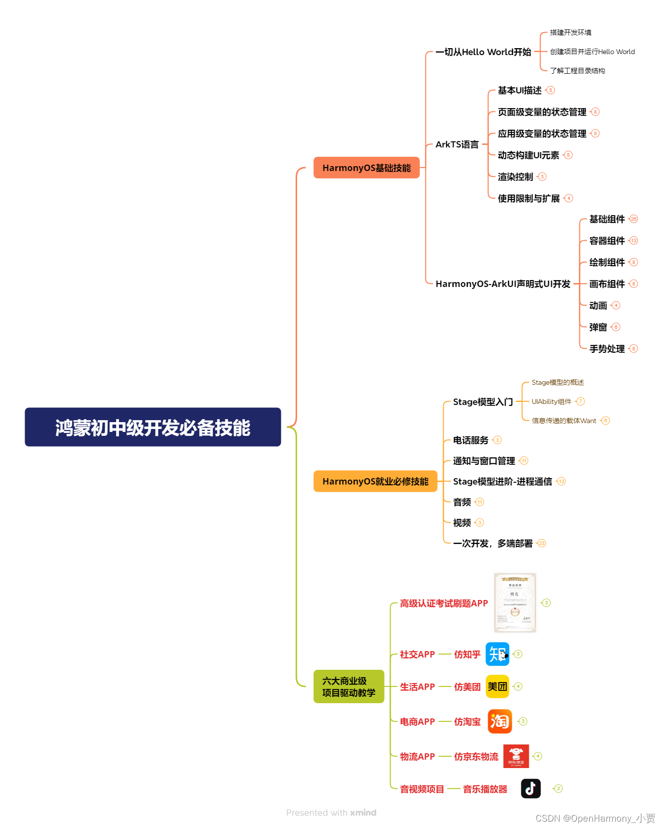
鸿蒙全栈开发全新学习指南
有很多小伙伴不知道学习哪些鸿蒙开发技术?不知道需要重点掌握哪些鸿蒙应用开发知识点?而且学习时频繁踩坑,最终浪费大量时间。所以要有一份实用的鸿蒙(HarmonyOS NEXT)学习路线与学习文档用来跟着学习是非常有必要的。
针对一些列因素,整理了一套纯血版鸿蒙(HarmonyOS Next)全栈开发技术的学习路线,包含了鸿蒙开发必掌握的核心知识要点,内容有(ArkTS、ArkUI开发组件、Stage模型、多端部署、分布式应用开发、WebGL、元服务、OpenHarmony多媒体技术、Napi组件、OpenHarmony内核、OpenHarmony驱动开发、系统定制移植等等)鸿蒙(HarmonyOS NEXT)技术知识点。
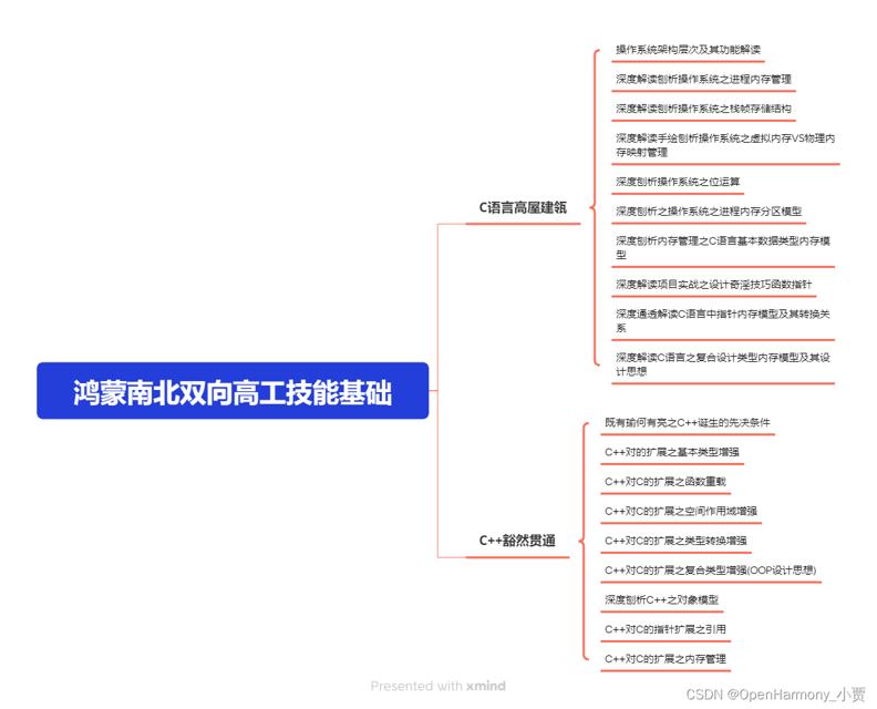
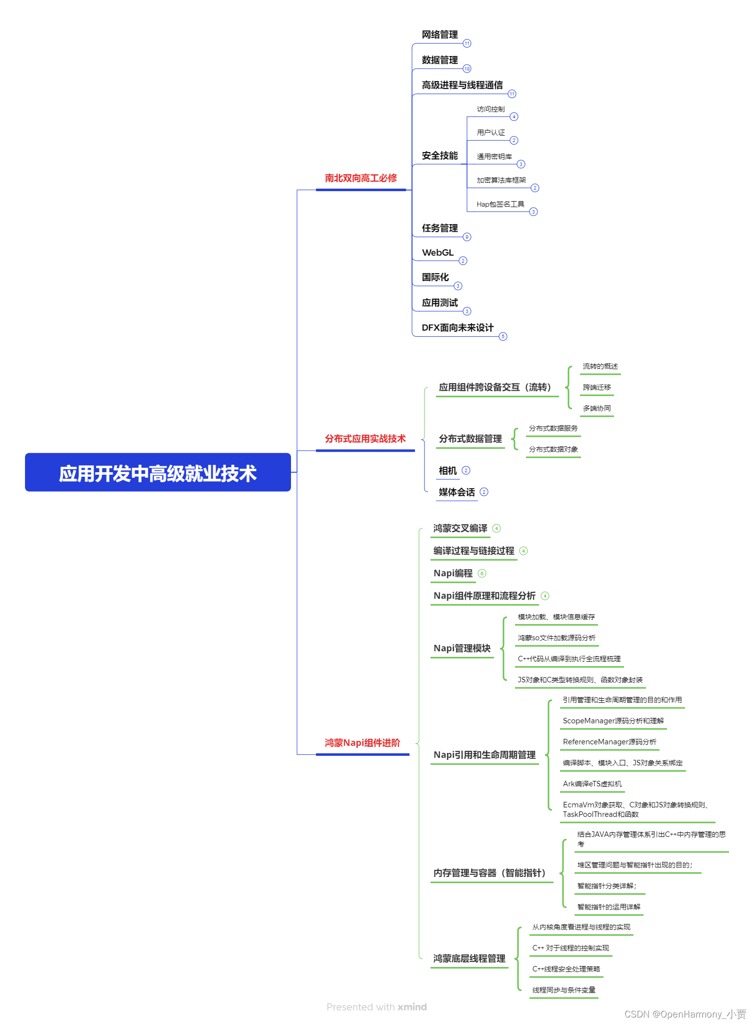
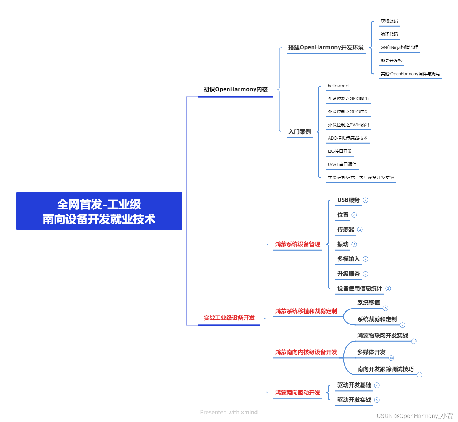
本路线共分为四个阶段:
第一阶段:鸿蒙初中级开发必备技能
第二阶段:鸿蒙南北双向高工技能基础:gitee.com/MNxiaona/733GH
第三阶段:应用开发中高级就业技术
第四阶段:全网首发-工业级南向设备开发就业技术:gitee.com/MNxiaona/733GH
《鸿蒙 (Harmony OS)开发学习手册》(共计892页)
如何快速入门?
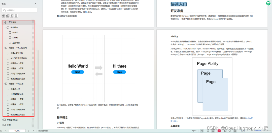
1.基本概念
2.构建第一个ArkTS应用
3.……
开发基础知识:gitee.com/MNxiaona/733GH
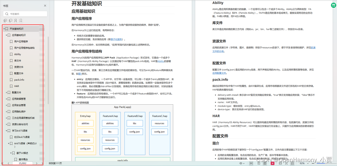
1.应用基础知识
2.配置文件
3.应用数据管理
4.应用安全管理
5.应用隐私保护
6.三方应用调用管控机制
7.资源分类与访问
8.学习ArkTS语言
9.……
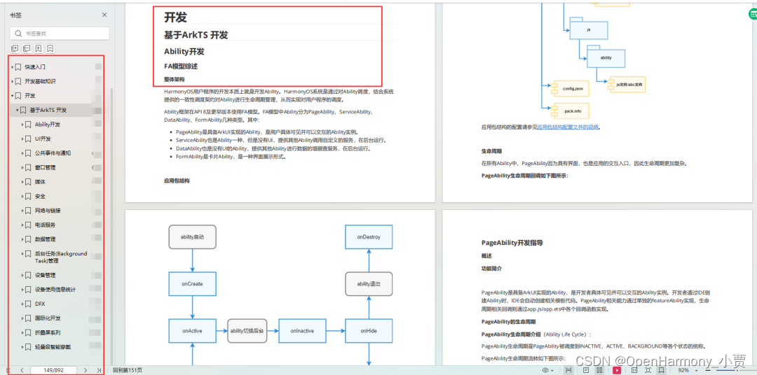
基于ArkTS 开发
1.Ability开发
2.UI开发
3.公共事件与通知
4.窗口管理
5.媒体
6.安全
7.网络与链接
8.电话服务
9.数据管理
10.后台任务(Background Task)管理
11.设备管理
12.设备使用信息统计
13.DFX
14.国际化开发
15.折叠屏系列
16.……
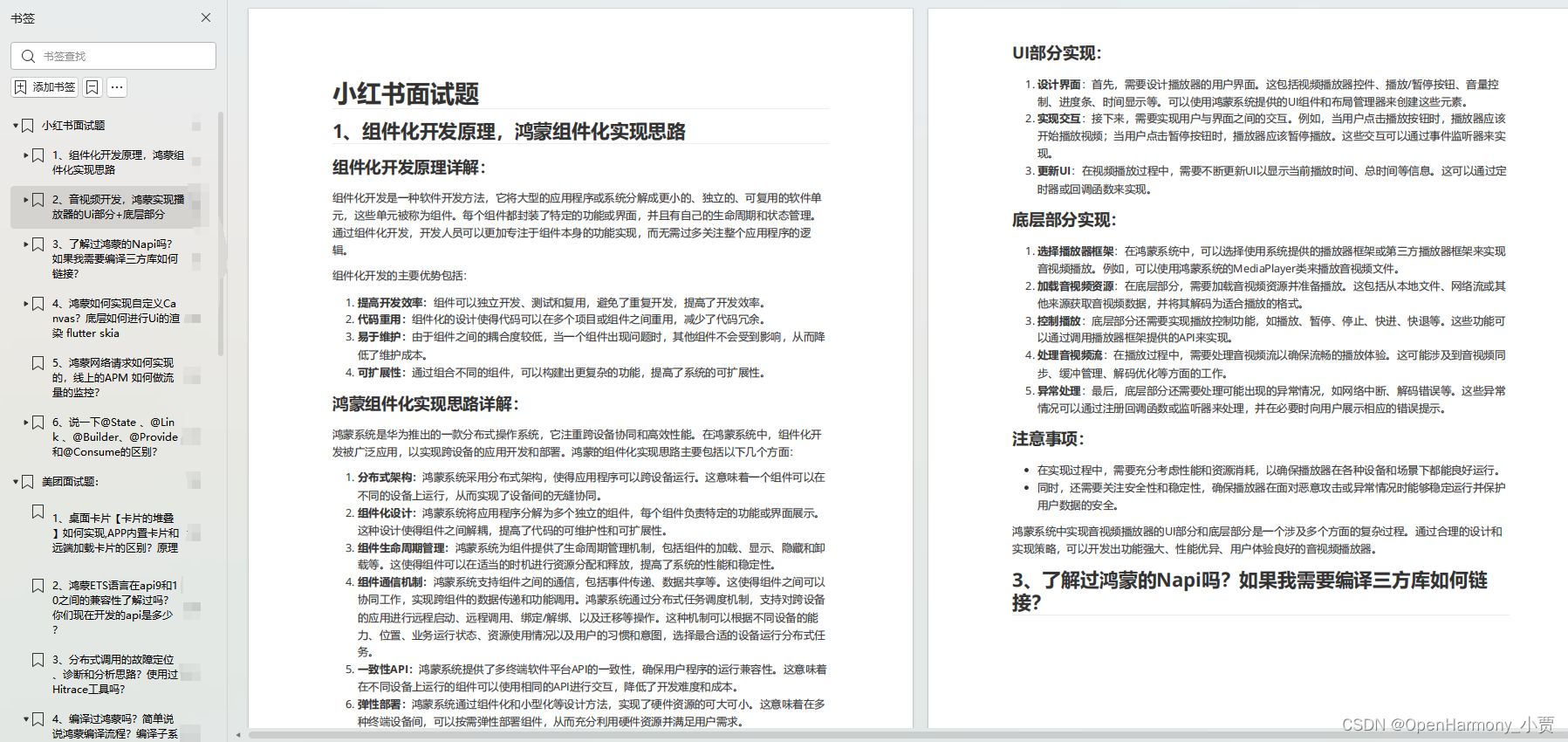
鸿蒙开发面试真题(含参考答案):gitee.com/MNxiaona/733GH
鸿蒙入门教学视频:
美团APP实战开发教学:gitee.com/MNxiaona/733GH
写在最后
- 如果你觉得这篇内容对你还蛮有帮助,我想邀请你帮我三个小忙:
- 点赞,转发,有你们的 『点赞和评论』,才是我创造的动力。
- 关注小编,同时可以期待后续文章ing?,不定期分享原创知识。
- 想要获取更多完整鸿蒙最新学习资源,请移步前往小编:
gitee.com/MNxiaona/733GH
 微信名片
微信名片

评论记录:
回复评论: