
阴影
阴影接口 shadow 可以为当前组件添加阴影效果,该接口支持两种类型参数,开发者可配置 ShadowOptions 自定义阴影效果。ShadowOptions模式下,当radius = 0 或者 color 的透明度为0时,无阴影效果。
@Entry
@Component
struct ShadowOptionDemo {
  build() {
    Row() {
      Column() {
        Column() {
          Text('shadowOption').fontSize(12)
        }
        .width(100)
        .aspectRatio(1)
        .margin(10)
        .justifyContent(FlexAlign.Center)
        .backgroundColor(Color.White)
        .borderRadius(20)
        .shadow({ radius: 10, color: Color.Gray })

        Column() {
          Text('shadowOption').fontSize(12)
        }
        .width(100)
        .aspectRatio(1)
        .margin(10)
        .justifyContent(FlexAlign.Center)
        .backgroundColor('#a8a888')
        .borderRadius(20)
        .shadow({ radius: 10, color: Color.Gray, offsetX: 20, offsetY: 20 })
      }
      .width('100%')
      .height('100%')
      .justifyContent(FlexAlign.Center)
    }
    .height('100%')
  }
}

- 1
- 2
- 3
- 4
- 5
- 6
- 7
- 8
- 9
- 10
- 11
- 12
- 13
- 14
- 15
- 16
- 17
- 18
- 19
- 20
- 21
- 22
- 23
- 24
- 25
- 26
- 27
- 28
- 29
- 30
- 31
- 32
- 33
- 34
- 35

色彩
通过颜色渐变接口,可以设置组件的背景颜色渐变效果,实现在两个或多个指定的颜色之间进行平稳的过渡。
| 接口 | 说明 |
|---|---|
| linearGradient | 为当前组件添加线性渐变的颜色渐变效果。 |
| sweepGradient | 为当前组件添加角度渐变的颜色渐变效果。 |
| radialGradient | 为当前组件添加径向渐变的颜色渐变效果。 |
为组件添加线性渐变效果
@Entry
@Component
struct LinearGradientDemo {
  build() {
    Grid() {
      GridItem() {
        Column() {
          Text('angle: 180')
            .fontSize(15)
        }
        .width(100)
        .height(100)
        .justifyContent(FlexAlign.Center)
        .borderRadius(10)
        .linearGradient({
          // 0点方向顺时针旋转为正向角度,线性渐变起始角度的默认值为180°
          colors: [
            [0xf56c6c, 0.0], // 颜色断点1的颜色和比重,对应组件在180°方向上的起始位置
            [0xffffff, 1.0], // 颜色断点2的颜色和比重,对应组件在180°方向上的终点位置
          ]
        })
      }

      GridItem() {
        Column() {
          Text('angle: 45')
            .fontSize(15)
        }
        .width(100)
        .height(100)
        .justifyContent(FlexAlign.Center)
        .borderRadius(10)
        .linearGradient({
          angle: 45, // 设置颜色渐变起始角度为顺时针方向45°
          colors: [
            [0xf56c6c, 0.0],
            [0xffffff, 1.0],
          ]
        })
      }

      GridItem() {
        Column() {
          Text('repeat: true')
            .fontSize(15)
        }
        .width(100)
        .height(100)
        .justifyContent(FlexAlign.Center)
        .borderRadius(10)
        .linearGradient({
          repeating: true, // 在当前组件内0.3到1.0区域内重复0到0.3区域的颜色渐变效果
          colors: [
            [0xf56c6c, 0.0],
            [0xE6A23C, .3],
          ]
        })
      }

      GridItem() {
        Column() {
          Text('repeat: fasle')
            .fontSize(15)
        }
        .width(100)
        .height(100)
        .justifyContent(FlexAlign.Center)
        .borderRadius(10)
        .linearGradient({
          colors: [
            [0xf56c6c, 0.0], // repeating默认为false,此时组件内只有0到0.3区域内存在颜色渐变效果
            [0xE6A23C, .3],
          ]
        })
      }
    }
    .columnsGap(10)
    .rowsGap(10)
    .columnsTemplate('1fr 1fr')
    .rowsTemplate('1fr 1fr 1fr')
    .width('100%')
    .height('100%')
  }
}
- 1
- 2
- 3
- 4
- 5
- 6
- 7
- 8
- 9
- 10
- 11
- 12
- 13
- 14
- 15
- 16
- 17
- 18
- 19
- 20
- 21
- 22
- 23
- 24
- 25
- 26
- 27
- 28
- 29
- 30
- 31
- 32
- 33
- 34
- 35
- 36
- 37
- 38
- 39
- 40
- 41
- 42
- 43
- 44
- 45
- 46
- 47
- 48
- 49
- 50
- 51
- 52
- 53
- 54
- 55
- 56
- 57
- 58
- 59
- 60
- 61
- 62
- 63
- 64
- 65
- 66
- 67
- 68
- 69
- 70
- 71
- 72
- 73
- 74
- 75
- 76
- 77
- 78
- 79
- 80
- 81
- 82
- 83
- 84

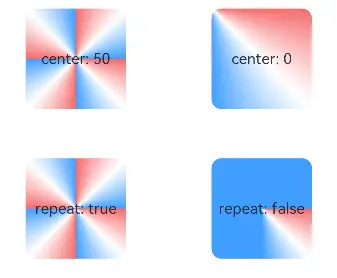
为组件添加角度渐变效果
@Entry
@Component
struct SweepGradientDemo {
  build() {
    Grid() {
      GridItem() {
        Column() {
          Text('center: 50')
            .fontSize(15)
        }
        .width(100)
        .height(100)
        .justifyContent(FlexAlign.Center)
        .borderRadius(10)
        .sweepGradient({
          center: [50, 50], // 角度渐变中心点
          start: 0, // 角度渐变的起点
          end: 360, // 角度渐变的终点。
          repeating: true, // 渐变效果在重复
          colors: [
          // 当前组件中,按照中心点和渐变的起点和终点值,
          // 角度区域为0-0.125的范围,从颜色断点1的颜色渐变到颜色断点2的颜色,
          // 角度区域0.125到0.25的范围,从颜色断点2的颜色渐变到颜色断点3的颜色,
          // 因为repeating设置为true,角度区域0.25到1的范围,重复区域0到0.25的颜色渐变效果
            [0xf56c6c, 0], // 颜色断点1的颜色和比重,对应角度为0*360°=0°,角点为中心点
            [0xffffff, 0.125], // 颜色断点2的颜色和比重
            [0x409EFF, 0.25] // 颜色断点3的颜色和比重
          ]
        })
      }

      GridItem() {
        Column() {
          Text('center: 0')
            .fontSize(15)
        }
        .width(100)
        .height(100)
        .justifyContent(FlexAlign.Center)
        .borderRadius(10)
        .sweepGradient({
          center: [0, 0], // 角度渐变中心点,当前为组件的左上角坐标
          start: 0,
          end: 360,
          repeating: true,
          colors: [
          // 当前组件中,因为角度渐变中心是组件的左上角,所以从颜色断点1到颜色断点3的角度范围,恰好可以覆盖整个组件
            [0xf56c6c, 0], // 颜色断点1的颜色和比重,对应角度为0*360°=0°
            [0xffffff, 0.125], // 色断点2的颜色和比重,对应角度为0.125*360°=45°
            [0x409EFF, 0.25] // 色断点3的颜色和比重,对应角度为0.25*360°=90°
          ]
        })
      }

      GridItem() {
        Column() {
          Text('repeat: true')
            .fontSize(15)
        }
        .width(100)
        .height(100)
        .justifyContent(FlexAlign.Center)
        .borderRadius(10)
        .sweepGradient({
          center: [50, 50],
          start: 0,
          end: 360,
          repeating: true,
          colors: [
            [0xf56c6c, 0],
            [0xffffff, 0.125],
            [0x409EFF, 0.25]
          ]
        })
      }

      GridItem() {
        Column() {
          Text('repeat: false')
            .fontSize(15)
        }
        .width(100)
        .height(100)
        .justifyContent(FlexAlign.Center)
        .borderRadius(10)
        .sweepGradient({
          center: [50, 50],
          start: 0,
          end: 360,
          repeating: false, //只在颜色断点角度覆盖范围内产生颜色渐变效果,其余范围内不重复
          colors: [
            [0xf56c6c, 0],
            [0xffffff, 0.125],
            [0x409EFF, 0.25]
          ]
        })
      }
    }
    .columnsGap(10)
    .rowsGap(10)
    .columnsTemplate('1fr 1fr')
    .rowsTemplate('1fr 1fr 1fr')
    .width('100%')
    .height(437)
  }
}
- 1
- 2
- 3
- 4
- 5
- 6
- 7
- 8
- 9
- 10
- 11
- 12
- 13
- 14
- 15
- 16
- 17
- 18
- 19
- 20
- 21
- 22
- 23
- 24
- 25
- 26
- 27
- 28
- 29
- 30
- 31
- 32
- 33
- 34
- 35
- 36
- 37
- 38
- 39
- 40
- 41
- 42
- 43
- 44
- 45
- 46
- 47
- 48
- 49
- 50
- 51
- 52
- 53
- 54
- 55
- 56
- 57
- 58
- 59
- 60
- 61
- 62
- 63
- 64
- 65
- 66
- 67
- 68
- 69
- 70
- 71
- 72
- 73
- 74
- 75
- 76
- 77
- 78
- 79
- 80
- 81
- 82
- 83
- 84
- 85
- 86
- 87
- 88
- 89
- 90
- 91
- 92
- 93
- 94
- 95
- 96
- 97
- 98
- 99
- 100
- 101
- 102
- 103
- 104
- 105
- 106
为组件添加径向渐变效果
@Entry
@Component
struct radialGradientDemo {
  build() {
    Grid() {
      GridItem() {
        Column() {
          Text('center: 50')
            .fontSize(15)
        }
        .width(100)
        .height(100)
        .justifyContent(FlexAlign.Center)
        .borderRadius(10)
        .radialGradient({
          center: [50, 50], // 径向渐变中心点
          radius: 100, // 径向渐变半径
          repeating: true, // 允许在组件内渐变范围外重复按照渐变范围内效果着色
          colors: [
            // 组件内以[50,50]为中心点,在半径为0到12.5的范围内从颜色断点1的颜色渐变到颜色断点2的颜色,
            // 在半径为12.5到25的范围内从颜色断点2的颜色渐变到颜色断点3的颜色,
            // 组件外其他半径范围内按照半径为0到25的渐变效果重复着色
            [0xf56c6c, 0], // 颜色断点1的颜色和比重,对应半径为0*100=0
            [0xffffff, 0.125], // 颜色断点2的颜色和比重,对应半径为0.125*100=12.5
            [0x409EFF, 0.25] // 颜色断点3的颜色和比重,对应半径为0.25*100=25
          ]
        })
      }

      GridItem() {
        Column() {
          Text('center: 0')
            .fontSize(15)
        }
        .width(100)
        .height(100)
        .justifyContent(FlexAlign.Center)
        .borderRadius(10)
        .radialGradient({
          center: [0, 0], // 径向渐变中心点,当前为组件左上角坐标
          radius: 100,
          repeating: true,
          colors: [
            [0xf56c6c, 0],
            [0xffffff, 0.125],
            [0x409EFF, 0.25]
          ]
        })
      }

      GridItem() {
        Column() {
          Text('repeat: true')
            .fontSize(15)
        }
        .width(100)
        .height(100)
        .justifyContent(FlexAlign.Center)
        .borderRadius(10)
        .radialGradient({
          center: [50, 50],
          radius: 100,
          repeating: true,
          colors: [
            [0xf56c6c, 0],
            [0xffffff, 0.125],
            [0x409EFF, 0.25]
          ]
        })
      }

      GridItem() {
        Column() {
          Text('repeat: false')
            .fontSize(15)
        }
        .width(100)
        .height(100)
        .justifyContent(FlexAlign.Center)
        .borderRadius(10)
        .radialGradient({
          center: [50, 50],
          radius: 100,
          repeating: false, // 在组件内渐变范围外不重复按照渐变范围内效果着色
          colors: [
            [0xf56c6c, 0],
            [0xffffff, 0.125],
            [0x409EFF, 0.25]
          ]
        })
      }
    }
    .columnsGap(10)
    .rowsGap(10)
    .columnsTemplate('1fr 1fr')
    .rowsTemplate('1fr 1fr 1fr')
    .width('100%')
    .height('100%')
  }
}
- 1
- 2
- 3
- 4
- 5
- 6
- 7
- 8
- 9
- 10
- 11
- 12
- 13
- 14
- 15
- 16
- 17
- 18
- 19
- 20
- 21
- 22
- 23
- 24
- 25
- 26
- 27
- 28
- 29
- 30
- 31
- 32
- 33
- 34
- 35
- 36
- 37
- 38
- 39
- 40
- 41
- 42
- 43
- 44
- 45
- 46
- 47
- 48
- 49
- 50
- 51
- 52
- 53
- 54
- 55
- 56
- 57
- 58
- 59
- 60
- 61
- 62
- 63
- 64
- 65
- 66
- 67
- 68
- 69
- 70
- 71
- 72
- 73
- 74
- 75
- 76
- 77
- 78
- 79
- 80
- 81
- 82
- 83
- 84
- 85
- 86
- 87
- 88
- 89
- 90
- 91
- 92
- 93
- 94
- 95
- 96
- 97
- 98
- 99
- 100

鸿蒙全栈开发全新学习指南
有很多小伙伴不知道学习哪些鸿蒙开发技术?不知道需要重点掌握哪些鸿蒙应用开发知识点?而且学习时频繁踩坑,最终浪费大量时间。所以要有一份实用的鸿蒙(HarmonyOS NEXT)学习路线与学习文档用来跟着学习是非常有必要的。
针对一些列因素,整理了一套纯血版鸿蒙(HarmonyOS Next)全栈开发技术的学习路线,包含了鸿蒙开发必掌握的核心知识要点,内容有(ArkTS、ArkUI开发组件、Stage模型、多端部署、分布式应用开发、WebGL、元服务、OpenHarmony多媒体技术、Napi组件、OpenHarmony内核、OpenHarmony驱动开发、系统定制移植等等)鸿蒙(HarmonyOS NEXT)技术知识点。
本路线共分为四个阶段:
第一阶段:鸿蒙初中级开发必备技能
第二阶段:鸿蒙南北双向高工技能基础:gitee.com/MNxiaona/733GH
第三阶段:应用开发中高级就业技术
第四阶段:全网首发-工业级南向设备开发就业技术:gitee.com/MNxiaona/733GH

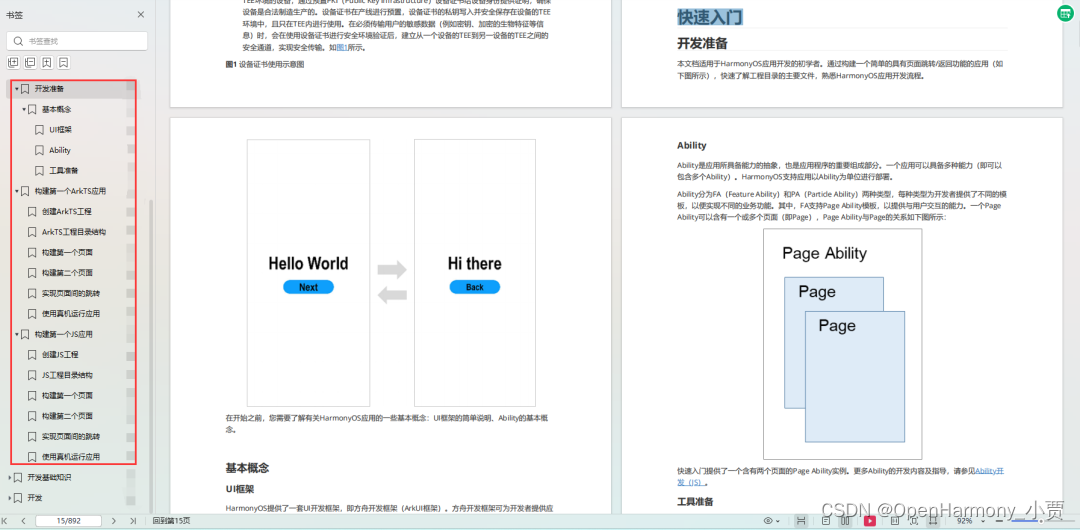
《鸿蒙 (Harmony OS)开发学习手册》(共计892页)
如何快速入门?
1.基本概念
2.构建第一个ArkTS应用
3.……
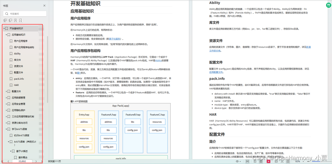
开发基础知识:gitee.com/MNxiaona/733GH
1.应用基础知识
2.配置文件
3.应用数据管理
4.应用安全管理
5.应用隐私保护
6.三方应用调用管控机制
7.资源分类与访问
8.学习ArkTS语言
9.……
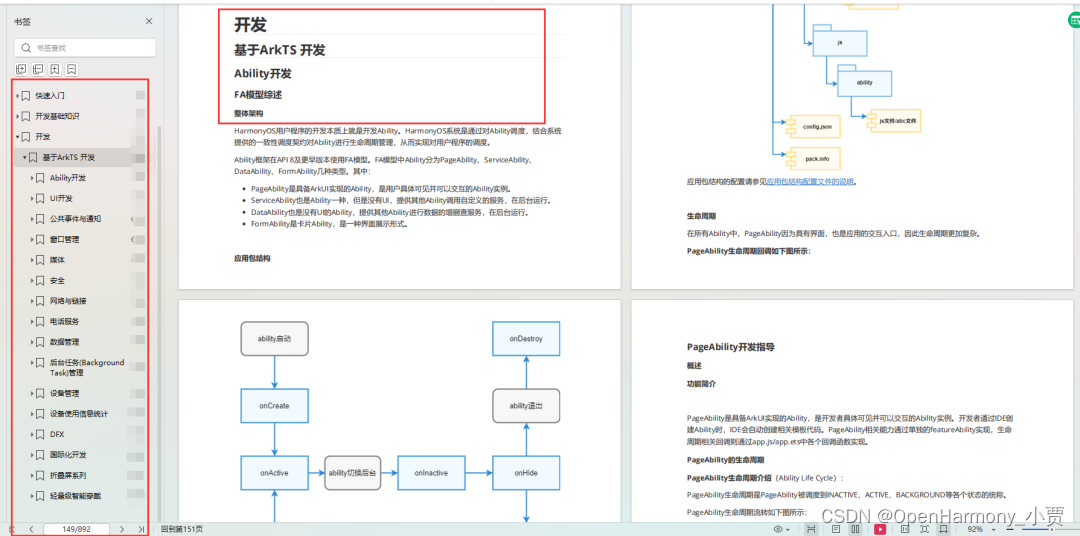
基于ArkTS 开发
1.Ability开发
2.UI开发
3.公共事件与通知
4.窗口管理
5.媒体
6.安全
7.网络与链接
8.电话服务
9.数据管理
10.后台任务(Background Task)管理
11.设备管理
12.设备使用信息统计
13.DFX
14.国际化开发
15.折叠屏系列
16.……
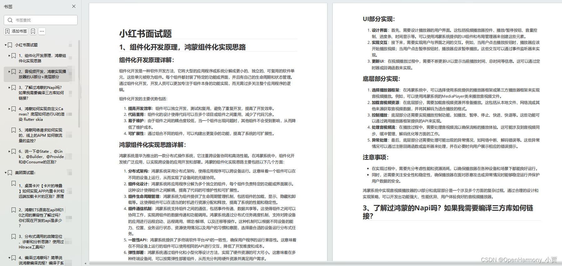
鸿蒙开发面试真题(含参考答案):gitee.com/MNxiaona/733GH
鸿蒙入门教学视频:
美团APP实战开发教学:gitee.com/MNxiaona/733GH

写在最后
- 如果你觉得这篇内容对你还蛮有帮助,我想邀请你帮我三个小忙:
- 点赞,转发,有你们的 『点赞和评论』,才是我创造的动力。
- 关注小编,同时可以期待后续文章ing?,不定期分享原创知识。
- 想要获取更多完整鸿蒙最新学习资源,请移步前往小编:
gitee.com/MNxiaona/733GH

文章知识点与官方知识档案匹配,可进一步学习相关知识
Python入门技能树首页概览450707 人正在系统学习中

鸿蒙开发学习资料领取!!!
 微信名片
微信名片
微信名片

评论记录:
回复评论: