
概述
属性接口(以下简称属性)包含尺寸属性、布局属性、位置属性等多种类型,用于控制组件的行为。针对当前界面上的组件,其部分属性(如位置属性)的变化会引起UI的变化。添加动画可以让属性值从起点逐渐变化到终点,从而产生连续的动画效果。根据变化时是否能够添加动画,可以将属性分为可动画属性和不可动画属性。判断一种属性是否适合作为可动画属性主要有两个标准:
-
属性变化能够引起UI的变化。例如, enabled 属性用于控制组件是否可以响应点击、触摸等事件,但enable属性的变化不会引起UI的变化,因此不适合作为可动画属性。
-
属性在变化时适合添加动画作为过渡。例如, focusable 属性决定当前组件是否可以获得焦点,当focusable属性发生变化时,应立即切换到终点值以响应用户行为,不应该加入动画效果,因此不适合作为可动画属性。
属性接口分类说明:
-
可动画属性:
-
系统可动画属性:
分类 说明 布局属性 位置、大小、内边距、外边距、对齐方式、权重等。 仿射变换 平移、旋转、缩放、锚点等。 背景 背景颜色、背景模糊等。 内容 文字大小、文字颜色,图片对齐方式、模糊等。 前景 前景颜色等。 Overlay Overlay属性等。 外观 透明度、圆角、边框、阴影等。 … … -
自定义可动画属性:通过自定义属性动画机制抽象出的可动画属性。
-
-
不可动画属性:zIndex、focusable等。
通常,可动画属性的参数数据类型必须具备连续性,即可以通过插值方法来填补数据点之间的空隙,达到视觉上的连续效果。但属性的参数数据类型是否能够进行插值并非决定属性是否可动画的关键因素。例如,对于设置元素水平方向布局的 direction 属性,其参数数据类型是枚举值。但是,由于位置属性是可动画属性,ArkUI同样支持在其属性值改变引起组件位置变化时添加动画。
对于可动画属性,系统不仅提供通用属性,还支持自定义可动画属性。
-
系统可动画属性:组件自带的支持改变UI界面的属性接口,如位置、缩放、模糊等。
-
自定义可动画属性 :ArkUI提供 @AnimatableExtend 装饰器用于自定义可动画属性。开发者可从自定义绘制的内容中抽象出可动画属性,用于控制每帧绘制的内容,如自定义绘制音量图标。通过自定义可动画属性,可以为ArkUI中部分原本不支持动画的属性添加动画。
属性动画接口说明
通过可动画属性改变引起UI上产生的连续视觉效果,即为属性动画。属性动画是最基础易懂的动画,ArkUI提供两种属性动画接口animateTo和animation驱动组件属性按照动画曲线等动画参数进行连续的变化,产生属性动画。
| 属性动画接口 | 作用域 | 原理 | 使用场景 |
|---|---|---|---|
| animateTo | 闭包内改变属性引起的界面变化。 作用于出现消失转场。 | 通用函数,对闭包前界面和闭包中的状态变量引起的界面之间的差异做动画。 支持多次调用,支持嵌套。 | 适用对多个可动画属性配置相同动画参数的动画。 需要嵌套使用动画的场景。 |
| animation | 组件通过属性接口绑定的属性变化引起的界面变化。 | 识别组件的可动画属性变化,自动添加动画。 组件的接口调用是从下往上执行,animation只会作用于在其之上的属性调用。 组件可以根据调用顺序对多个属性设置不同的animation。 | 适用于对多个可动画属性配置不同参数动画的场景。 |
使用animateTo产生属性动画
animateTo(value: AnimateParam, event: () => void): void
- 1
animateTo 接口参数中,value指定 动画参数 (包括时长、曲线 等)event为动画的闭包函数,闭包内变量改变产生的属性动画将遵循相同的动画参数。
import curves from '@ohos.curves'

@Entry
@Component
struct AnimateToDemo {
  @State animate: boolean = false;
  // 第一步: 声明相关状态变量
  @State rotateValue: number = 0; // 组件一旋转角度
  @State translateX: number = 0; // 组件二偏移量
  @State opacityValue: number = 1; // 组件二透明度

  // 第二步:将状态变量设置到相关可动画属性接口
  build() {
    Row() {
      // 组件一
      Column() {
      }
      .rotate({ angle: this.rotateValue })
      .backgroundColor('#317AF7')
      .justifyContent(FlexAlign.Center)
      .width(100)
      .height(100)
      .borderRadius(30)
      .onClick(() => {
        animateTo({ curve: curves.springMotion() }, () => {
          this.animate = !this.animate;
          // 第三步:闭包内通过状态变量改变UI界面
          // 这里可以写任何能改变UI的逻辑比如数组添加,显隐控制,系统会检测改变后的UI界面与之前的UI界面的差异,对有差异的部分添加动画
          // 组件一的rotate属性发生变化,所以会给组件一添加rotate旋转动画
          this.rotateValue = this.animate ? 90 : 0;
          // 组件二的透明度发生变化,所以会给组件二添加透明度的动画
          this.opacityValue = this.animate ? 0.6 : 1;
          // 组件二的offset属性发生变化,所以会给组件二添加offset偏移动画
          this.translateX = this.animate ? 50 : 0;
        })
      })

      // 组件二
      Column() {

      }
      .justifyContent(FlexAlign.Center)
      .width(100)
      .height(100)
      .backgroundColor('#D94838')
      .borderRadius(30)
      .opacity(this.opacityValue)
      .translate({ x: this.translateX })
    }
    .width('100%')
    .height('100%')
    .justifyContent(FlexAlign.Center)
  }
}

- 1
- 2
- 3
- 4
- 5
- 6
- 7
- 8
- 9
- 10
- 11
- 12
- 13
- 14
- 15
- 16
- 17
- 18
- 19
- 20
- 21
- 22
- 23
- 24
- 25
- 26
- 27
- 28
- 29
- 30
- 31
- 32
- 33
- 34
- 35
- 36
- 37
- 38
- 39
- 40
- 41
- 42
- 43
- 44
- 45
- 46
- 47
- 48
- 49
- 50
- 51
- 52
- 53
- 54

使用animation产生属性动画
相比于animateTo接口需要把要执行动画的属性的修改放在闭包中, animation 接口无需使用闭包,把animation接口加在要做属性动画的可动画属性后即可。animation只要检测到其绑定的可动画属性发生变化,就会自动添加属性动画,animateTo则必须在动画闭包内改变可动画属性的值从而生成动画。
import curves from '@ohos.curves'

@Entry
@Component
struct AnimationDemo {
  @State animate: boolean = false;
  // 第一步: 声明相关状态变量
  @State rotateValue: number = 0; // 组件一旋转角度
  @State translateX: number = 0; // 组件二偏移量
  @State opacityValue: number = 1; // 组件二透明度

  // 第二步:将状态变量设置到相关可动画属性接口
  build() {
    Row() {
      // 组件一
      Column() {
      }
      .opacity(this.opacityValue)
      .rotate({ angle: this.rotateValue })
      // 第三步:通过属性动画接口开启属性动画
      .animation({ curve: curves.springMotion() })
      .backgroundColor('#317AF7')
      .justifyContent(FlexAlign.Center)
      .width(100)
      .height(100)
      .borderRadius(30)
      .onClick(() => {
        this.animate = !this.animate;
        // 第四步:闭包内通过状态变量改变UI界面
        // 这里可以写任何能改变UI的逻辑比如数组添加,显隐控制,系统会检测改变后的UI界面与之前的UI界面的差异,对有差异的部分添加动画
        // 组件一的rotate属性发生变化,所以会给组件一添加rotate旋转动画
        this.rotateValue = this.animate ? 90 : 0;
        // 组件二的offset属性发生变化,所以会给组件二添加offset偏移动画
        this.translateX = this.animate ? 50 : 0;
        // 父组件column的opacity属性有变化,会导致其子节点的透明度也变化,所以这里会给column和其子节点的透明度属性都加动画
        this.opacityValue = this.animate ? 0.6 : 1;
      })

      // 组件二
      Column() {
      }
      .justifyContent(FlexAlign.Center)
      .width(100)
      .height(100)
      .backgroundColor('#D94838')
      .borderRadius(30)
      .opacity(this.opacityValue)
      .translate({ x: this.translateX })
      .animation({ curve: curves.springMotion() })
    }
    .width('100%')
    .height('100%')
    .justifyContent(FlexAlign.Center)
  }
}
- 1
- 2
- 3
- 4
- 5
- 6
- 7
- 8
- 9
- 10
- 11
- 12
- 13
- 14
- 15
- 16
- 17
- 18
- 19
- 20
- 21
- 22
- 23
- 24
- 25
- 26
- 27
- 28
- 29
- 30
- 31
- 32
- 33
- 34
- 35
- 36
- 37
- 38
- 39
- 40
- 41
- 42
- 43
- 44
- 45
- 46
- 47
- 48
- 49
- 50
- 51
- 52
- 53
- 54
- 55

说明
-
在对组件的位置大小的变化做动画的时候,由于布局属性的改变会触发测量布局,性能开销大。 scale 属性的改变不会触发测量布局,性能开销小。因此,在组件位置大小持续发生变化的场景,如跟手触发组件大小变化的场景,推荐适用scale。
-
属性动画应该作用于始终存在的组件,对于将要出现或者将要消失的组件的动画应该使用 转场动画 。
-
尽量不要使用动画结束回调。属性动画是对已经发生的状态进行的动画,不需要开发者去处理结束的逻辑。如果要使用结束回调,一定要正确处理连续操作的数据管理。
自定义属性动画
属性动画是可动画属性的参数值发生变化时,引起UI上产生的连续视觉效果。当参数值发生连续变化,且设置到可以引起UI发生变化的属性接口上时,就可以实现属性动画。
ArkUI提供 @AnimatableExtend 装饰器,用于自定义可动画属性接口。由于参数的数据类型必须具备一定程度的连续性,自定义可动画属性接口的参数类型仅支持number类型和实现 AnimtableArithmetic 接口的自定义类型。通过自定义可动画属性接口和可动画数据类型,在使用animateTo或animation执行动画时,通过逐帧回调函数修改不可动画属性接口的值,能够让不可动画属性接口实现动画效果。
使用number数据类型和@AnimatableExtend装饰器改变字体大小
// 第一步:使用@AnimatableExtend装饰器,自定义可动画属性接口
@AnimatableExtend(Text)
function animatableFontSize(size: number) {
  .fontSize(size) // 调用系统属性接口
}

@Entry
@Component
struct AnimatablePropertyExample  {
  @State fontSize: number = 20;

  build() {
    Row() {
      Text("AnimatableProperty")
        .backgroundColor("#0C000000")
        .animatableFontSize(this.fontSize)// 第二步:将自定义可动画属性接口设置到组件上
        .animation({ duration: 1000, curve: "ease" })// 第三步:为自定义可动画属性接口绑定动画
        .width(300)
        .height(140)
        .textAlign(TextAlign.Center)
        .onClick(() => {
          this.fontSize = this.fontSize == 20 ? 30 : 20; // 第四步:改变自定义可动画属性的参数,产生动画
        })
    }.width("100%").height('100%').justifyContent(FlexAlign.Center)
    .padding(10)
  }
}
- 1
- 2
- 3
- 4
- 5
- 6
- 7
- 8
- 9
- 10
- 11
- 12
- 13
- 14
- 15
- 16
- 17
- 18
- 19
- 20
- 21
- 22
- 23
- 24
- 25
- 26
- 27

使用自定义数据类型和@AnimatableExtend装饰器改变图形形状
declare type Point = number[];

// 定义可动画属性接口的参数类型,实现AnimtableArithmetic接口中加法、减法、乘法和判断相等函数
class PointClass extends Array {
  constructor(value: Point) {
    super(value[0], value[1])
  }

  add(rhs: PointClass): PointClass {
    let result: Point = new Array() as Point;
    for (let i = 0; i < 2; i++) {
      result.push(rhs[i] + this[i])
    }
    return new PointClass(result);
  }

  subtract(rhs: PointClass): PointClass {
    let result: Point = new Array() as Point;
    for (let i = 0; i < 2; i++) {
      result.push(this[i] - rhs[i]);
    }
    return new PointClass(result);
  }

  multiply(scale: number): PointClass {
    let result: Point = new Array() as Point;
    for (let i = 0; i < 2; i++) {
      result.push(this[i] * scale)
    }
    return new PointClass(result);
  }
}

// 定义可动画属性接口的参数类型,实现AnimtableArithmetic接口中加法、减法、乘法和判断相等函数
// 模板T支持嵌套实现AnimtableArithmetic的类型
class PointVector extends Array implements AnimatableArithmetic> {
  constructor(initialValue: Array) {
    super();
    if (initialValue.length) {
      initialValue.forEach((p: Point) => this.push(new PointClass(p)))
    }
  }

  // implement the IAnimatableArithmetic interface
  plus(rhs: PointVector): PointVector {
    let result = new PointVector([]);
    const len = Math.min(this.length, rhs.length)
    for (let i = 0; i < len; i++) {
      result.push(this[i].add(rhs[i]))
    }
    return result;
  }

  subtract(rhs: PointVector): PointVector {
    let result = new PointVector([]);
    const len = Math.min(this.length, rhs.length)
    for (let i = 0; i < len; i++) {
      result.push(this[i].subtract(rhs[i]))
    }
    return result;
  }

  multiply(scale: number): PointVector {
    let result = new PointVector([]);
    for (let i = 0; i < this.length; i++) {
      result.push(this[i].multiply(scale))
    }
    return result;
  }

  equals(rhs: PointVector): boolean {
    if (this.length !== rhs.length) {
      return false;
    }
    for (let index = 0, size = this.length; index < size; ++index) {
      if (this[index][0] !== rhs[index][0] || this[index][1] !== rhs[index][1]) {
        return false;
      }
    }
    return true;
  }
}

// 自定义可动画属性接口
@AnimatableExtend(Polyline)
function animatablePoints(points: PointVector) {
  .points(points)
}

@Entry
@Component
struct AnimatedShape {
  squareStartPointX: number = 75;
  squareStartPointY: number = 25;
  squareWidth: number = 150;
  squareEndTranslateX: number = 50;
  squareEndTranslateY: number = 50;
  @State pointVec1: PointVector = new PointVector([
    [this.squareStartPointX, this.squareStartPointY],
    [this.squareStartPointX + this.squareWidth, this.squareStartPointY],
    [this.squareStartPointX + this.squareWidth, this.squareStartPointY + this.squareWidth],
    [this.squareStartPointX, this.squareStartPointY + this.squareWidth]
  ]);
  @State pointVec2: PointVector = new PointVector([
    [this.squareStartPointX + this.squareEndTranslateX, this.squareStartPointY + this.squareStartPointY],
    [this.squareStartPointX + this.squareWidth + this.squareEndTranslateX, this.squareStartPointY + this.squareStartPointY],
    [this.squareStartPointX + this.squareWidth, this.squareStartPointY + this.squareWidth],
    [this.squareStartPointX, this.squareStartPointY + this.squareWidth]
  ]);
  @State color: Color = Color.Green;
  @State fontSize: number = 20.0;
  @State polyline1Vec: PointVector = this.pointVec1;
  @State polyline2Vec: PointVector = this.pointVec2;

  build() {
    Row() {
      Polyline()
        .width(300)
        .height(200)
        .backgroundColor("#0C000000")
        .fill('#317AF7')
        .animatablePoints(this.polyline1Vec)
        .animation({ duration: 2000, delay: 0, curve: Curve.Ease })
        .onClick(() => {

          if (this.polyline1Vec.equals(this.pointVec1)) {
            this.polyline1Vec = this.pointVec2;
          } else {
            this.polyline1Vec = this.pointVec1;
          }
        })
    }
    .width('100%').height('100%').justifyContent(FlexAlign.Center)
  }
}
- 1
- 2
- 3
- 4
- 5
- 6
- 7
- 8
- 9
- 10
- 11
- 12
- 13
- 14
- 15
- 16
- 17
- 18
- 19
- 20
- 21
- 22
- 23
- 24
- 25
- 26
- 27
- 28
- 29
- 30
- 31
- 32
- 33
- 34
- 35
- 36
- 37
- 38
- 39
- 40
- 41
- 42
- 43
- 44
- 45
- 46
- 47
- 48
- 49
- 50
- 51
- 52
- 53
- 54
- 55
- 56
- 57
- 58
- 59
- 60
- 61
- 62
- 63
- 64
- 65
- 66
- 67
- 68
- 69
- 70
- 71
- 72
- 73
- 74
- 75
- 76
- 77
- 78
- 79
- 80
- 81
- 82
- 83
- 84
- 85
- 86
- 87
- 88
- 89
- 90
- 91
- 92
- 93
- 94
- 95
- 96
- 97
- 98
- 99
- 100
- 101
- 102
- 103
- 104
- 105
- 106
- 107
- 108
- 109
- 110
- 111
- 112
- 113
- 114
- 115
- 116
- 117
- 118
- 119
- 120
- 121
- 122
- 123
- 124
- 125
- 126
- 127
- 128
- 129
- 130
- 131
- 132
- 133
- 134
- 135

鸿蒙全栈开发全新学习指南
有很多小伙伴不知道学习哪些鸿蒙开发技术?不知道需要重点掌握哪些鸿蒙应用开发知识点?而且学习时频繁踩坑,最终浪费大量时间。所以要有一份实用的鸿蒙(HarmonyOS NEXT)学习路线与学习文档用来跟着学习是非常有必要的。
针对一些列因素,整理了一套纯血版鸿蒙(HarmonyOS Next)全栈开发技术的学习路线,包含了鸿蒙开发必掌握的核心知识要点,内容有(ArkTS、ArkUI开发组件、Stage模型、多端部署、分布式应用开发、WebGL、元服务、OpenHarmony多媒体技术、Napi组件、OpenHarmony内核、OpenHarmony驱动开发、系统定制移植等等)鸿蒙(HarmonyOS NEXT)技术知识点。
本路线共分为四个阶段:
第一阶段:鸿蒙初中级开发必备技能
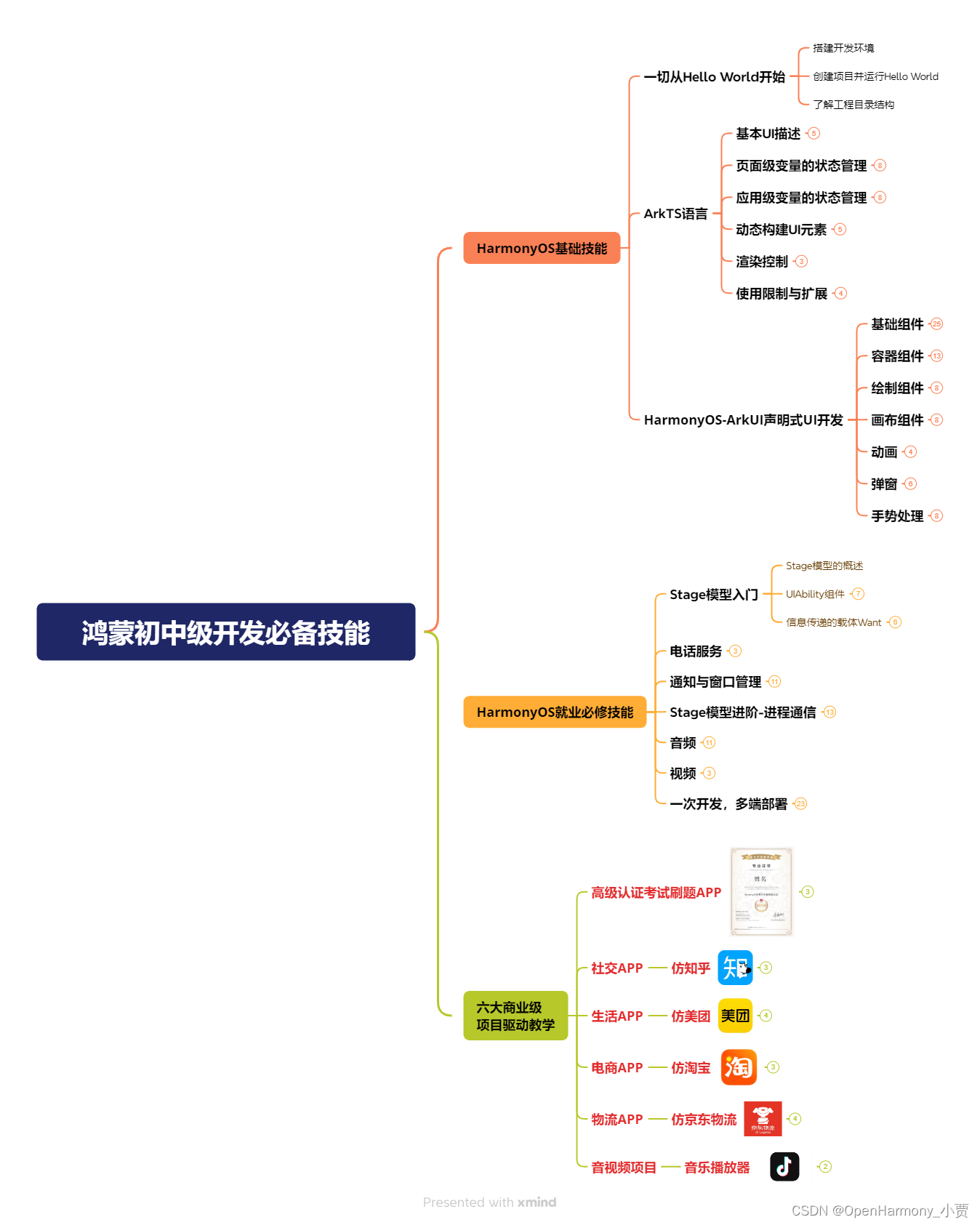
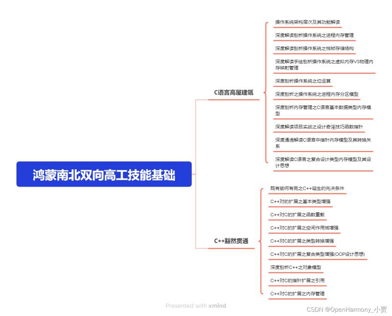
第二阶段:鸿蒙南北双向高工技能基础:gitee.com/MNxiaona/733GH
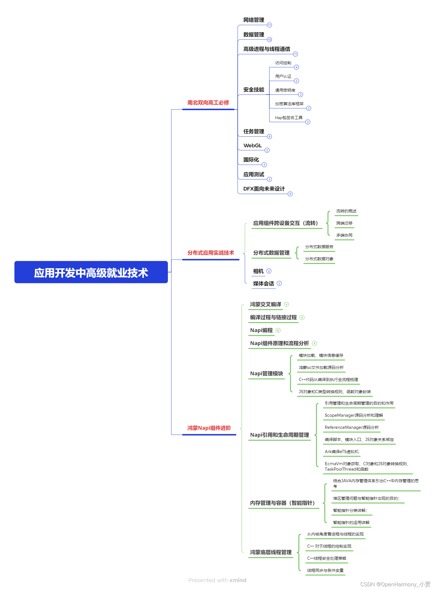
第三阶段:应用开发中高级就业技术
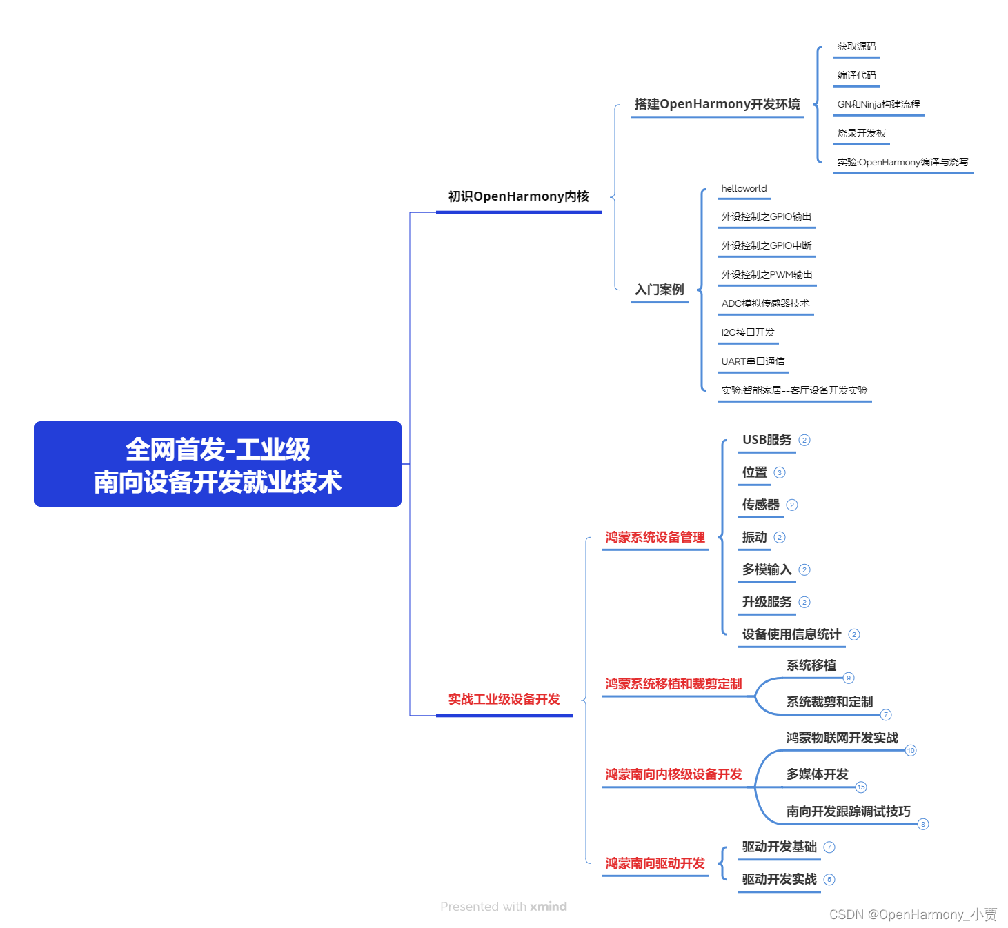
第四阶段:全网首发-工业级南向设备开发就业技术:gitee.com/MNxiaona/733GH
《鸿蒙 (Harmony OS)开发学习手册》(共计892页)
如何快速入门?
1.基本概念
2.构建第一个ArkTS应用
3.……
开发基础知识:gitee.com/MNxiaona/733GH
1.应用基础知识
2.配置文件
3.应用数据管理
4.应用安全管理
5.应用隐私保护
6.三方应用调用管控机制
7.资源分类与访问
8.学习ArkTS语言
9.……
基于ArkTS 开发
1.Ability开发
2.UI开发
3.公共事件与通知
4.窗口管理
5.媒体
6.安全
7.网络与链接
8.电话服务
9.数据管理
10.后台任务(Background Task)管理
11.设备管理
12.设备使用信息统计
13.DFX
14.国际化开发
15.折叠屏系列
16.……
鸿蒙开发面试真题(含参考答案):gitee.com/MNxiaona/733GH
鸿蒙入门教学视频:
美团APP实战开发教学:gitee.com/MNxiaona/733GH

写在最后
- 如果你觉得这篇内容对你还蛮有帮助,我想邀请你帮我三个小忙:
- 点赞,转发,有你们的 『点赞和评论』,才是我创造的动力。
- 关注小编,同时可以期待后续文章ing?,不定期分享原创知识。
- 想要获取更多完整鸿蒙最新学习资源,请移步前往小编:
gitee.com/MNxiaona/733GH

 微信名片
微信名片

评论记录:
回复评论: