CustomDialog是自定义弹窗,可用于广告、中奖、警告、软件更新等与用户交互响应操作。开发者可以通过CustomDialogController类显示自定义弹窗。具体用法请参考 自定义弹窗 。
创建自定义弹窗
-
使用@CustomDialog装饰器装饰自定义弹窗。
-
@CustomDialog装饰器用于装饰自定义弹框,此装饰器内进行自定义内容(也就是弹框内容)。
@CustomDialog
struct CustomDialogExample {
  controller: CustomDialogController = new CustomDialogController({
    builder: CustomDialogExample({}),
  })

  build() {
    Column() {
      Text('我是内容')
        .fontSize(20)
        .margin({ top: 10, bottom: 10 })
    }
  }
}
- 1
- 2
- 3
- 4
- 5
- 6
- 7
- 8
- 9
- 10
- 11
- 12
- 13
- 14
- 创建构造器,与装饰器呼应相连。
 @Entry
 @Component
 struct CustomDialogUser {
   dialogController: CustomDialogController = new CustomDialogController({
     builder: CustomDialogExample(),
   })
 }
- 1
- 2
- 3
- 4
- 5
- 6
- 7
- 点击与onClick事件绑定的组件使弹窗弹出。
@Entry
@Component
struct CustomDialogUser {
  dialogController: CustomDialogController = new CustomDialogController({
    builder: CustomDialogExample(),
  })

  build() {
    Column() {
      Button('click me')
        .onClick(() => {
          this.dialogController.open()
        })
    }.width('100%').margin({ top: 5 })
  }
}

- 1
- 2
- 3
- 4
- 5
- 6
- 7
- 8
- 9
- 10
- 11
- 12
- 13
- 14
- 15
- 16

弹窗的交互
弹窗可用于数据交互,完成用户一系列响应操作。
- 在@CustomDialog装饰器内添加按钮,同时添加数据函数。
@CustomDialog
struct CustomDialogExample {
  cancel?: () => void
  confirm?: () => void
  controller: CustomDialogController

  build() {
    Column() {
      Text('我是内容').fontSize(20).margin({ top: 10, bottom: 10 })
      Flex({ justifyContent: FlexAlign.SpaceAround }) {
        Button('cancel')
          .onClick(() => {
            this.controller.close()
            if (this.cancel) {
              this.cancel()
            }
          }).backgroundColor(0xffffff).fontColor(Color.Black)
        Button('confirm')
          .onClick(() => {
            this.controller.close()
            if (this.confirm) {
              this.confirm()
            }
          }).backgroundColor(0xffffff).fontColor(Color.Red)
      }.margin({ bottom: 10 })
    }
  }
}
- 1
- 2
- 3
- 4
- 5
- 6
- 7
- 8
- 9
- 10
- 11
- 12
- 13
- 14
- 15
- 16
- 17
- 18
- 19
- 20
- 21
- 22
- 23
- 24
- 25
- 26
- 27
- 28
- 页面内需要在构造器内进行接收,同时创建相应的函数操作。
@Entry
@Component
struct CustomDialogUser {
  dialogController: CustomDialogController = new CustomDialogController({
    builder: CustomDialogExample({
      cancel: ()=> { this.onCancel() },
      confirm: ()=> { this.onAccept() },
    }),
  })

  onCancel() {
    console.info('Callback when the first button is clicked')
  }

  onAccept() {
    console.info('Callback when the second button is clicked')
  }

  build() {
    Column() {
      Button('click me')
        .onClick(() => {
          this.dialogController.open()
        })
    }.width('100%').margin({ top: 5 })
  }
}
- 1
- 2
- 3
- 4
- 5
- 6
- 7
- 8
- 9
- 10
- 11
- 12
- 13
- 14
- 15
- 16
- 17
- 18
- 19
- 20
- 21
- 22
- 23
- 24
- 25
- 26
- 27

3.可通过弹窗中的按钮实现路由跳转,同时获取跳转页面向当前页传入的参数。
// Index.ets
import { router } from '@kit.ArkUI';

@CustomDialog
struct CustomDialogExample {
  @Link textValue: string
  controller?: CustomDialogController
  cancel: () => void = () => {
  }
  confirm: () => void = () => {
  }

  build() {
    Column({ space: 20 }) {
      if (this.textValue != '') {
        Text(`第二个页面的内容为:${this.textValue}`)
          .fontSize(20)
      } else {
        Text('是否获取第二个页面的内容')
          .fontSize(20)
      }
      Flex({ justifyContent: FlexAlign.SpaceAround }) {
        Button('cancel')
          .onClick(() => {
            if (this.controller != undefined) {
              this.controller.close()
              this.cancel()
            }
          }).backgroundColor(0xffffff).fontColor(Color.Black)
        Button('confirm')
          .onClick(() => {
            if (this.controller != undefined && this.textValue != '') {
              this.controller.close()
            } else if (this.controller != undefined) {
              router.pushUrl({
                url: 'pages/Index2'
              })
              this.controller.close()
            }
          }).backgroundColor(0xffffff).fontColor(Color.Red)
      }.margin({ bottom: 10 })
    }.borderRadius(10).padding({ top: 20 })
  }
}

@Entry
@Component
struct CustomDialogUser {
  @State textValue: string = ''
  dialogController: CustomDialogController | null = new CustomDialogController({
    builder: CustomDialogExample({
      cancel: () => {
        this.onCancel()
      },
      confirm: () => {
        this.onAccept()
      },
      textValue: $textValue
    })
  })

  // 在自定义组件即将析构销毁时将dialogController置空
  aboutToDisappear() {
    this.dialogController = null // 将dialogController置空
  }

  onPageShow() {
    const params = router.getParams() as Record; // 获取传递过来的参数对象
    if (params) {
      this.dialogController?.open()
      this.textValue = params.info as string; // 获取info属性的值
    }
  }

  onCancel() {
    console.info('Callback when the first button is clicked')
  }

  onAccept() {
    console.info('Callback when the second button is clicked')
  }

  exitApp() {
    console.info('Click the callback in the blank area')
  }

  build() {
    Column() {
      Button('click me')
        .onClick(() => {
          if (this.dialogController != null) {
            this.dialogController.open()
          }
        }).backgroundColor(0x317aff)
    }.width('100%').margin({ top: 5 })
  }
}
- 1
- 2
- 3
- 4
- 5
- 6
- 7
- 8
- 9
- 10
- 11
- 12
- 13
- 14
- 15
- 16
- 17
- 18
- 19
- 20
- 21
- 22
- 23
- 24
- 25
- 26
- 27
- 28
- 29
- 30
- 31
- 32
- 33
- 34
- 35
- 36
- 37
- 38
- 39
- 40
- 41
- 42
- 43
- 44
- 45
- 46
- 47
- 48
- 49
- 50
- 51
- 52
- 53
- 54
- 55
- 56
- 57
- 58
- 59
- 60
- 61
- 62
- 63
- 64
- 65
- 66
- 67
- 68
- 69
- 70
- 71
- 72
- 73
- 74
- 75
- 76
- 77
- 78
- 79
- 80
- 81
- 82
- 83
- 84
- 85
- 86
- 87
- 88
- 89
- 90
- 91
- 92
- 93
- 94
- 95
- 96
- 97
// Index2.ets
import { router } from '@kit.ArkUI';

@Entry
@Component
struct Index2 {
  @State message: string = '点击返回';
  build() {
    Column() {
      Button(this.message)
        .fontSize(50)
        .fontWeight(FontWeight.Bold).onClick(() => {
        router.back({
          url: 'pages/Index',
          params: {
            info: 'Hello World'
          }
        });
      })
    }.width('100%').height('100%').margin({ top: 20 })
  }
}
- 1
- 2
- 3
- 4
- 5
- 6
- 7
- 8
- 9
- 10
- 11
- 12
- 13
- 14
- 15
- 16
- 17
- 18
- 19
- 20
- 21
- 22

弹窗的动画
弹窗通过定义openAnimation控制弹窗出现动画的持续时间,速度等参数。
@CustomDialog
struct CustomDialogExample {
  controller?: CustomDialogController

  build() {
    Column() {
      Text('Whether to change a text?').fontSize(16).margin({ bottom: 10 })
    }
  }
}

@Entry
@Component
struct CustomDialogUser {
  @State textValue: string = ''
  @State inputValue: string = 'click me'
  dialogController: CustomDialogController | null = new CustomDialogController({
    builder: CustomDialogExample(),
    openAnimation: {
      duration: 1200,
      curve: Curve.Friction,
      delay: 500,
      playMode: PlayMode.Alternate,
      onFinish: () => {
        console.info('play end')
      }
    },
    autoCancel: true,
    alignment: DialogAlignment.Bottom,
    offset: { dx: 0, dy: -20 },
    gridCount: 4,
    customStyle: false,
    backgroundColor: 0xd9ffffff,
    cornerRadius: 10,
  })

  // 在自定义组件即将析构销毁时将dialogController置空
  aboutToDisappear() {
    this.dialogController = null // 将dialogController置空
  }

  build() {
    Column() {
      Button(this.inputValue)
        .onClick(() => {
          if (this.dialogController != null) {
            this.dialogController.open()
          }
        }).backgroundColor(0x317aff)
    }.width('100%').margin({ top: 5 })
  }
}
- 1
- 2
- 3
- 4
- 5
- 6
- 7
- 8
- 9
- 10
- 11
- 12
- 13
- 14
- 15
- 16
- 17
- 18
- 19
- 20
- 21
- 22
- 23
- 24
- 25
- 26
- 27
- 28
- 29
- 30
- 31
- 32
- 33
- 34
- 35
- 36
- 37
- 38
- 39
- 40
- 41
- 42
- 43
- 44
- 45
- 46
- 47
- 48
- 49
- 50
- 51
- 52

弹窗的样式
弹窗通过定义宽度、高度、背景色、阴影等参数来控制样式。
@CustomDialog
struct CustomDialogExample {
  controller?: CustomDialogController

  build() {
    Column() {
      Text('我是内容').fontSize(16).margin({ bottom: 10 })
    }
  }
}

@Entry
@Component
struct CustomDialogUser {
  @State textValue: string = ''
  @State inputValue: string = 'click me'
  dialogController: CustomDialogController | null = new CustomDialogController({
    builder: CustomDialogExample(),
    autoCancel: true,
    alignment: DialogAlignment.Center,
    offset: { dx: 0, dy: -20 },
    gridCount: 4,
    customStyle: false,
    backgroundColor: 0xd9ffffff,
    cornerRadius: 20,
    width: '80%',
    height: '100px',
    borderWidth: 1,
    borderStyle: BorderStyle.Dashed,//使用borderStyle属性,需要和borderWidth属性一起使用
    borderColor: Color.Blue,//使用borderColor属性,需要和borderWidth属性一起使用
    shadow: ({ radius: 20, color: Color.Grey, offsetX: 50, offsetY: 0}),
  })

  // 在自定义组件即将析构销毁时将dialogController置空
  aboutToDisappear() {
    this.dialogController = null // 将dialogController置空
  }

  build() {
    Column() {
      Button(this.inputValue)
        .onClick(() => {
          if (this.dialogController != null) {
            this.dialogController.open()
          }
        }).backgroundColor(0x317aff)
    }.width('100%').margin({ top: 5 })
  }
}
- 1
- 2
- 3
- 4
- 5
- 6
- 7
- 8
- 9
- 10
- 11
- 12
- 13
- 14
- 15
- 16
- 17
- 18
- 19
- 20
- 21
- 22
- 23
- 24
- 25
- 26
- 27
- 28
- 29
- 30
- 31
- 32
- 33
- 34
- 35
- 36
- 37
- 38
- 39
- 40
- 41
- 42
- 43
- 44
- 45
- 46
- 47
- 48
- 49

嵌套自定义弹窗
通过第一个弹窗打开第二个弹窗时,最好将第二个弹窗定义在第一个弹窗的父组件处,通过父组件传给第一个弹窗的回调来打开第二个弹窗。
@CustomDialog
struct CustomDialogExampleTwo {
  controllerTwo?: CustomDialogController
  @State message: string = "I'm the second dialog box."
  @State showIf: boolean = false;
  build() {
    Column() {
      if (this.showIf) {
        Text("Text")
          .fontSize(30)
          .height(100)
      }
      Text(this.message)
        .fontSize(30)
        .height(100)
      Button("Create Text")
        .onClick(()=>{
          this.showIf = true;
        })
      Button ('Close Second Dialog Box')
        .onClick(() => {
          if (this.controllerTwo != undefined) {
            this.controllerTwo.close()
          }
        })
        .margin(20)
    }
  }
}
@CustomDialog
struct CustomDialogExample {
  openSecondBox?: ()=>void
  controller?: CustomDialogController

  build() {
    Column() {
      Button ('Open Second Dialog Box and close this box')
        .onClick(() => {
          this.controller!.close();
          this.openSecondBox!();
        })
        .margin(20)
    }.borderRadius(10)
  }
}
@Entry
@Component
struct CustomDialogUser {
  @State inputValue: string = 'Click Me'
  dialogController: CustomDialogController | null = new CustomDialogController({
    builder: CustomDialogExample({
      openSecondBox: ()=>{
        if (this.dialogControllerTwo != null) {
          this.dialogControllerTwo.open()
        }
      }
    }),
    cancel: this.exitApp,
    autoCancel: true,
    alignment: DialogAlignment.Bottom,
    offset: { dx: 0, dy: -20 },
    gridCount: 4,
    customStyle: false
  })
  dialogControllerTwo: CustomDialogController | null = new CustomDialogController({
    builder: CustomDialogExampleTwo(),
    alignment: DialogAlignment.Bottom,
    offset: { dx: 0, dy: -25 } })

  aboutToDisappear() {
    this.dialogController = null
    this.dialogControllerTwo = null
  }

  onCancel() {
    console.info('Callback when the first button is clicked')
  }

  onAccept() {
    console.info('Callback when the second button is clicked')
  }

  exitApp() {
    console.info('Click the callback in the blank area')
  }
  build() {
    Column() {
      Button(this.inputValue)
        .onClick(() => {
          if (this.dialogController != null) {
            this.dialogController.open()
          }
        }).backgroundColor(0x317aff)
    }.width('100%').margin({ top: 5 })
  }
}
- 1
- 2
- 3
- 4
- 5
- 6
- 7
- 8
- 9
- 10
- 11
- 12
- 13
- 14
- 15
- 16
- 17
- 18
- 19
- 20
- 21
- 22
- 23
- 24
- 25
- 26
- 27
- 28
- 29
- 30
- 31
- 32
- 33
- 34
- 35
- 36
- 37
- 38
- 39
- 40
- 41
- 42
- 43
- 44
- 45
- 46
- 47
- 48
- 49
- 50
- 51
- 52
- 53
- 54
- 55
- 56
- 57
- 58
- 59
- 60
- 61
- 62
- 63
- 64
- 65
- 66
- 67
- 68
- 69
- 70
- 71
- 72
- 73
- 74
- 75
- 76
- 77
- 78
- 79
- 80
- 81
- 82
- 83
- 84
- 85
- 86
- 87
- 88
- 89
- 90
- 91
- 92
- 93
- 94
- 95
- 96

由于自定义弹窗在状态管理侧有父子关系,如果将第二个弹窗定义在第一个弹窗内,那么当父组件(第一个弹窗)被销毁(关闭)时,子组件(第二个弹窗)内无法再继续创建新的组件。
鸿蒙全栈开发全新学习指南
为了积极培养鸿蒙生态人才,让大家都能学习到鸿蒙开发最新的技术,针对一些在职人员、0基础小白、应届生/计算机专业、鸿蒙爱好者等人群,整理了一套纯血版鸿蒙(HarmonyOS Next)全栈开发技术的学习路线【包含了大厂APP实战项目开发】。
本路线共分为四个阶段:
第一阶段:鸿蒙初中级开发必备技能
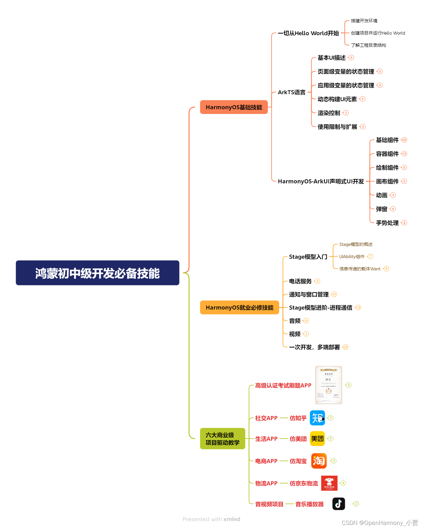
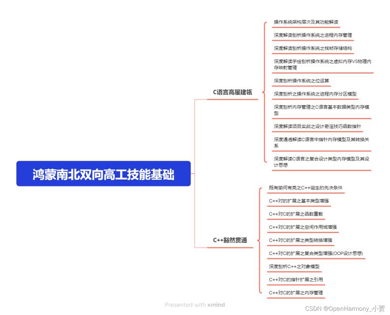
第二阶段:鸿蒙南北双向高工技能基础:gitee.com/MNxiaona/733GH
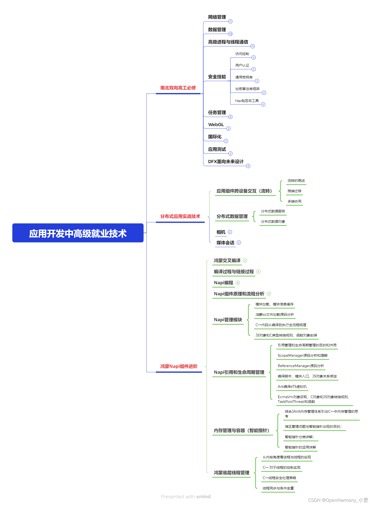
第三阶段:应用开发中高级就业技术
第四阶段:全网首发-工业级南向设备开发就业技术:gitee.com/MNxiaona/733GH
《鸿蒙 (Harmony OS)开发学习手册》(共计892页)
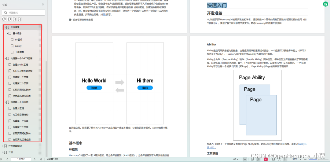
如何快速入门?
1.基本概念
2.构建第一个ArkTS应用
3.……
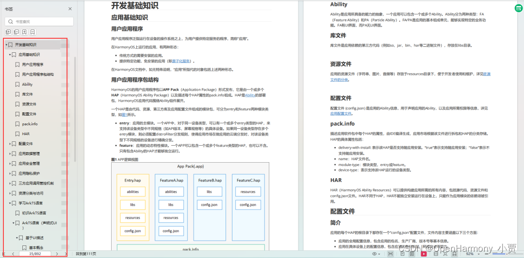
开发基础知识:gitee.com/MNxiaona/733GH
1.应用基础知识
2.配置文件
3.应用数据管理
4.应用安全管理
5.应用隐私保护
6.三方应用调用管控机制
7.资源分类与访问
8.学习ArkTS语言
9.……
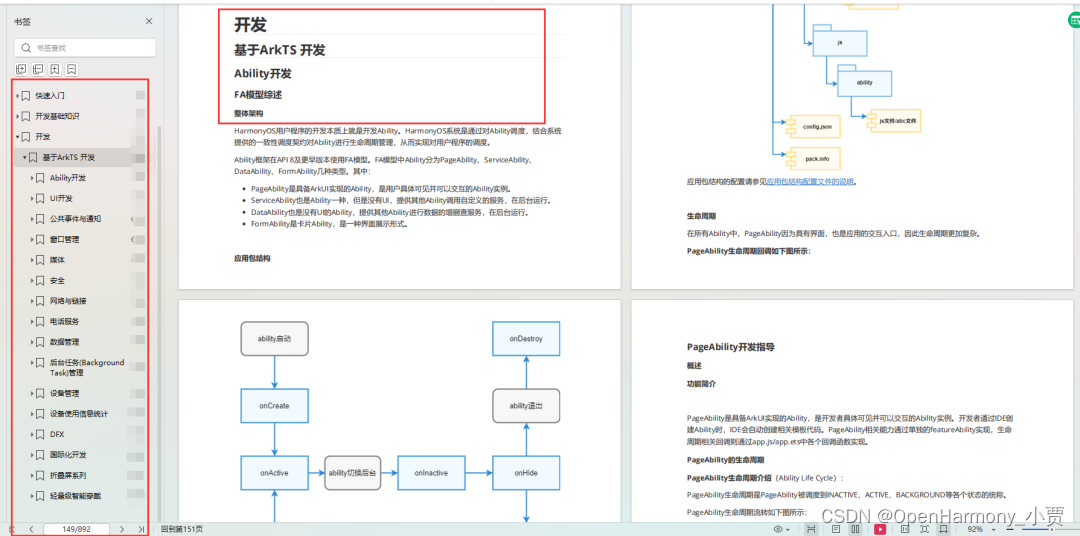
基于ArkTS 开发
1.Ability开发
2.UI开发
3.公共事件与通知
4.窗口管理
5.媒体
6.安全
7.网络与链接
8.电话服务
9.数据管理
10.后台任务(Background Task)管理
11.设备管理
12.设备使用信息统计
13.DFX
14.国际化开发
15.折叠屏系列
16.……
鸿蒙开发面试真题(含参考答案):gitee.com/MNxiaona/733GH
鸿蒙入门教学视频:
美团APP实战开发教学:gitee.com/MNxiaona/733GH

写在最后
- 如果你觉得这篇内容对你还蛮有帮助,我想邀请你帮我三个小忙:
- 点赞,转发,有你们的 『点赞和评论』,才是我创造的动力。
- 关注小编,同时可以期待后续文章ing?,不定期分享原创知识。
- 想要获取更多完整鸿蒙最新学习资源,请移步前往小编:
gitee.com/MNxiaona/733GH

 微信名片
微信名片

评论记录:
回复评论: