
概述
弹性布局( Flex )提供更加有效的方式对容器中的子元素进行排列、对齐和分配剩余空间。常用于页面头部导航栏的均匀分布、页面框架的搭建、多行数据的排列等。
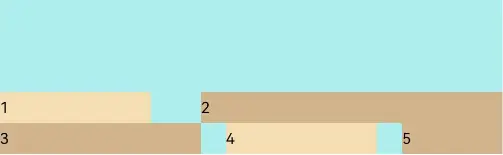
容器默认存在主轴与交叉轴,子元素默认沿主轴排列,子元素在主轴方向的尺寸称为主轴尺寸,在交叉轴方向的尺寸称为交叉轴尺寸。
图1 主轴为水平方向的Flex容器示意图

基本概念
-
主轴:Flex组件布局方向的轴线,子元素默认沿着主轴排列。主轴开始的位置称为主轴起始点,结束位置称为主轴结束点。
-
交叉轴:垂直于主轴方向的轴线。交叉轴开始的位置称为交叉轴起始点,结束位置称为交叉轴结束点。
布局方向
在弹性布局中,容器的子元素可以按照任意方向排列。通过设置参数direction,可以决定主轴的方向,从而控制子元素的排列方向。
图2 弹性布局方向图

- FlexDirection.Row(默认值):主轴为水平方向,子元素从起始端沿着水平方向开始排布。
Flex({ direction: FlexDirection.Row }) {
  Text('1').width('33%').height(50).backgroundColor(0xF5DEB3)
  Text('2').width('33%').height(50).backgroundColor(0xD2B48C)
  Text('3').width('33%').height(50).backgroundColor(0xF5DEB3)
}
.height(70)
.width('90%')
.padding(10)
.backgroundColor(0xAFEEEE)
- 1
- 2
- 3
- 4
- 5
- 6
- 7
- 8
- 9

- FlexDirection.RowReverse:主轴为水平方向,子元素从终点端沿着FlexDirection. Row相反的方向开始排布。
Flex({ direction: FlexDirection.RowReverse }) {
  Text('1').width('33%').height(50).backgroundColor(0xF5DEB3)
  Text('2').width('33%').height(50).backgroundColor(0xD2B48C)
  Text('3').width('33%').height(50).backgroundColor(0xF5DEB3)
}
.height(70)
.width('90%')
.padding(10)
.backgroundColor(0xAFEEEE)
- 1
- 2
- 3
- 4
- 5
- 6
- 7
- 8
- 9

- FlexDirection.Column:主轴为垂直方向,子元素从起始端沿着垂直方向开始排布。
Flex({ direction: FlexDirection.Column }) {
  Text('1').width('100%').height(50).backgroundColor(0xF5DEB3)
  Text('2').width('100%').height(50).backgroundColor(0xD2B48C)
  Text('3').width('100%').height(50).backgroundColor(0xF5DEB3)
}
.height(70)
.width('90%')
.padding(10)
.backgroundColor(0xAFEEEE)
- 1
- 2
- 3
- 4
- 5
- 6
- 7
- 8
- 9

- FlexDirection.ColumnReverse:主轴为垂直方向,子元素从终点端沿着FlexDirection. Column相反的方向开始排布。
Flex({ direction: FlexDirection.ColumnReverse }) {
  Text('1').width('100%').height(50).backgroundColor(0xF5DEB3)
  Text('2').width('100%').height(50).backgroundColor(0xD2B48C)
  Text('3').width('100%').height(50).backgroundColor(0xF5DEB3)
}
.height(70)
.width('90%')
.padding(10)
.backgroundColor(0xAFEEEE)
- 1
- 2
- 3
- 4
- 5
- 6
- 7
- 8
- 9

布局换行
弹性布局分为单行布局和多行布局。默认情况下,Flex容器中的子元素都排在一条线(又称“轴线”)上。wrap属性控制当子元素主轴尺寸之和大于容器主轴尺寸时,Flex是单行布局还是多行布局。在多行布局时,通过交叉轴方向,确认新行排列方向。
- FlexWrap. NoWrap(默认值):不换行。如果子元素的宽度总和大于父元素的宽度,则子元素会被压缩宽度。
Flex({ wrap: FlexWrap.NoWrap }) {
  Text('1').width('50%').height(50).backgroundColor(0xF5DEB3)
  Text('2').width('50%').height(50).backgroundColor(0xD2B48C)
  Text('3').width('50%').height(50).backgroundColor(0xF5DEB3)
}
.width('90%')
.padding(10)
.backgroundColor(0xAFEEEE)
- 1
- 2
- 3
- 4
- 5
- 6
- 7
- 8

- FlexWrap. Wrap:换行,每一行子元素按照主轴方向排列。
Flex({ wrap: FlexWrap.Wrap }) {
  Text('1').width('50%').height(50).backgroundColor(0xF5DEB3)
  Text('2').width('50%').height(50).backgroundColor(0xD2B48C)
  Text('3').width('50%').height(50).backgroundColor(0xD2B48C)
}
.width('90%')
.padding(10)
.backgroundColor(0xAFEEEE)
- 1
- 2
- 3
- 4
- 5
- 6
- 7
- 8

- FlexWrap. WrapReverse:换行,每一行子元素按照主轴反方向排列。
Flex({ wrap: FlexWrap.WrapReverse}) {
  Text('1').width('50%').height(50).backgroundColor(0xF5DEB3)
  Text('2').width('50%').height(50).backgroundColor(0xD2B48C)
  Text('3').width('50%').height(50).backgroundColor(0xF5DEB3)
}
.width('90%')
.padding(10)
.backgroundColor(0xAFEEEE)
- 1
- 2
- 3
- 4
- 5
- 6
- 7
- 8

主轴对齐方式
通过justifyContent参数设置子元素在主轴方向的对齐方式。

- FlexAlign.Start(默认值):子元素在主轴方向起始端对齐, 第一个子元素与父元素边沿对齐,其他元素与前一个元素对齐。
let PTopBottom:Record = { 'top': 10, 'bottom': 10 }
Flex({ justifyContent: FlexAlign.Start }) {
  Text('1').width('20%').height(50).backgroundColor(0xF5DEB3)
  Text('2').width('20%').height(50).backgroundColor(0xD2B48C)
  Text('3').width('20%').height(50).backgroundColor(0xF5DEB3)
}
.width('90%')
.padding(PTopBottom)
.backgroundColor(0xAFEEEE)
- 1
- 2
- 3
- 4
- 5
- 6
- 7
- 8
- 9

- FlexAlign.Center:子元素在主轴方向居中对齐。
let PTopBottom:Record = { 'top': 10, 'bottom': 10 }
Flex({ justifyContent: FlexAlign.Center }) {
  Text('1').width('20%').height(50).backgroundColor(0xF5DEB3)
  Text('2').width('20%').height(50).backgroundColor(0xD2B48C)
  Text('3').width('20%').height(50).backgroundColor(0xF5DEB3)
}
.width('90%')
.padding(PTopBottom)
.backgroundColor(0xAFEEEE)
- 1
- 2
- 3
- 4
- 5
- 6
- 7
- 8
- 9

- FlexAlign.End:子元素在主轴方向终点端对齐, 最后一个子元素与父元素边沿对齐,其他元素与后一个元素对齐。
let PTopBottom:Record = { 'top': 10, 'bottom': 10 }
Flex({ justifyContent: FlexAlign.End }) {
  Text('1').width('20%').height(50).backgroundColor(0xF5DEB3)
  Text('2').width('20%').height(50).backgroundColor(0xD2B48C)
  Text('3').width('20%').height(50).backgroundColor(0xF5DEB3)
}
.width('90%')
.padding(PTopBottom)
.backgroundColor(0xAFEEEE)
- 1
- 2
- 3
- 4
- 5
- 6
- 7
- 8
- 9

- FlexAlign.SpaceBetween:Flex主轴方向均匀分配弹性元素,相邻子元素之间距离相同。第一个子元素和最后一个子元素与父元素边沿对齐。
let PTopBottom1:Record = { 'top': 10, 'bottom': 10 }
Flex({ justifyContent: FlexAlign.SpaceBetween }) {
  Text('1').width('20%').height(50).backgroundColor(0xF5DEB3)
  Text('2').width('20%').height(50).backgroundColor(0xD2B48C)
  Text('3').width('20%').height(50).backgroundColor(0xF5DEB3)
}
.width('90%')
.padding(PTopBottom1)
.backgroundColor(0xAFEEEE)
- 1
- 2
- 3
- 4
- 5
- 6
- 7
- 8
- 9

- FlexAlign.SpaceAround:Flex主轴方向均匀分配弹性元素,相邻子元素之间距离相同。第一个子元素到主轴起始端的距离和最后一个子元素到主轴终点端的距离是相邻元素之间距离的一半。
let PTopBottom:Record = { 'top': 10, 'bottom': 10 }
Flex({ justifyContent: FlexAlign.SpaceAround }) {
  Text('1').width('20%').height(50).backgroundColor(0xF5DEB3)
  Text('2').width('20%').height(50).backgroundColor(0xD2B48C)
  Text('3').width('20%').height(50).backgroundColor(0xF5DEB3)
}
.width('90%')
.padding(PTopBottom)
.backgroundColor(0xAFEEEE)
- 1
- 2
- 3
- 4
- 5
- 6
- 7
- 8
- 9

- FlexAlign.SpaceEvenly:Flex主轴方向元素等间距布局,相邻子元素之间的间距、第一个子元素与主轴起始端的间距、最后一个子元素到主轴终点端的间距均相等。
let PTopBottom:Record = { 'top': 10, 'bottom': 10 }
Flex({ justifyContent: FlexAlign.SpaceEvenly }) {
  Text('1').width('20%').height(50).backgroundColor(0xF5DEB3)
  Text('2').width('20%').height(50).backgroundColor(0xD2B48C)
  Text('3').width('20%').height(50).backgroundColor(0xF5DEB3)
}
.width('90%')
.padding(PTopBottom)
.backgroundColor(0xAFEEEE)
- 1
- 2
- 3
- 4
- 5
- 6
- 7
- 8
- 9

交叉轴对齐方式
容器和子元素都可以设置交叉轴对齐方式,且子元素设置的对齐方式优先级较高。
容器组件设置交叉轴对齐
可以通过Flex组件的alignItems参数设置子元素在交叉轴的对齐方式。
- ItemAlign.Auto:使用Flex容器中默认配置。
let SWh:Record = { 'width': '90%', 'height': 80 }
Flex({ alignItems: ItemAlign.Auto }) {
  Text('1').width('33%').height(30).backgroundColor(0xF5DEB3)
  Text('2').width('33%').height(40).backgroundColor(0xD2B48C)
  Text('3').width('33%').height(50).backgroundColor(0xF5DEB3)
}
.size(SWh)
.padding(10)
.backgroundColor(0xAFEEEE)
- 1
- 2
- 3
- 4
- 5
- 6
- 7
- 8
- 9

- ItemAlign.Start:交叉轴方向首部对齐。
let SWh:Record = { 'width': '90%', 'height': 80 }
Flex({ alignItems: ItemAlign.Start }) {
  Text('1').width('33%').height(30).backgroundColor(0xF5DEB3)
  Text('2').width('33%').height(40).backgroundColor(0xD2B48C)
  Text('3').width('33%').height(50).backgroundColor(0xF5DEB3)
}
.size(SWh)
.padding(10)
.backgroundColor(0xAFEEEE)
- 1
- 2
- 3
- 4
- 5
- 6
- 7
- 8
- 9

- ItemAlign.Center:交叉轴方向居中对齐。
let SWh:Record = { 'width': '90%', 'height': 80 }
Flex({ alignItems: ItemAlign.Center }) {
  Text('1').width('33%').height(30).backgroundColor(0xF5DEB3)
  Text('2').width('33%').height(40).backgroundColor(0xD2B48C)
  Text('3').width('33%').height(50).backgroundColor(0xF5DEB3)
}
.size(SWh)
.padding(10)
.backgroundColor(0xAFEEEE)
- 1
- 2
- 3
- 4
- 5
- 6
- 7
- 8
- 9

- ItemAlign.End:交叉轴方向底部对齐。
let SWh:Record = { 'width': '90%', 'height': 80 }
Flex({ alignItems: ItemAlign.End }) {
  Text('1').width('33%').height(30).backgroundColor(0xF5DEB3)
  Text('2').width('33%').height(40).backgroundColor(0xD2B48C)
  Text('3').width('33%').height(50).backgroundColor(0xF5DEB3)
}
.size(SWh)
.padding(10)
.backgroundColor(0xAFEEEE)
- 1
- 2
- 3
- 4
- 5
- 6
- 7
- 8
- 9

- ItemAlign.Stretch:交叉轴方向拉伸填充,在未设置尺寸时,拉伸到容器尺寸。
let SWh:Record = { 'width': '90%', 'height': 80 }
Flex({ alignItems: ItemAlign.Stretch }) {
  Text('1').width('33%').backgroundColor(0xF5DEB3)
  Text('2').width('33%').backgroundColor(0xD2B48C)
  Text('3').width('33%').backgroundColor(0xF5DEB3)
}
.size(SWh)
.padding(10)
.backgroundColor(0xAFEEEE)
- 1
- 2
- 3
- 4
- 5
- 6
- 7
- 8
- 9

- ItemAlign. Baseline:交叉轴方向文本基线对齐。
let SWh:Record = { 'width': '90%', 'height': 80 }
Flex({ alignItems: ItemAlign.Baseline }) {
  Text('1').width('33%').height(30).backgroundColor(0xF5DEB3)
  Text('2').width('33%').height(40).backgroundColor(0xD2B48C)
  Text('3').width('33%').height(50).backgroundColor(0xF5DEB3)
}
.size(SWh)
.padding(10)
.backgroundColor(0xAFEEEE)
- 1
- 2
- 3
- 4
- 5
- 6
- 7
- 8
- 9

子元素设置交叉轴对齐
子元素的 alignSelf 属性也可以设置子元素在父容器交叉轴的对齐格式,且会覆盖Flex布局容器中alignItems配置。如下例所示:
Flex({ direction: FlexDirection.Row, alignItems: ItemAlign.Center }) { // 容器组件设置子元素居中
  Text('alignSelf Start').width('25%').height(80)
    .alignSelf(ItemAlign.Start)
    .backgroundColor(0xF5DEB3)
  Text('alignSelf Baseline')
    .alignSelf(ItemAlign.Baseline)
    .width('25%')
    .height(80)
    .backgroundColor(0xD2B48C)
  Text('alignSelf Baseline').width('25%').height(100)
    .backgroundColor(0xF5DEB3)
    .alignSelf(ItemAlign.Baseline)
  Text('no alignSelf').width('25%').height(100)
    .backgroundColor(0xD2B48C)
  Text('no alignSelf').width('25%').height(100)
    .backgroundColor(0xF5DEB3)

}.width('90%').height(220).backgroundColor(0xAFEEEE)

- 1
- 2
- 3
- 4
- 5
- 6
- 7
- 8
- 9
- 10
- 11
- 12
- 13
- 14
- 15
- 16
- 17
- 18

上例中,Flex容器中alignItems设置交叉轴子元素的对齐方式为居中,子元素自身设置了alignSelf属性的情况,覆盖父组件的alignItems值,表现为alignSelf的定义。
内容对齐
可以通过 alignContent 参数设置子元素各行在交叉轴剩余空间内的对齐方式,只在多行的Flex布局中生效,可选值有:
- FlexAlign.Start:子元素各行与交叉轴起点对齐。
Flex({ justifyContent: FlexAlign.SpaceBetween, wrap: FlexWrap.Wrap, alignContent: FlexAlign.Start }) {
  Text('1').width('30%').height(20).backgroundColor(0xF5DEB3)
  Text('2').width('60%').height(20).backgroundColor(0xD2B48C)
  Text('3').width('40%').height(20).backgroundColor(0xD2B48C)
  Text('4').width('30%').height(20).backgroundColor(0xF5DEB3)
  Text('5').width('20%').height(20).backgroundColor(0xD2B48C)
}
.width('90%')
.height(100)
.backgroundColor(0xAFEEEE)
- 1
- 2
- 3
- 4
- 5
- 6
- 7
- 8
- 9
- 10

- FlexAlign.Center:子元素各行在交叉轴方向居中对齐。
Flex({ justifyContent: FlexAlign.SpaceBetween, wrap: FlexWrap.Wrap, alignContent: FlexAlign.Center }) {
  Text('1').width('30%').height(20).backgroundColor(0xF5DEB3)
  Text('2').width('60%').height(20).backgroundColor(0xD2B48C)
  Text('3').width('40%').height(20).backgroundColor(0xD2B48C)
  Text('4').width('30%').height(20).backgroundColor(0xF5DEB3)
  Text('5').width('20%').height(20).backgroundColor(0xD2B48C)
}
.width('90%')
.height(100)
.backgroundColor(0xAFEEEE)
- 1
- 2
- 3
- 4
- 5
- 6
- 7
- 8
- 9
- 10

- FlexAlign.End:子元素各行与交叉轴终点对齐。
Flex({ justifyContent: FlexAlign.SpaceBetween, wrap: FlexWrap.Wrap, alignContent: FlexAlign.End }) {
  Text('1').width('30%').height(20).backgroundColor(0xF5DEB3)
  Text('2').width('60%').height(20).backgroundColor(0xD2B48C)
  Text('3').width('40%').height(20).backgroundColor(0xD2B48C)
  Text('4').width('30%').height(20).backgroundColor(0xF5DEB3)
  Text('5').width('20%').height(20).backgroundColor(0xD2B48C)
}
.width('90%')
.height(100)
.backgroundColor(0xAFEEEE)
- 1
- 2
- 3
- 4
- 5
- 6
- 7
- 8
- 9
- 10
- FlexAlign.SpaceBetween:子元素各行与交叉轴两端对齐,各行间垂直间距平均分布。
Flex({ justifyContent: FlexAlign.SpaceBetween, wrap: FlexWrap.Wrap, alignContent: FlexAlign.SpaceBetween }) {
  Text('1').width('30%').height(20).backgroundColor(0xF5DEB3)
  Text('2').width('60%').height(20).backgroundColor(0xD2B48C)
  Text('3').width('40%').height(20).backgroundColor(0xD2B48C)
  Text('4').width('30%').height(20).backgroundColor(0xF5DEB3)
  Text('5').width('20%').height(20).backgroundColor(0xD2B48C)
}
.width('90%')
.height(100)
.backgroundColor(0xAFEEEE)
- 1
- 2
- 3
- 4
- 5
- 6
- 7
- 8
- 9
- 10

- FlexAlign.SpaceAround:子元素各行间距相等,是元素首尾行与交叉轴两端距离的两倍。
Flex({ justifyContent: FlexAlign.SpaceBetween, wrap: FlexWrap.Wrap, alignContent: FlexAlign.SpaceAround }) {
  Text('1').width('30%').height(20).backgroundColor(0xF5DEB3)
  Text('2').width('60%').height(20).backgroundColor(0xD2B48C)
  Text('3').width('40%').height(20).backgroundColor(0xD2B48C)
  Text('4').width('30%').height(20).backgroundColor(0xF5DEB3)
  Text('5').width('20%').height(20).backgroundColor(0xD2B48C)
}
.width('90%')
.height(100)
.backgroundColor(0xAFEEEE)
- 1
- 2
- 3
- 4
- 5
- 6
- 7
- 8
- 9
- 10

- FlexAlign.SpaceEvenly: 子元素各行间距,子元素首尾行与交叉轴两端距离都相等。
Flex({ justifyContent: FlexAlign.SpaceBetween, wrap: FlexWrap.Wrap, alignContent: FlexAlign.SpaceEvenly }) {
  Text('1').width('30%').height(20).backgroundColor(0xF5DEB3)
  Text('2').width('60%').height(20).backgroundColor(0xD2B48C)
  Text('3').width('40%').height(20).backgroundColor(0xD2B48C)
  Text('4').width('30%').height(20).backgroundColor(0xF5DEB3)
  Text('5').width('20%').height(20).backgroundColor(0xD2B48C)
}
.width('90%')
.height(100)
.backgroundColor(0xAFEEEE)
- 1
- 2
- 3
- 4
- 5
- 6
- 7
- 8
- 9
- 10

自适应拉伸
在弹性布局父组件尺寸过小时,通过子元素的以下属性设置其在父容器的占比,达到自适应布局。
- flexBasis:设置子元素在父容器主轴方向上的基准尺寸。如果设置了该属性,则子项占用的空间为该属性所设置的值;如果没设置该属性,那子项的空间为width/height的值。
Flex() {
  Text('flexBasis("auto")')
    .flexBasis('auto') // 未设置width以及flexBasis值为auto,内容自身宽度
    .height(100)
    .backgroundColor(0xF5DEB3)
  Text('flexBasis("auto")'+' width("40%")')
    .width('40%')
    .flexBasis('auto') //设置width以及flexBasis值auto,使用width的值
    .height(100)
    .backgroundColor(0xD2B48C)

  Text('flexBasis(100)')  // 未设置width以及flexBasis值为100,宽度为100vp
    .flexBasis(100)
    .height(100)
    .backgroundColor(0xF5DEB3)

  Text('flexBasis(100)')
    .flexBasis(100)
    .width(200) // flexBasis值为100,覆盖width的设置值,宽度为100vp
    .height(100)
    .backgroundColor(0xD2B48C)
}.width('90%').height(120).padding(10).backgroundColor(0xAFEEEE)
- 1
- 2
- 3
- 4
- 5
- 6
- 7
- 8
- 9
- 10
- 11
- 12
- 13
- 14
- 15
- 16
- 17
- 18
- 19
- 20
- 21
- 22

- flexGrow:设置父容器的剩余空间分配给此属性所在组件的比例。用于分配父组件的剩余空间。
Flex() {
  Text('flexGrow(2)')
    .flexGrow(2)
    .width(100)
    .height(100)
    .backgroundColor(0xF5DEB3)
  Text('flexGrow(3)')
    .flexGrow(3)
    .width(100)
    .height(100)
    .backgroundColor(0xD2B48C)

  Text('no flexGrow')
    .width(100)
    .height(100)
    .backgroundColor(0xF5DEB3)
}.width(420).height(120).padding(10).backgroundColor(0xAFEEEE)
- 1
- 2
- 3
- 4
- 5
- 6
- 7
- 8
- 9
- 10
- 11
- 12
- 13
- 14
- 15
- 16
- 17

父容器宽度420vp,三个子元素原始宽度为100vp,左右padding为20vp,总和320vp,剩余空间100vp根据flexGrow值的占比分配给子元素,未设置flexGrow的子元素不参与“瓜分”。
第一个元素以及第二个元素以2:3分配剩下的100vp。第一个元素为100vp+100vp * 2/5=140vp,第二个元素为100vp+100vp * 3/5=160vp。
- flexShrink: 当父容器空间不足时,子元素的压缩比例。
Flex({ direction: FlexDirection.Row }) {
  Text('flexShrink(3)')
    .flexShrink(3)
    .width(200)
    .height(100)
    .backgroundColor(0xF5DEB3)

  Text('no flexShrink')
    .width(200)
    .height(100)
    .backgroundColor(0xD2B48C)

  Text('flexShrink(2)')
    .flexShrink(2)
    .width(200)
    .height(100)
    .backgroundColor(0xF5DEB3)
}.width(400).height(120).padding(10).backgroundColor(0xAFEEEE)
- 1
- 2
- 3
- 4
- 5
- 6
- 7
- 8
- 9
- 10
- 11
- 12
- 13
- 14
- 15
- 16
- 17
- 18

场景示例
使用弹性布局,可以实现子元素沿水平方向排列,两端对齐,子元素间距平分,垂直方向上子元素居中的效果。
@Entry
@Component
struct FlexExample {
  build() {
    Column() {
      Column({ space: 5 }) {
        Flex({ direction: FlexDirection.Row, wrap: FlexWrap.NoWrap, justifyContent: FlexAlign.SpaceBetween, alignItems: ItemAlign.Center }) {
          Text('1').width('30%').height(50).backgroundColor(0xF5DEB3)
          Text('2').width('30%').height(50).backgroundColor(0xD2B48C)
          Text('3').width('30%').height(50).backgroundColor(0xF5DEB3)
        }
        .height(70)
        .width('90%')
        .backgroundColor(0xAFEEEE)
      }.width('100%').margin({ top: 5 })
    }.width('100%')
 }
}
- 1
- 2
- 3
- 4
- 5
- 6
- 7
- 8
- 9
- 10
- 11
- 12
- 13
- 14
- 15
- 16
- 17
- 18

鸿蒙全栈开发全新学习指南
为了积极培养鸿蒙生态人才,让大家都能学习到鸿蒙开发最新的技术,针对一些在职人员、0基础小白、应届生/计算机专业、鸿蒙爱好者等人群,整理了一套纯血版鸿蒙(HarmonyOS Next)全栈开发技术的学习路线【包含了大厂APP实战项目开发】。
本路线共分为四个阶段:
第一阶段:鸿蒙初中级开发必备技能
第二阶段:鸿蒙南北双向高工技能基础:gitee.com/MNxiaona/733GH
第三阶段:应用开发中高级就业技术
第四阶段:全网首发-工业级南向设备开发就业技术:gitee.com/MNxiaona/733GH
《鸿蒙 (Harmony OS)开发学习手册》(共计892页)
如何快速入门?
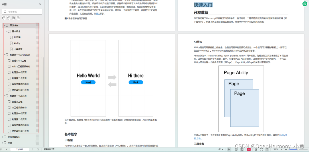
1.基本概念
2.构建第一个ArkTS应用
3.……
开发基础知识:gitee.com/MNxiaona/733GH
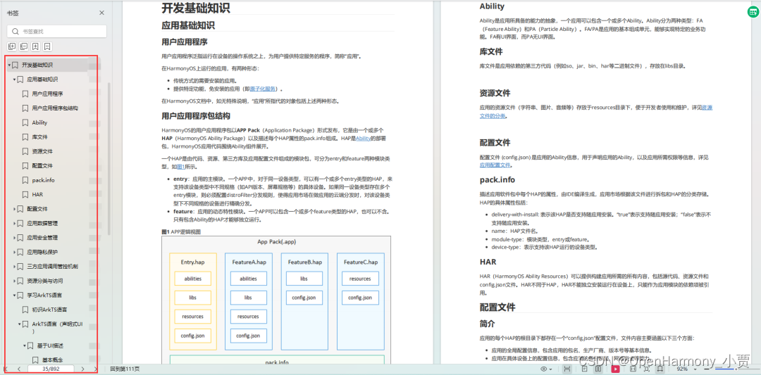
1.应用基础知识
2.配置文件
3.应用数据管理
4.应用安全管理
5.应用隐私保护
6.三方应用调用管控机制
7.资源分类与访问
8.学习ArkTS语言
9.……
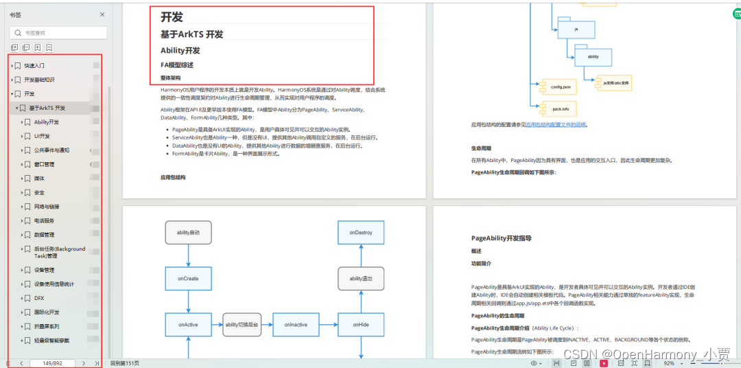
基于ArkTS 开发
1.Ability开发
2.UI开发
3.公共事件与通知
4.窗口管理
5.媒体
6.安全
7.网络与链接
8.电话服务
9.数据管理
10.后台任务(Background Task)管理
11.设备管理
12.设备使用信息统计
13.DFX
14.国际化开发
15.折叠屏系列
16.……
鸿蒙开发面试真题(含参考答案):gitee.com/MNxiaona/733GH
鸿蒙入门教学视频:
美团APP实战开发教学:gitee.com/MNxiaona/733GH

写在最后
- 如果你觉得这篇内容对你还蛮有帮助,我想邀请你帮我三个小忙:
- 点赞,转发,有你们的 『点赞和评论』,才是我创造的动力。
- 关注小编,同时可以期待后续文章ing?,不定期分享原创知识。
- 想要获取更多完整鸿蒙最新学习资源,请移步前往小编:
gitee.com/MNxiaona/733GH

 微信名片
微信名片

评论记录:
回复评论: