
@Styles装饰器:定义组件重用样式
如果每个组件的样式都需要单独设置,在开发过程中会出现大量代码在进行重复样式设置,虽然可以复制粘贴,但为了代码简洁性和后续方便维护,我们推出了可以提炼公共样式进行复用的装饰器@Styles。
@Styles装饰器可以将多条样式设置提炼成一个方法,直接在组件声明的位置调用。通过@Styles装饰器可以快速定义并复用自定义样式。用于快速定义并复用自定义样式。
装饰器使用说明
- 当前@Styles仅支持通用属性和通用事件。
- @Styles方法不支持参数,反例如下。
- // 反例: @Styles不支持参数
- @Styles function globalFancy (value: number) {
- .width(value)
- }
复制
- @Styles可以定义在组件内或全局,在全局定义时需在方法名前面添加function关键字,组件内定义时则不需要添加function关键字。
- // 全局
- @Styles function functionName() { ... }
-
- // 在组件内
- @Component
- struct FancyUse {
- @Styles fancy() {
- .height(100)
- }
- }
复制
- 定义在组件内的@Styles可以通过this访问组件的常量和状态变量,并可以在@Styles里通过事件来改变状态变量的值,示例如下:
- @Component
- struct FancyUse {
- @State heightVlaue: number = 100
- @Styles fancy() {
- .height(this.heightVlaue)
- .backgroundColor(Color.Yellow)
- .onClick(() => {
- this.heightVlaue = 200
- })
- }
- }
复制
- 组件内@Styles的优先级高于全局@Styles。 框架优先找当前组件内的@Styles,如果找不到,则会全局查找。
使用场景
以下示例中演示了组件内@Styles和全局@Styles的用法。
- // 定义在全局的@Styles封装的样式
- @Styles function globalFancy () {
- .width(150)
- .height(100)
- .backgroundColor(Color.Pink)
- }
-
- @Entry
- @Component
- struct FancyUse {
- @State heightVlaue: number = 100
- // 定义在组件内的@Styles封装的样式
- @Styles fancy() {
- .width(200)
- .height(this.heightVlaue)
- .backgroundColor(Color.Yellow)
- .onClick(() => {
- this.heightVlaue = 200
- })
- }
-
- build() {
- Column({ space: 10 }) {
- // 使用全局的@Styles封装的样式
- Text('FancyA')
- .globalFancy ()
- .fontSize(30)
- // 使用组件内的@Styles封装的样式
- Text('FancyB')
- .fancy()
- .fontSize(30)
- }
- }
- }

复制
@Extend装饰器:定义扩展组件样式
在前文的示例中,可以使用@Styles用于样式的扩展,在@Styles的基础上,我们提供了@Extend,用于扩展原生组件样式。
语法
@Extend(UIComponentName) function functionName { ... }复制
用规则
- 和@Styles不同,@Extend仅支持定义在全局,不支持在组件内部定义。
- 和@Styles不同,@Extend支持封装指定的组件的私有属性和私有事件和预定义相同组件的@Extend的方法。
- // @Extend(Text)可以支持Text的私有属性fontColor
- @Extend(Text) function fancy () {
- .fontColor(Color.Red)
- }
- // superFancyText可以调用预定义的fancy
- @Extend(Text) function superFancyText(size:number) {
- .fontSize(size)
- .fancy()
- }
复制
- 和@Styles不同,@Extend装饰的方法支持参数,开发者可以在调用时传递参数,调用遵循TS方法传值调用。
- // xxx.ets
- @Extend(Text) function fancy (fontSize: number) {
- .fontColor(Color.Red)
- .fontSize(fontSize)
- }
-
- @Entry
- @Component
- struct FancyUse {
- build() {
- Row({ space: 10 }) {
- Text('Fancy')
- .fancy(16)
- Text('Fancy')
- .fancy(24)
- }
- }
- }
复制
- @Extend装饰的方法的参数可以为function,作为Event事件的句柄。
- @Extend(Text) function makeMeClick(onClick: () => void) {
- .backgroundColor(Color.Blue)
- .onClick(onClick)
- }
-
- @Entry
- @Component
- struct FancyUse {
- @State label: string = 'Hello World';
-
- onClickHandler() {
- this.label = 'Hello ArkUI';
- }
-
- build() {
- Row({ space: 10 }) {
- Text(`${this.label}`)
- .makeMeClick(this.onClickHandler.bind(this))
- }
- }
- }
复制
- @Extend的参数可以为状态变量,当状态变量改变时,UI可以正常的被刷新渲染。
- @Extend(Text) function fancy (fontSize: number) {
- .fontColor(Color.Red)
- .fontSize(fontSize)
- }
-
- @Entry
- @Component
- struct FancyUse {
- @State fontSizeValue: number = 20
- build() {
- Row({ space: 10 }) {
- Text('Fancy')
- .fancy(this.fontSizeValue)
- .onClick(() => {
- this.fontSizeValue = 30
- })
- }
- }
- }
复制
使用场景
以下示例声明了3个Text组件,每个Text组件均设置了fontStyle、fontWeight和backgroundColor样式。
- @Entry
- @Component
- struct FancyUse {
- @State label: string = 'Hello World'
-
- build() {
- Row({ space: 10 }) {
- Text(`${this.label}`)
- .fontStyle(FontStyle.Italic)
- .fontWeight(100)
- .backgroundColor(Color.Blue)
- Text(`${this.label}`)
- .fontStyle(FontStyle.Italic)
- .fontWeight(200)
- .backgroundColor(Color.Pink)
- Text(`${this.label}`)
- .fontStyle(FontStyle.Italic)
- .fontWeight(300)
- .backgroundColor(Color.Orange)
- }.margin('20%')
- }
- }
复制
@Extend将样式组合复用,示例如下。
- @Extend(Text) function fancyText(weightValue: number, color: Color) {
- .fontStyle(FontStyle.Italic)
- .fontWeight(weightValue)
- .backgroundColor(color)
- }
复制
通过@Extend组合样式后,使得代码更加简洁,增强可读性。
- @Entry
- @Component
- struct FancyUse {
- @State label: string = 'Hello World'
-
- build() {
- Row({ space: 10 }) {
- Text(`${this.label}`)
- .fancyText(100, Color.Blue)
- Text(`${this.label}`)
- .fancyText(200, Color.Pink)
- Text(`${this.label}`)
- .fancyText(300, Color.Orange)
- }.margin('20%')
- }
- }
复制
stateStyles:多态样式
@Styles和@Extend仅仅应用于静态页面的样式复用,stateStyles可以依据组件的内部状态的不同,快速设置不同样式。这就是我们本章要介绍的内容stateStyles(又称为:多态样式)。
概述
stateStyles是属性方法,可以根据UI内部状态来设置样式,类似于css伪类,但语法不同。ArkUI提供以下四种状态:
- focused:获焦态。
- normal:正常态。
- pressed:按压态。
- disabled:不可用态。
使用场景
基础场景
下面的示例展示了stateStyles最基本的使用场景。Button处于第一个组件,默认获焦,生效focused指定的粉色样式。按压时显示为pressed态指定的黑色。如果在Button前再放一个组件,使其不处于获焦态,就会生效normal态的黄色。
- @Entry
- @Component
- struct StateStylesSample {
- build() {
- Column() {
- Button('Click me')
- .stateStyles({
- focused: {
- .backgroundColor(Color.Pink)
- },
- pressed: {
- .backgroundColor(Color.Black)
- },
- normal: {
- .backgroundColor(Color.Yellow)
- }
- })
- }.margin('30%')
- }
- }
复制
图1 获焦态和按压态

@Styles和stateStyles联合使用
以下示例通过@Styles指定stateStyles的不同状态。
- @Entry
- @Component
- struct MyComponent {
- @Styles normalStyle() {
- .backgroundColor(Color.Gray)
- }
-
- @Styles pressedStyle() {
- .backgroundColor(Color.Red)
- }
-
- build() {
- Column() {
- Text('Text1')
- .fontSize(50)
- .fontColor(Color.White)
- .stateStyles({
- normal: this.normalStyle,
- pressed: this.pressedStyle,
- })
- }
- }
- }
复制
图2 正常态和按压态

在stateStyles里使用常规变量和状态变量
stateStyles可以通过this绑定组件内的常规变量和状态变量。
- @Entry
- @Component
- struct CompWithInlineStateStyles {
- @State focusedColor: Color = Color.Red;
- normalColor: Color = Color.Green
- build() {
- Button('clickMe').height(100).width(100)
- .stateStyles({
- normal: {
- .backgroundColor(this.normalColor)
- },
- focused: {
- .backgroundColor(this.focusedColor)
- }
- })
- .onClick(() => {
- this.focusedColor = Color.Pink
- })
- .margin('30%')
- }
- }
复制
Button默认获焦显示红色,点击事件触发后,获焦态变为粉色。
图3 点击改变获焦态样式

最后,为了能让大家更好的去学习提升鸿蒙 (Harmony OS) 开发技术,小编连夜整理了一份30个G纯血版学习资料(含视频、电子书、学习文档等)以及一份在Github上持续爆火霸榜的《纯血版华为鸿蒙 (Harmony OS)开发手册》(共计890页),希望对大家有所帮助。
纯血版鸿蒙 HarmonyOS 4.0 视频学习资料
需要以上视频学习资料小伙伴
《纯血版华为鸿蒙 (Harmony OS)开发手册》
这份手册涵盖了当前鸿蒙 (Harmony OS) 开发技术必掌握的核心知识点
纯血版鸿蒙 (Harmony OS)开发手册部分精彩内容
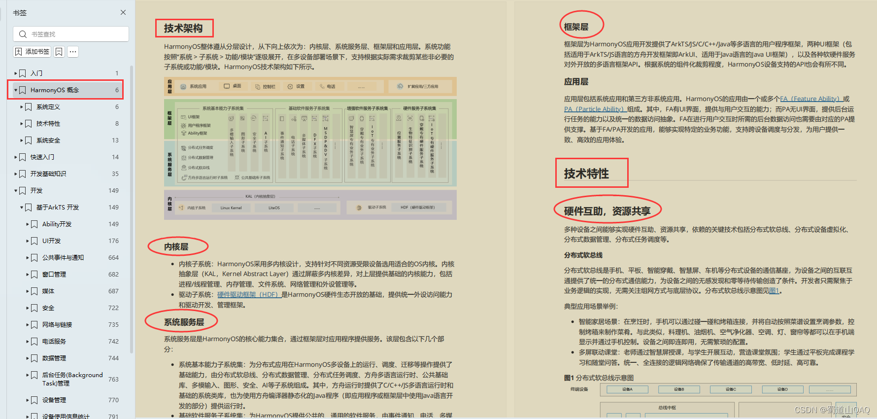
HarmonyOS 概念:
- 系统定义
- 技术架构
- 技术特性
- 系统安全
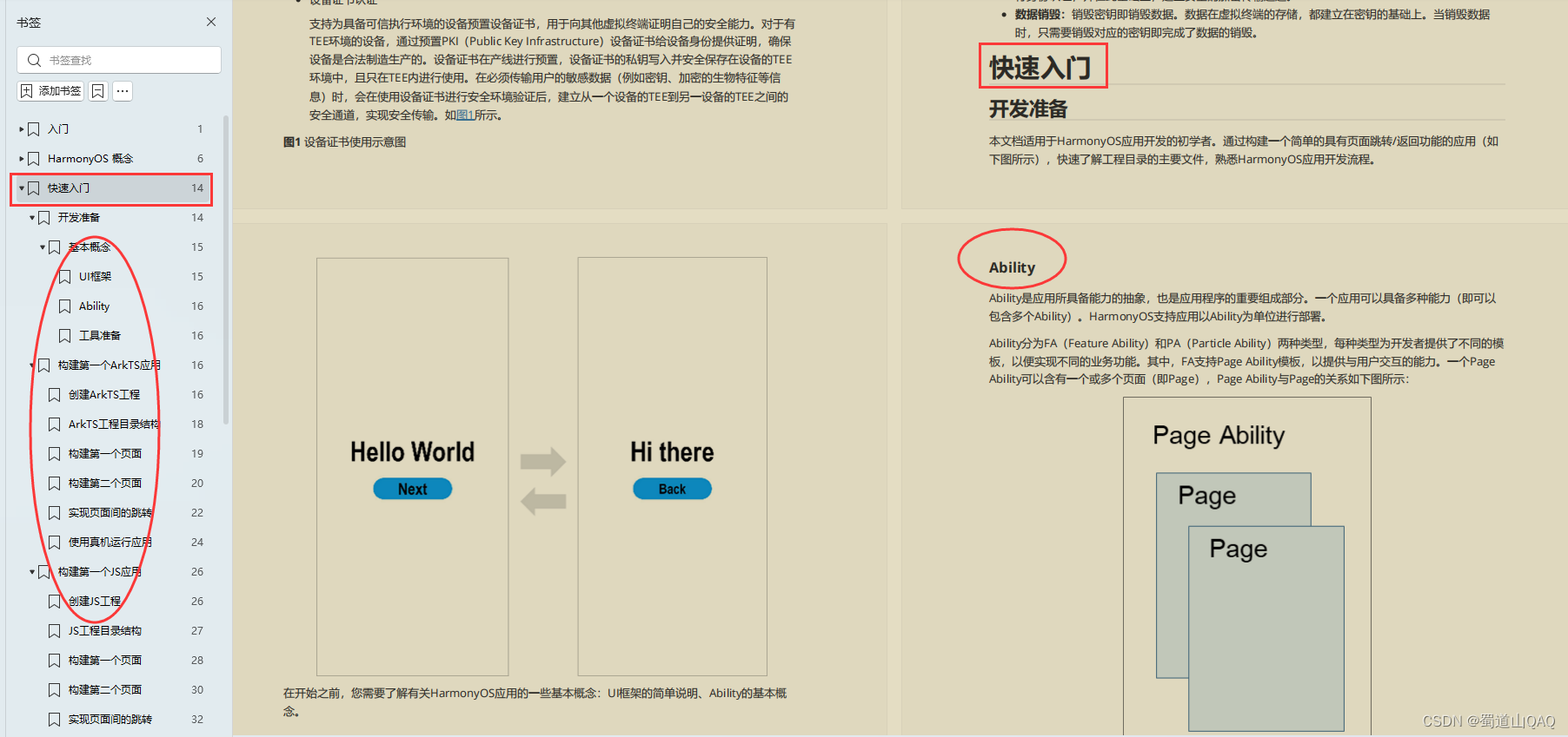
如何快速入门?
- 基本概念
- 构建第一个ArkTS应用
- 构建第一个JS应用
- ……
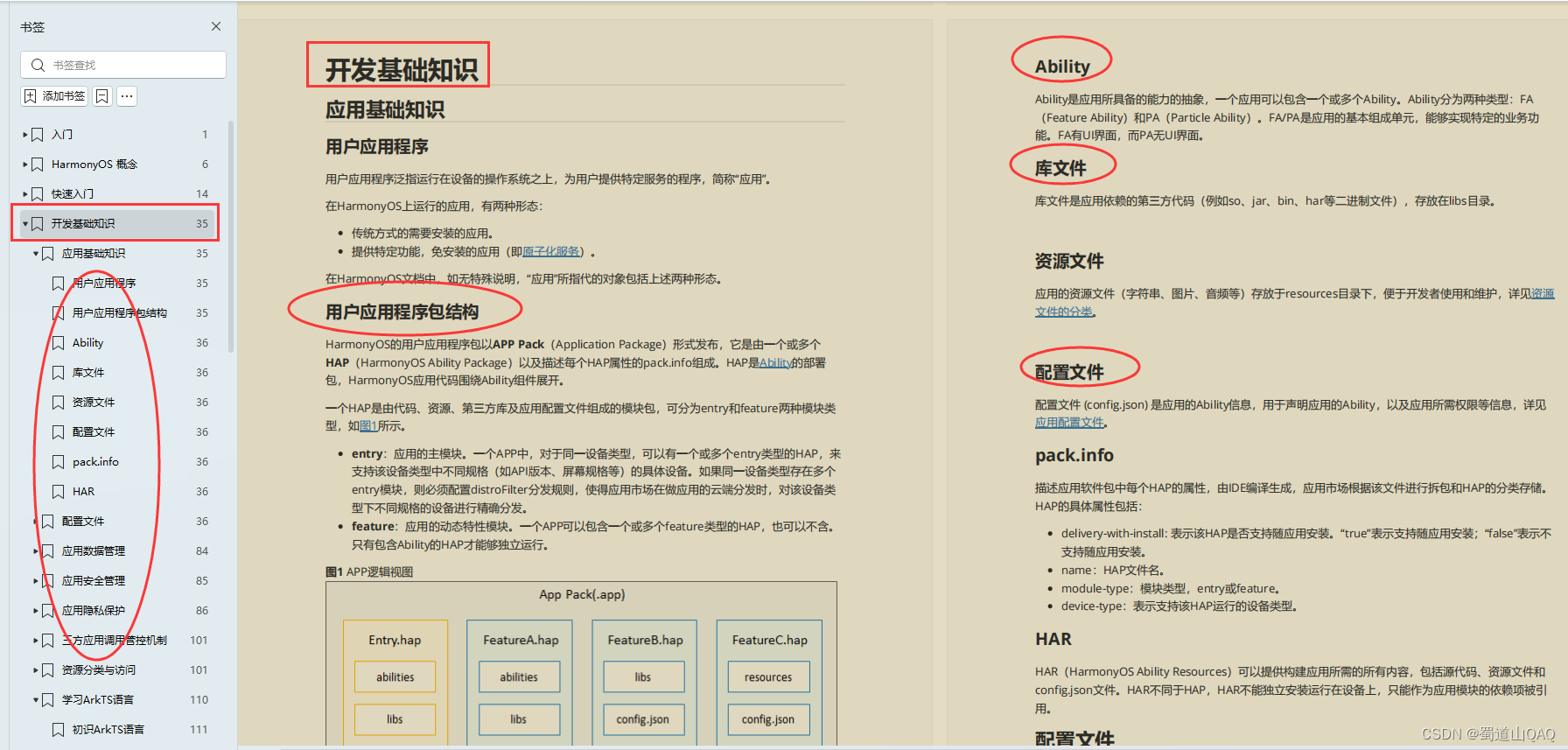
开发基础知识:
- 应用基础知识
- 配置文件
- 应用数据管理
- 应用安全管理
- 应用隐私保护
- 三方应用调用管控机制
- 资源分类与访问
- 学习ArkTS语言
- ……
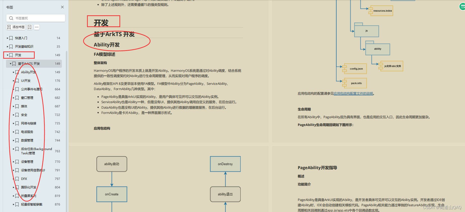
基于ArkTS 开发:
- Ability开发
- UI开发
- 公共事件与通知
- 窗口管理
- 媒体
- 安全
- 网络与链接
- 电话服务
- 数据管理
- 后台任务(Background Task)管理
- 设备管理
- 设备使用信息统计
- DFX
- 国际化开发
- 折叠屏系列
- .……
获取以上文中提到的这份纯血版鸿蒙 (Harmony OS) 开发资料的小伙伴
?写在最后
- 如果你觉得这篇内容对你还蛮有帮助,我想邀请你帮我三个小忙:
- 点赞,转发,有你们的 『点赞和评论』,才是我创造的动力。
- 关注小编,同时可以期待后续文章ing?,不定期分享原创知识。
- 想要获取更多完整鸿蒙最新VIP学习资料,请点击→纯血版全套鸿蒙HarmonyOS学习资料


 微信名片
微信名片

评论记录:
回复评论: