
一、ArkTS语言基本语法
1.简介
HarmonyOS的ArkTS语言是一种基于TypeScript开发的语言,它专为HarmonyOS系统开发而设计。ArkTS语言结合了JavaScript的灵活性和TypeScript的严谨性,使得开发者能够快速、高效地开发出高质量的HarmonyOS应用程序。
ArkTS语言具有以下特点:
-
静态类型检查:开发者在编写代码时可以使用类型注解来进行类型检查,从而减少因类型错误而导致的bug。
-
异步/同步编程:ArkTS语言支持基于Promise和async/await的异步/同步编程方式,能够更好地处理异步操作。
-
内置模块:ArkTS语言内置了许多常用的模块,如文件系统、网络请求、图形渲染等,使得开发者不必自己编写这些模块。
-
兼容性:ArkTS语言使用TypeScript语法,可以与JavaScript代码无缝集成,并且可以编译成JavaScript代码来在其他平台上运行。
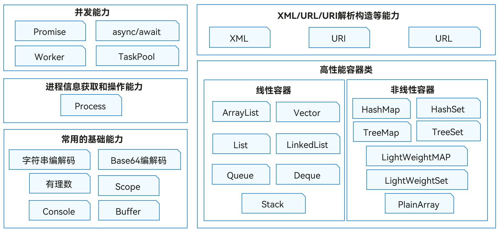
ArkTS语言基础类库是HarmonyOS系统上为应用开发者提供的常用基础能力,主要包含能力如下图所示:
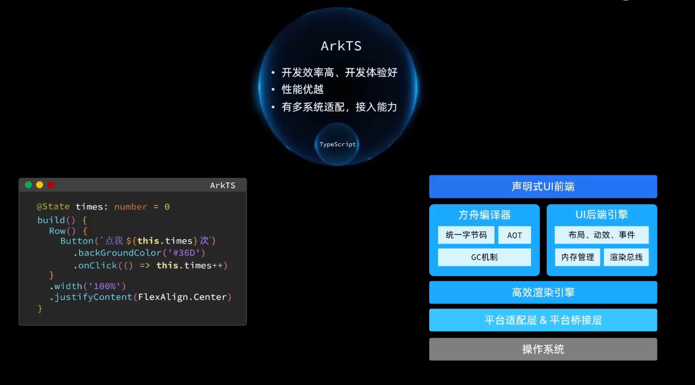
ArkTS是HarmonyOS优选的主力应用开发语言。ArkTS围绕应用开发在TypeScript(简称TS)生态基础上做了进一步扩展,继承了TS的所有特性,是TS的超集。
ArkTS和HTML的差别: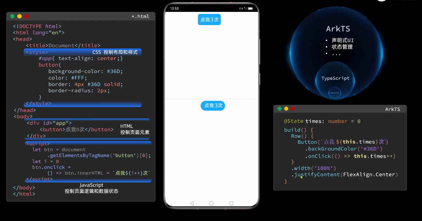
2.TypeScript的基础语法
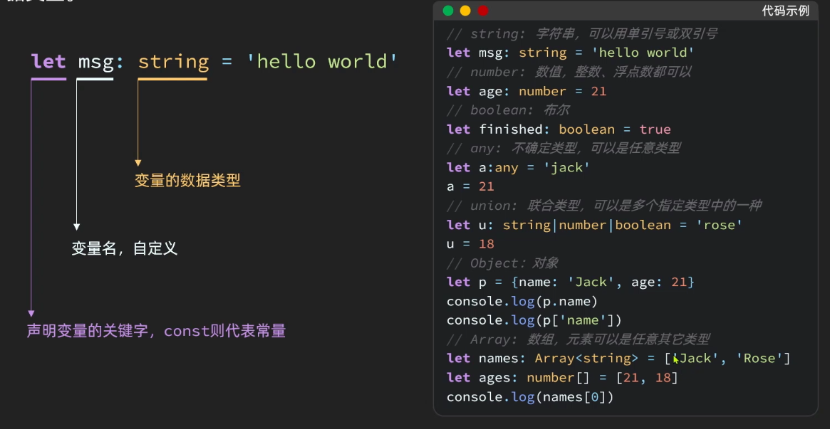
TypeScript是一种由微软开发的JavaScript超集语言,它支持JavaScript的所有语法,但添加了一些新的特性和语法,使开发更加可靠和高效。TypeScript最大的特点是引入了静态类型,开发者可以在编译时发现类型错误,提高代码的可维护性和可读性。
TypeScript代码可以在编译时被转换成JavaScript代码,在浏览器和Node.js环境下都可以运行。虽然TypeScript相对于JavaScript来说更加复杂,但是它可以帮助开发者更好地组织和管理复杂的项目,特别是在团队协作中提高代码的质量和可维护性。
TypeScript基础知识包括基本类型、变量声明、函数、类、接口、泛型等。另外,TypeScript还支持模块化开发,可以使用ES模块规范或者CommonJS规范导入和导出模块。在实际项目开发中,TypeScript还可以结合工具链如Webpack、Babel进行编译、打包等操作。
除了上面提到的变量声明、函数定义、类定义、接口定义和枚举类型外,TypeScript还有一些基础语法需要掌握:
2.1 类型注解
TypeScript的静态类型检查是通过类型注解实现的。在声明变量或函数时,可以使用冒号加上类型注解,指定变量或函数的类型。例如:
- let name: string = "TypeScript";
-
- function add(a: number, b: number): number {
- return a + b;
- }
2.2 接口
TypeScript的接口是用来描述对象的形状的。可以定义对象需要包含哪些属性和方法,以及它们的类型。例如:
- interface Person {
- name: string;
- age: number;
- sayHello(): void;
- }
-
- let tom: Person = {
- name: "Tom",
- age: 18,
- sayHello: function() {
- console.log(`Hello, my name is ${this.name}!`);
- }
- };
2.3 泛型
TypeScript的泛型可以帮助我们编写更加灵活、可重用的代码。它允许在编写函数、类或接口时使用参数化类型,从而提高代码的通用性和可读性。例如:
- function identity<T>(arg: T): T {
- return arg;
- }
-
- let output = identity<string>("TypeScript");
- console.log(output); // 输出 TypeScript
2.4 类的继承
TypeScript的类可以继承其他类,从而实现代码的重用和扩展。通过关键字extends可以让一个类继承另一个类,并继承其属性和方法。例如:
- class Animal {
- name: string;
- constructor(name: string) {
- this.name = name;
- }
- move(distance: number = 0) {
- console.log(`${this.name} moved ${distance}m.`);
- }
- }
-
- class Dog extends Animal {
- bark() {
- console.log("Woof! Woof!");
- }
- }
-
- let dog = new Dog("Bobby");
- dog.move(10); // 输出 "Bobby moved 10m."
- dog.bark(); // 输出 "Woof! Woof!"

2.5 类的访问修饰符
TypeScript的类可以通过访问修饰符来控制类的属性和方法的访问权限。有三个访问修饰符可以使用:public、private和protected。默认情况下,都是public。
public:公共的,任何外部或内部都可以访问。
private:私有的,只有类的内部可以访问,外部无法访问。
protected:受保护的,只有类的内部和其子类可以访问,外部无法访问。
- class Person {
- protected name: string;
- constructor(name: string) {
- this.name = name;
- }
- protected sayHello() {
- console.log(`Hello, I'm ${this.name}.`);
- }
- }
-
- class Student extends Person {
- constructor(name: string) {
- super(name);
- }
- public sayHelloToTeacher(teacher: Person) {
- console.log(`Hello, ${teacher.name}, I'm ${this.name}.`);
- }
- }
-
- let tom = new Student("Tom");
- let bob = new Person("Bob");
- tom.sayHelloToTeacher(bob); // 输出 "Hello, Bob, I'm Tom."
- bob.sayHello(); // 报错:属性 'sayHello' 受保护,只能在类 'Person' 及其子类中访问。
以上只是举例一些TS的基础语法,TS内容远不止这些不懂的可以去学学TS。
3.ArkTS的基本组成
-
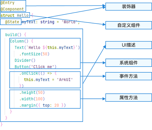
装饰器:用于装饰类、结构、方法以及变量,并赋予其特殊的含义。如上述示例中@Entry、@Component和@State都是装饰器,@Component表示自定义组件,@Entry表示该自定义组件为入口组件,@State表示组件中的状态变量,状态变量变化会触发UI刷新。
-
UI描述:以声明式的方式来描述UI的结构,例如build()方法中的代码块。
-
自定义组件:可复用的UI单元,可组合其他组件,如上述被@Component装饰的struct Hello。
-
系统组件:ArkUI框架中默认内置的基础和容器组件,可直接被开发者调用,比如示例中的Column、Text、Divider、Button。
-
属性方法:组件可以通过链式调用配置多项属性,如fontSize()、width()、height()、backgroundColor()等。
-
事件方法:组件可以通过链式调用设置多个事件的响应逻辑,如跟随在Button后面的onClick()。
系统组件、属性方法、事件方法具体使用可参考基于ArkTS的声明式开发范式。
除此之外,ArkTS扩展了多种语法范式来使开发更加便捷:
- @Builder/@BuilderParam:特殊的封装UI描述的方法,细粒度的封装和复用UI描述。
- @Extend/@Style:扩展内置组件和封装属性样式,更灵活地组合内置组件。
- stateStyles:多态样式,可以依据组件的内部状态的不同,设置不同样式。
4.自定义组件
- @Component
- struct HelloComponent {
- @State message: string = 'Hello, World!';
-
- build() {
- // HelloComponent自定义组件组合系统组件Row和Text
- Row() {
- Text(this.message)
- .onClick(() => {
- // 状态变量message的改变驱动UI刷新,UI从'Hello, World!'刷新为'Hello, ArkUI!'
- this.message = 'Hello, ArkUI!';
- })
- }
- }
- }
-
- @Entry
- @Component
- struct ParentComponent {
- build() {
- Column() {
- Text('ArkUI message')
- HelloComponent({ message: 'Hello, World!' });
- Divider()
- HelloComponent({ message: '你好!' });
- }
- }
- }
-
struct:自定义组件基于struct实现,struct + 自定义组件名 +
{…}的组合构成自定义组件,不能有继承关系。对于struct的实例化,可以省略new。 -
build()函数:build()函数用于定义自定义组件的声明式UI描述,自定义组件必须定义build()函数。
-
@Entry:@Entry装饰的自定义组件将作为UI页面的入口。在单个UI页面中,最多可以使用@Entry装饰一个自定义组件。@Entry可以接受一个可选的LocalStorage的参数。
4.1 build()函数规范
1、根节点唯一
- @Entry
- @Component
- struct MyComponent {
- build() {
- // 根节点唯一且必要,必须为容器组件
- Row() {
- ChildComponent()
- }
- }
- }
-
- @Component
- struct ChildComponent {
- build() {
- // 根节点唯一且必要,可为非容器组件
- Image('test.jpg')
- }
- }
2、不允许声明本地变量、打印、作用域
- build() {
- // 反例:不允许声明本地变量
- let a: number = 1;
- // 反例:不允许console.info
- console.info('print debug log');
- // 反例:不允许本地作用域
- {
- ...
- }
- }
-
3、不允许调用没有用@Builder装饰的方法,允许系统组件的参数是TS方法的返回值。
- @Component
- struct ParentComponent {
- doSomeCalculations() {
- }
-
- calcTextValue(): string {
- return 'Hello World';
- }
-
- @Builder doSomeRender() {
- Text(`Hello World`)
- }
-
- build() {
- Column() {
- // 反例:不能调用没有用@Builder装饰的方法
- this.doSomeCalculations();
- // 正例:可以调用
- this.doSomeRender();
- // 正例:参数可以为调用TS方法的返回值
- Text(this.calcTextValue())
- }
- }
- }
4、不允许switch和表达式
- build() {
- Column() {
- // 反例:不允许使用switch语法
- switch (expression) {
- case 1:
- Text('...')
- break;
- case 2:
- Image('...')
- break;
- default:
- Text('...')
- break;
- }
- // 反例:不允许使用表达式
- (this.aVar > 10) ? Text('...') : Image('...')
- }
- }
5.页面和自定义组件生命周期
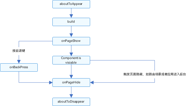
页面生命周期,即被@Entry装饰的组件生命周期,提供以下生命周期接口:
- onPageShow:页面每次显示时触发。
- onPageHide:页面每次隐藏时触发一次。
- onBackPress:当用户点击返回按钮时触发。
组件生命周期,即一般用@Component装饰的自定义组件的生命周期,提供以下生命周期接口:
- aboutToAppear:组件即将出现时回调该接口,具体时机为在创建自定义组件的新实例后,在执行其build()函数之前执行。
- aboutToDisappear:在自定义组件即将析构销毁时执行。
- // Index.ets
- import router from '@ohos.router';
-
- @Entry
- @Component
- struct MyComponent {
- @State showChild: boolean = true;
-
- // 只有被@Entry装饰的组件才可以调用页面的生命周期
- onPageShow() {
- console.info('Index onPageShow');
- }
- // 只有被@Entry装饰的组件才可以调用页面的生命周期
- onPageHide() {
- console.info('Index onPageHide');
- }
-
- // 只有被@Entry装饰的组件才可以调用页面的生命周期
- onBackPress() {
- console.info('Index onBackPress');
- }
-
- // 组件生命周期
- aboutToAppear() {
- console.info('MyComponent aboutToAppear');
- }
-
- // 组件生命周期
- aboutToDisappear() {
- console.info('MyComponent aboutToDisappear');
- }
-
- build() {
- Column() {
- // this.showChild为true,创建Child子组件,执行Child aboutToAppear
- if (this.showChild) {
- Child()
- }
- // this.showChild为false,删除Child子组件,执行Child aboutToDisappear
- Button('create or delete Child').onClick(() => {
- this.showChild = false;
- })
- // push到Page2页面,执行onPageHide
- Button('push to next page')
- .onClick(() => {
- router.pushUrl({ url: 'pages/Page2' });
- })
- }
-
- }
- }
-
- @Component
- struct Child {
- @State title: string = 'Hello World';
- // 组件生命周期
- aboutToDisappear() {
- console.info('[lifeCycle] Child aboutToDisappear')
- }
- // 组件生命周期
- aboutToAppear() {
- console.info('[lifeCycle] Child aboutToAppear')
- }
-
- build() {
- Text(this.title).fontSize(50).onClick(() => {
- this.title = 'Hello ArkUI';
- })
- }
- }
6.装饰函数
6.1 @Builder装饰器
@Builder主要是定义页面UI
6.1.1 装饰指向
1、自定义组件内自定义构建函数
- @Builder MyBuilderFunction(){ ... }
- #使用
- this.MyBuilderFunction(){ ... }
2、MyGlobalBuilderFunction()
- @Builder function MyGlobalBuilderFunction(){ ... }
- #使用
- MyGlobalBuilderFunction()
6.1.2 参数传递
1、按引用传递参数
- @Builder function ABuilder($$: { paramA1: string }) {
- Row() {
- Text(`UseStateVarByReference: ${$$.paramA1} `)
- }
- }
- @Entry
- @Component
- struct Parent {
- @State label: string = 'Hello';
- build() {
- Column() {
- // 在Parent组件中调用ABuilder的时候,将this.label引用传递给ABuilder
- ABuilder({ paramA1: this.label })
- Button('Click me').onClick(() => {
- // 点击“Click me”后,UI从“Hello”刷新为“ArkUI”
- this.label = 'ArkUI';
- })
- }
- }
- }
2、按值传递参数
- @Builder function ABuilder(paramA1: string) {
- Row() {
- Text(`UseStateVarByValue: ${paramA1} `)
- }
- }
- @Entry
- @Component
- struct Parent {
- label: string = 'Hello';
- build() {
- Column() {
- ABuilder(this.label)
- }
- }
- }
6.2 @BuilderParam装饰器
@BuilderParam用来装饰指向@Builder方法的变量,开发者可在初始化自定义组件时对此属性进行赋值,为自定义组件增加特定的功能。
6.2.1 装饰指向
1、本地初始化@BuilderParam
- @Builder function GlobalBuilder0() {}
-
- @Component
- struct Child {
- @Builder doNothingBuilder() {};
-
- @BuilderParam aBuilder0: () => void = this.doNothingBuilder;
- @BuilderParam aBuilder1: () => void = GlobalBuilder0;
- build(){}
- }
2、初始化子组件@BuilderParam
- @Component
- struct Child {
- @BuilderParam aBuilder0: () => void;
-
- build() {
- Column() {
- this.aBuilder0()
- }
- }
- }
-
- @Entry
- @Component
- struct Parent {
- @Builder componentBuilder() {
- Text(`Parent builder `)
- }
-
- build() {
- Column() {
- Child({ aBuilder0: this.componentBuilder })
- }
- }
- }
this都是器其本身,不会存在传递。
6.2.2 使用场景
1、参数化传递
- @Builder function GlobalBuilder1($$ : {label: string }) {
- Text($$.label)
- .width(400)
- .height(50)
- .backgroundColor(Color.Blue)
- }
-
- @Component
- struct Child {
- label: string = 'Child'
- // 无参数类,指向的componentBuilder也是无参数类型
- @BuilderParam aBuilder0: () => void;
- // 有参数类型,指向的GlobalBuilder1也是有参数类型的方法
- @BuilderParam aBuilder1: ($$ : { label : string}) => void;
-
- build() {
- Column() {
- this.aBuilder0()
- this.aBuilder1({label: 'global Builder label' } )
- }
- }
- }
-
- @Entry
- @Component
- struct Parent {
- label: string = 'Parent'
-
- @Builder componentBuilder() {
- Text(`${this.label}`)
- }
-
- build() {
- Column() {
- this.componentBuilder()
- Child({ aBuilder0: this.componentBuilder, aBuilder1: GlobalBuilder1 })
- }
- }
- }
2、尾随闭包
- // xxx.ets
- @Component
- struct CustomContainer {
- @Prop header: string;
- @BuilderParam closer: () => void
-
- build() {
- Column() {
- Text(this.header)
- .fontSize(30)
- this.closer()
- }
- }
- }
-
- @Builder function specificParam(label1: string, label2: string) {
- Column() {
- Text(label1)
- .fontSize(30)
- Text(label2)
- .fontSize(30)
- }
- }
-
- @Entry
- @Component
- struct CustomContainerUser {
- @State text: string = 'header';
-
- build() {
- Column() {
- // 创建CustomContainer,在创建CustomContainer时,通过其后紧跟一个大括号“{}”形成尾随闭包
- // 作为传递给子组件CustomContainer @BuilderParam closer: () => void的参数
- CustomContainer({ header: this.text }) {
- Column() {
- specificParam('testA', 'testB')
- }.backgroundColor(Color.Yellow)
- .onClick(() => {
- this.text = 'changeHeader';
- })
- }
- }
- }
- }
6.3 @Styles装饰器
@Styles装饰器主要是定义公共样式
6.3.1 装饰指向
1、全局
- // 全局
- @Styles function functionName() { ... }
-
- // 在组件内
- @Component
- struct FancyUse {
- @Styles fancy() {
- .height(100)
- }
- }
2、组件内
- @Component
- struct FancyUse {
- @State heightValue: number = 100
- @Styles fancy() {
- .height(this.heightValue)
- .backgroundColor(Color.Yellow)
- .onClick(() => {
- this.heightValue = 200
- })
- }
- }
6.3.2 使用场景
- // 定义在全局的@Styles封装的样式
- @Styles function globalFancy () {
- .width(150)
- .height(100)
- .backgroundColor(Color.Pink)
- }
-
- @Entry
- @Component
- struct FancyUse {
- @State heightValue: number = 100
- // 定义在组件内的@Styles封装的样式
- @Styles fancy() {
- .width(200)
- .height(this.heightValue)
- .backgroundColor(Color.Yellow)
- .onClick(() => {
- this.heightValue = 200
- })
- }
-
- build() {
- Column({ space: 10 }) {
- // 使用全局的@Styles封装的样式
- Text('FancyA')
- .globalFancy ()
- .fontSize(30)
- // 使用组件内的@Styles封装的样式
- Text('FancyB')
- .fancy()
- .fontSize(30)
- }
- }
- }
6.4 @Extend装饰器
@Extend用于扩展原生组件样式,作用和@Styles差不多。
6.4.1 装饰指向
@Extend仅支持定义在全局,不支持在组件内部定义
1、@Extend支持封装指定的组件的私有属性和私有事件
- // @Extend(Text)可以支持Text的私有属性fontColor
- @Extend(Text) function fancy () {
- .fontColor(Color.Red)
- }
- // superFancyText可以调用预定义的fancy
- @Extend(Text) function superFancyText(size:number) {
- .fontSize(size)
- .fancy()
- }
2、@Extend装饰的方法支持参数
- // xxx.ets
- @Extend(Text) function fancy (fontSize: number) {
- .fontColor(Color.Red)
- .fontSize(fontSize)
- }
-
- @Entry
- @Component
- struct FancyUse {
- build() {
- Row({ space: 10 }) {
- Text('Fancy')
- .fancy(16)
- Text('Fancy')
- .fancy(24)
- }
- }
- }
3、@Extend装饰的方法的参数可以为function
- @Extend(Text) function makeMeClick(onClick: () => void) {
- .backgroundColor(Color.Blue)
- .onClick(onClick)
- }
-
- @Entry
- @Component
- struct FancyUse {
- @State label: string = 'Hello World';
-
- onClickHandler() {
- this.label = 'Hello ArkUI';
- }
-
- build() {
- Row({ space: 10 }) {
- Text(`${this.label}`)
- .makeMeClick(this.onClickHandler.bind(this))
- }
- }
- }
4、@Extend的参数可以为状态变量
- @Extend(Text) function fancy (fontSize: number) {
- .fontColor(Color.Red)
- .fontSize(fontSize)
- }
-
- @Entry
- @Component
- struct FancyUse {
- @State fontSizeValue: number = 20
- build() {
- Row({ space: 10 }) {
- Text('Fancy')
- .fancy(this.fontSizeValue)
- .onClick(() => {
- this.fontSizeValue = 30
- })
- }
- }
- }
☀️6.4.2 使用场景
- @Extend(Text) function fancyText(weightValue: number, color: Color) {
- .fontStyle(FontStyle.Italic)
- .fontWeight(weightValue)
- .backgroundColor(color)
- }
-
- @Entry
- @Component
- struct FancyUse {
- @State label: string = 'Hello World'
-
- build() {
- Row({ space: 10 }) {
- Text(`${this.label}`)
- .fancyText(100, Color.Blue)
- Text(`${this.label}`)
- .fancyText(200, Color.Pink)
- Text(`${this.label}`)
- .fancyText(300, Color.Orange)
- }.margin('20%')
- }
- }
7.多态样式
stateStyles是属性方法,可以根据UI内部状态来设置样式,类似于css伪类,但语法不同。ArkUI提供以下四种状态:
- focused:获焦态
- normal:正常态
- pressed:按压态
- disabled:不可用态
7.1 基本使用
- @Entry
- @Component
- struct CompWithInlineStateStyles {
- @State focusedColor: Color = Color.Red;
- normalColor: Color = Color.Green
- build() {
- Column() {
- Button('clickMe').height(100).width(100)
- .stateStyles({
- normal: {
- .backgroundColor(this.normalColor)
- },
- focused: {
- .backgroundColor(this.focusedColor)
- }
- })
- .onClick(() => {
- this.focusedColor = Color.Pink
- })
- .margin('30%')
- }
- }
- }
7.2 @Styles和stateStyles联合使用
- @Entry
- @Component
- struct MyComponent {
- @Styles normalStyle() {
- .backgroundColor(Color.Gray)
- }
-
- @Styles pressedStyle() {
- .backgroundColor(Color.Red)
- }
-
- build() {
- Column() {
- Text('Text1')
- .fontSize(50)
- .fontColor(Color.White)
- .stateStyles({
- normal: this.normalStyle,
- pressed: this.pressedStyle,
- })
- }
- }
- }
7.3 stateStyles里使用常规变量和状态变量
- @Entry
- @Component
- struct CompWithInlineStateStyles {
- @State focusedColor: Color = Color.Red;
- normalColor: Color = Color.Green
- build() {
- Button('clickMe').height(100).width(100)
- .stateStyles({
- normal: {
- .backgroundColor(this.normalColor)
- },
- focused: {
- .backgroundColor(this.focusedColor)
- }
- })
- .onClick(() => {
- this.focusedColor = Color.Pink
- })
- .margin('30%')
- }
- }
?写在最后
- 如果你觉得这篇内容对你还蛮有帮助,我想邀请你帮我三个小忙:
- 点赞,转发,有你们的 『点赞和评论』,才是我创造的动力。
- 关注小编,同时可以期待后续文章ing?,不定期分享原创知识。
- 想要获取文中提到的学习资料,请点击→全套鸿蒙HarmonyOS学习资料
- 或者关注小编后私信回复【666】也可获取资料哦~~
评论记录:
回复评论: